It hits on some great points of self promotion that apply to not only announcing something, but making sure that your bright light isn’t hid under a bushel.
It’s not enough to do great work at work, but you must also let people know about what you’ve done, specifically your boss. The same is true of your … projects.
... If someone asks you about your project, can you explain its awesomeness, and why he should use it? If not, why are you bothering? And if you can, are telling everyone you can about it? If not, why are you bothering?
Often your boss will only hear negative feedback about your work. People just don’t go out of their way to tell your boss if you’re doing a great job. Often they’ll tell you, but meanwhile your boss hasn’t heard squat.
Can you explain your awesomeness to your boss? Are you telling them about it every week?
Same goes for the project you’re working on. Can you explain its awesomeness? If you can’t, why are you working on it? Get your awesomeness straight, or shut it down. And when it’s awesome, make sure peoples know about it.
Jakob Nielsen’s Alertbox today proclaims that we we should Stop Masking Passwords. He claims the usability costs are too high, especially on mobile devices where typos are more common.
I was skeptical, but he has some great points, the most important being that the greatest security risks when you are entering a password are really electronic—someone snooping your password through an unsecure connection. Someone watching your screen can just as easily watch your keyboard to see what keys you tap. But most of the time this is irrelevant, since you are at home and not really being stalked by an over-the-shoulder snooper.
And to cover the occasional Internet kiosk scenario, he suggests providing a checkbox that will let users decide whether they want to mask their password. I like it! Virtual equivalent of cupping your hand around the keypad at an ATM.
Now that I think about it, I have recently noticed that when I type a password on my mobile phone, it briefly shows the last character I typed before replacing it with an asterisk. (Is that an Opera Mobile feature?) That seems to be a concession to some of Nielsen’s points regarding mobile password entry. But I wonder whether it really makes sense either. If it’s visible to you briefly, then it’s visible to a snooper briefly too. But what are the chances that someone can see that teeny tiny text you are taptapping on your phone anyway???
So I guess he’s convinced me! Death to the Asterisk!
I’ve only listened to the first podcast so far, but the Mormon Channel’s series on creativity seems really promising. Looking forward to the next episode on my commute!
If you don’t have budget to fly around the world and witness how people use mobile phones in emerging markets, this may be the next best thing: Adaptive Path’s Mobile Literacy project is complete with photos, anecdotal reports, and video interviews (scroll down to see the videos, which are also on Vimeo).
“Three lessons on what’s really important,” from Good Experience:
“How important are you? Just ask a customer.” Great anecdote about Google asking people what a “browser” is…
“Accept your unimportance. It may help.” If you believe you are the center of the universe, then you’ve just created a very small universe for yourself.
“When people start believing their own hype, run.” Cites those “in the know” before the financial meltdown… who appeared to be in the “not-know” after all.
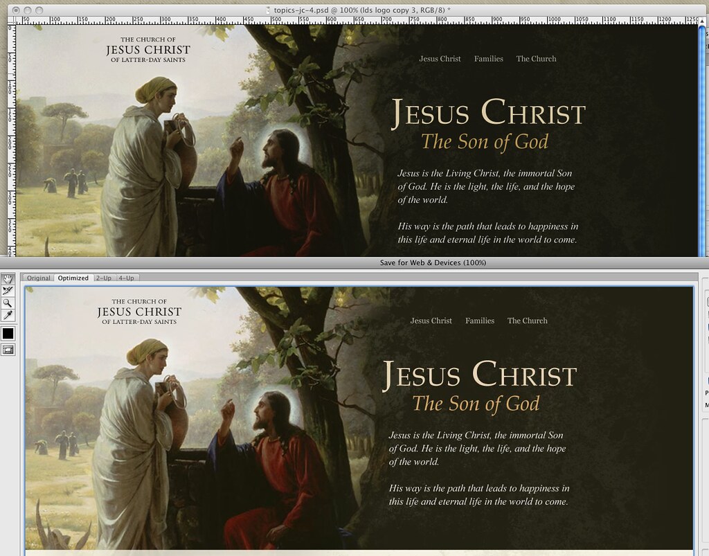
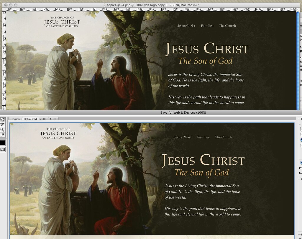
I have been plagued with this problem for literally 4 years. I’ll work on a design in Photoshop for days, only to save the dang thing for the web and get a washed out, off color piece of crap result. Finally, today, I have the answer: one change of the Proof Setup setting will finally match your working space with your output images.
See below. The rich dark chocolates and deep reds of the Carl Bloch painting are washed out when you Save for Web in Photoshop:
OK so sure, most can’t tell the difference. Still infuriating.
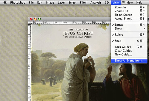
Chris mentioned the above image was a bit washed out, and when met with a fury of whining from yours truly about the issue, calmly pointed me to the View menu (Photoshop CS4). You have to first click “Show All Menu Items” (reason #54 why you should never hire an interface designer with Adobe on their resume). You then are greeted with “Proof Setup” at the very top:
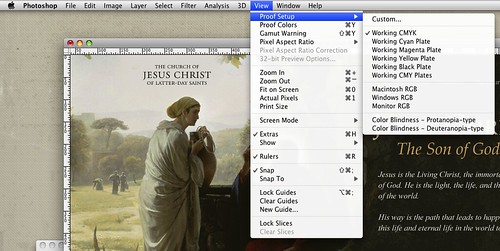
There you have the problem: Photoshop ships with the Proof Setup as “Working CMYK.” Because if you use Photoshop you must be a print designer.
For those of us who aren’t just print designers, simply change it to match your project and machine. In my case, Macintosh RGB, and voila:
Unfortunately, your new view of a current document will now be washed out. But at least it reflects reality! Now you can fix it accurately, and if you save your workspace, your settings should apply for all new projects, ridding you of this problem forever.
Google, you may now point everyone with Photoshop color problems to this article.
“People don’t want to buy a quarter-inch drill. They want a quarter-inch hole.”
Theodore Levitt, quoted in The Innovator’s Solution, sequel to The Innovator’s Dilemma, both recommended to me by John as I’m in the early stages of defining what a proposed product should do.
Timely reminder that customers “hire a product to do a job,” not to fill a slot on their shelf reserved for an artificial product category. (Of course they don’t really just want a hole; they want to build something, drain something, see through something, etc. We need to get down to real intents and desired outcomes, or we’ll never understand what we should build to meet real needs.)
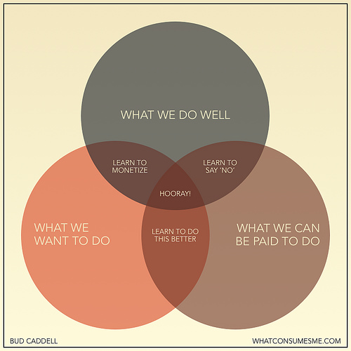
We can’t determine how to make enough money from the things we want to do, and do really well. I’m constantly surprised at what can be monetized. And on the web, there’s a market for almost anything. But this problem requires you to rapidly iterate your positioning and the type of clients you serve. Often, we’ll get transfixed on a single direction early on (because we’re desperate to solidify our business) and we’ll miss our chance to radically experiment with the market.
A short and sweet synopsis of what we should all be striving for, not just if you have your own business.
Have you ever stopped to think about what information is, really? If you’re as big a nerd as I am, you have. I was introduced to the concept through Neal Stephenson’s Cryptonomicon and was reminded of it when I came across the above video from Maya Design (via etre)
If you haven’t watched it yet, please do so now….
Users are constantly picking up information from your site. What they can and can’t do, where they could go, where they should go, or whether they should go away all together.
Thinking about information abstractly will help you convey your message using more than just body copy.
“Being a child of modernism I have heard this mantra all my life—Less is more. One morning upon awakening I realised that it was total nonsense, it is an absurd proposition … If you look at a Persian rug, you cannot say that less is more because you realise that every part of that rug, every change of colour, every shift in form is absolutely essential for its aesthetic success. You cannot prove to me that a solid blue rug is in any way superior. I have an alternative to the proposition that I believe is more appropriate — Just enough is more.”
“There is bad taste and then there is this. What was going through the designer’s mind? ‘I’ll scale it a little bit. Hmmm, maybe just a little more. More. More. I have so much power. I’m drunk in scaling power. More. More. Scale it more. Don’t stop. Do it. Okay, that’s enough.’”
Brand New commentary on the new Microsoft Bing logo
“How important is the voice of the customer? Very. But discerning the difference between what customers are able to say and what they want, and then acting on those unspoken desires, demands that companies learn to go well beyond listening.”
Dorothy Leonard, speaking of the importance of focusing on observation and desired outcomes rather than specific customer-proposed solutions, in “The Limitations of Listening,” Harvard Business Review, January 2002.
Up in 120 frames. * SPOILER WARNING* If you haven’t seen the movie yet (what are you waiting for??) DO NOT click through to the larger image as you will see some plot details (don’t look too closely at the above image either).
That warning having been given, there is even more delicious goodness on the Art of Up (same spoiler warning) by Lou Romano.
Here is some of the development & production work I did on UP (2005-2008). Similar to the work from The Incredibles, (production paintings, color/lighting design and artistic direction) this was done to help inspire the look of the film.
Lost of pictures, art, drawings, videos, etc. All a wonderful glimpse behind the scenes of a great movie.


