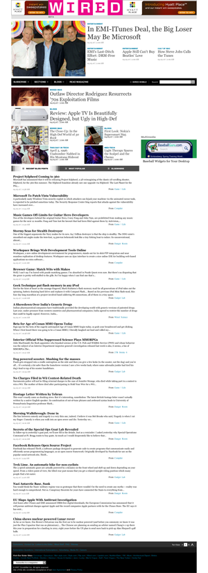
Anyone paying attention to the new Wired.com designs? They’ve changed it up quite a bit in recent weeks, responding to user feedback (read: horror) and trying some new things. Lame “BETA” tag on the site too. My take: I love the site above the fold, but the massive list of Wired blog posts (based on Dave Winer’s River of News concept) is just plain ugly. This screen shot puts it into perspective.
Related: 13 years of Wired.com.