article archives
The darndest thing happened in the last five days and I was fortunate to be privy to it. Apple has gotten people excited about computing.
But this time, it’s not nerds or geeks and certainly not IT industry analysts. It’s everyone else.
I had a curious set of three conversations this week. One with a grandma, one with a technophobe and the third with a self-proclaimed luddite.
Grandma
My mother-in-law walked in the door the day of the keynote and the first thing out of her mouth was “Did you see that new Apple iPad? That looks like it would work for me. Would that work for me?”
I was utterly flabbergasted. She NEVER talks about computers or technology. She tolerates them at best. Her attitude is typical of most baby boomers I’ve talked to regarding computers. She wants to benefit from them but is frustrated by the wall she must climb in order to do so. She’s learned how to use email and a couple of other things on the Internet and that’s about it.
Her bringing up the iPad was amazing for two reasons. First, someone in her office (she works with other ‘boomers) found out about it within hours of the keynote and shared it with her. That Apple news warranted attention from baby boomers at all is significant. That she then held her interest long enough to tell me at the end of the day is equally significant.
After learning a little more information about it, she has decided that she wants an iPad. It actually borders on technolust.
Technophobe
A good friend of mine is an attorney and reluctantly uses technology for his work. In age, he’s somewhere between my generation and the baby boomers. He recently lost his phone in the snow and then found out his company was moving to AT&T. He replaced his lost phone with a blackberry and when our group of friends caught wind of that, we informed him he could have gotten an iPhone. So on our recommendation, he decided to take the Blackberry back and give the iPhone a try.
I had never once seen him exhibit any excitement over technology but the next time I saw him, he could barely contain his enthusiasm for his new phone.
Fast forward to last Wednesday evening. I told him about the new iPad and his eyes grew wide. He blurted out “Wait, are you talking about an iPhone but with a bigger screen? A regular sized computer THIS easy to use? $15 a month for internet anywhere? When can I buy one?”
He had been won over completely by the user experience of the iPhone. It was amazing to watch and fascinating to see him project his good experience and excitement to the iPad.
Luddite
The third conversation came from a completely unexpected source. I have a good friend and neighbor who works remodeling houses and who reluctantly agreed to have me design a website for his company after being pressured by his family. I don’t know anyone else who hates computers more. He has refused to get an email address. He doesn’t use his mobile phone to do anything other than make a call. And he often mocks me anytime I even mention computers. I want to make it perfectly clear that I’m not exaggerating his attitude. At all.
He stopped by my house the day of the keynote to talk about his new website and when he walked in I happened to have some iPad photos open on my laptop. He asked me what they were about and I casually described the new Apple “tablet” that had just been released. I didn’t spend a lot of time on it considering his historical lack of interest in computers. He asked me a couple of questions and then we discussed his site.
Three days later, he called me and the following exchange ensued. “Dude, I think I want to get one of those Apple tablets for my business.” “Really?” I said. “Yeah, I went and looked at them and they seem really easy to use. I think it would work great for showing potential customers my work and for doing bids on.” I was completely speechless.
The Point
After Apple released the iPhone and when the serious rumors started about the “tablet” a year or so ago I had hoped that this was where Apple was going. I’ve long felt that computers were too hard to use, that the filesystem should NEVER be seen by the user. That human-computer interaction should favor the “human” side.
As the Apple guys stood on stage and described the iPad, I knew I was seeing computer history being made. This new approach to computing and experience is as much a game changer as the ORIGINAL Mac. Heck, it may even be more so.
But honestly, before having these three conversations, I figured Apple’s vision would be realized in ten to fifteen years. Now I’m thinking five or less.
One More Thing
When the date for the announcement was set, I started hoping that Apple would release something like iWork for the “tablet.” I doubted they would so soon but the hope was there. As I figured, if they did, they’d be sending a clear message that this was the future of computing, not just for gaming, watching videos and reading books.
Somehow that message has been lost on people (so many iWork comments end with “meh”), but I consider the release of mobile iWork to be the biggest sign of things to come and the strongest message Apple sent regarding their vision for the future.
It’s amazing to watch all of this unfold.
posted by
foster
on Monday, Feb 01, 2010
Somehow this eluded quite a few of us over here, but this weekend is the Altitude Design Summit in Salt Lake City (disclaimer: links to Hulabalub, a site I made). Alt is bringing together a ton of designy bloggers and enthusiasts to talk shop and style. This week, Thursday and Friday, but note that online registration is now closed, with only a handful of walk-up spots available.
Alt’s Twitter pointed us to Design*Sponge’s guide to Salt Lake City, which proves a good guide to many places we love and a handful I haven’t seen yet. Worth a look..
posted by
jason
on Tuesday, Jan 19, 2010
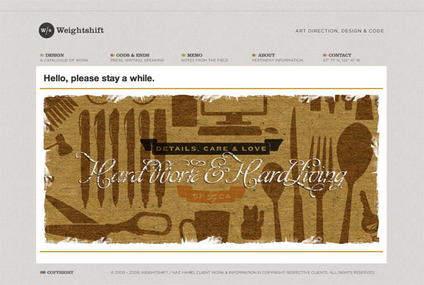
Naz Hamid has a new article on Weightshift called Stuck between an App and a Website, and its a thoughtful look at designing to the project and the humans using it:
Get to know your client well, do the research, do what is right, not what is now and trendy and because Apple/Facebook/xxxxxx does it. Listen, communicate, design well.
It’s all too easy to get wrapped up in a look, a design or an aesthetic. The science fiction of my youth left those impressions but ultimately, it was the human element — the stories that mattered the most, that left the lasting impression. In the end, we’re all trying to make machines more rounded, more curved, more organic, more human.
By the way, I hadn’t seen Naz’s new design but it’s equally impressive:
posted by
jason
on Thursday, Nov 12, 2009
This past week the church put on a technical conference (no not THAT conference) called SORT (no it doesn’t stand for anything). It was a two day conference held at the institute building at the University of Utah. There were over 850 attendees, 200+ classes and 6 keynotes. Yes, this was a serious conference.
Aside from the keynotes, all of the classes were given by people from inside the churches organizations. Employees from the ICS (IT) department, Family History, BYU and more. The conference ran smoother then most other conferences I have been to. They provided breakfast, lunch and snacks throughout the day. Class content ranged from beginner to advanced, from back end to front end, security to performance, and many many more topics. All in all, one of the best conferences I have attended.
I decided to punish myself (and others) by presenting at the conference. I gave 3 presentations: Intermediate jQuery, Advanced jQuery and Designing Faster Websites. The Faster Websites had so many people sign up for it that they gave it a second time slot as well so more people could see it. It’s awesome that so many people were interested in this subject to need that.
Several other NorthTemple-ites also presented.
- Nic Johnson presented an HTML5 and CSS3 class (also called upon for a repeat performance the second day… without his knowledge… when he forgot his laptop at home).
- Ted Boren on Conducting Customer Interviews.
- Emmy Southworth and Susan Jarvis presented a two part Basic Usability Skills class where they covered the basics of usability testing.
- Rob Thomas on Presentation Skills: How to Make Your Point.
Overall a great representation from our team to get these important topics in the minds of people from many disciplines.
Due to the church being understandably overly cautious about legal issues we will probably not be able to post our slides from our presentations. But I figured posting some links to stuff I mentioned would be beneficial to those who attended my presentations and others as well. This will not be the prettiest of lists, but some good information regardless.
Intermediate jQuery
Most of my presentation was a dive into the following pages. If I can get clearance to post the demos and my other optimization examples, I’ll post them.
Advanced jQuery
Designing Faster Websites
I was glad so many people were interested in this topic. There is a lot of activity in this space lately and our users will thank us for making the extra effort.
General Performance
Sprites
- Sprites explained
- Sprite Generators:
Spritegen,
Sprite me By Steve Souders. Can’t do local files, only sprites what is on the current page (not all the image files for the site).
- Sprite Examples
Tools
posted by
aaron
on Wednesday, Oct 21, 2009
One reason for the chirping crickets around here is the insane amount of work we have going on here at the LDS Church. We have major projects going on in every department of the church, and its keeping the 40 or so of us pretty busy.
So busy, in fact, that we’ve been able to shed the pesky hiring freeze and open up several spots. If you’re an active member of the LDS Church, are willing to work in Salt Lake City, and match up with the following requirements, send me an email at jobs@northtemple.com.
Design Manager
Our Design Manager role coordinates all user experience design in one of our many portfolios of projects. You’ll need experience managing people (read: geeks), and experience in a Creative Director or similar role. Check out this really formal job description for more info.
HTML/CSS Coder
We’re looking for contractors who can work 30-40 hours a week, on-site, cutting our Photoshop files into standards-compliant HTML and CSS. Send me an email if you know your stuff, and especially if you have experience interacting with or supporting development teams.
posted by
jason
on Monday, Sep 28, 2009
Jakob Nielsen recently ran a Twitter post through 5 rounds of iterative design to get the impact he wanted. At first blush I was thinking, “That sounds like a lot of effort to optimize a Tweet!” But if you are using twitter as a marketing medium, I guess it makes sense. (Far as I can tell, these were just design rounds; he wasn’t running a user study or anything.)
See his article for lessons learned in each round, from concision to focus, impact, and re-tweetability. (There, I’m making up new words right and left.)
He finishes the article with a notable quote: “Text is a UI. It’s a common mistake to think that only full-fledged graphical user interfaces count as interaction design and deserve usability attention. ... In fact, the shorter it is, the more important it is to design text for usability.”
posted by
ted
on Monday, Aug 24, 2009
37 Signals’ Jason Zimdars hits the nail squarely today in his post Stop following directions and start designing:
Of course it is totally understandable to take the ideas of those that pay our bills as gospel. But we should also be reminded that those same people hired us for our expertise. If they just wanted someone to follow orders, they’d probably have hired someone else.
This is especially true in our jobs here on North Temple Street, where design instruction can come from the same people who write actual Church doctrine. I fear too few of us stand up for our own truths, the truths of proportion and color and composition.
While our customers – and yours certainly – are well versed in the gospels of their own sphere, we are the trained experts of design. Often these people who demand that the page doesn’t scroll or whatnot haven’t a clue as to how their message should be communicated.
Instead, let us assert our expertise. Carefully take the customers’ feedback, adjust the design as you see fit, and with confidence explain why those decisions were necessary. In the end, you’ll have progressed the design in ways that improve the product – and not the egos – of your customers.
posted by
jason
on Wednesday, Jul 29, 2009
In an unrelated post, Jamis Charles asked, “I know this is totally unrelated, but you mentioned some time ago you started using Balsamiq Mockups. I’d like to pitch it to my UI Team. How has it been working for you? How do you incorporate it into your workflow? Has it increased productivity? A post about this would be greatly appreciated. Thanks.”
I’ll let others speak to their own experience, but here’s a quick post on how it worked for me. I was looking for something easy that would help my team focus less on pixels and colors during the planning stage, and just focus on concepts and framework. Balsamiq worked admirably for that purpose. In fact, within weeks of using Balsamiq for our weekly high-level design meetings, team members were themselves articulating the reason to use Balsamiq: “We don’t get bogged down in the details anymore!”
The workflow was something like this:
- I would review high level requirements, talk with the customer and mock something up quickly in Balsamiq, with sketchy notes in the margins. As promised, the tool is drop-dead simple for most things it supports. Don’t expect a freeform drawing tool, but for dragging and dropping basic UI elements, it’s very easy.
- Team would meet to discuss.
- I would take notes directly in Balsamiq, sometimes updating the mockup, but often just leaving a note in the margins for later. Because of the low fidelity of the prototype, the team was able to get past nitpicking the details and focus on the functional requirements and workflow.
- Once we moved out of planning into iterative development, I would refer to the mockups and the notes recorded there to create higher fidelity prototypes, using Fireworks images or HTML prototypes, depending on the need. I tried to get a cycle or two ahead of the dev team, and was generally successful.
- As the high fidelity design progressed, we referenced the low fidelity mockups less and less. By the last cycle or two, we were hardly using them at all anymore. I probably haven’t opened the tool in 3 months.
So in terms of productivity, our planning discussions were more productive because we were not bogged down at the pixel level. But in terms of turning the Balsamiq Mockups into production code—that was not really our intent, nor does the tool really support that.
Anybody else have a perspective to share on this or other rapid prototyping tools?
posted by
ted
on Thursday, Jul 02, 2009
Mull this over this weekend and get back to me:
Today John Gruber wrote this little gem in his review of the iPhone’s
Copy and Paste abilities:
That we had to wait two years for the iPhone’s text selection and pasteboard is a good example of one aspect of the Apple way: better nothing at all than something less than great.
... it’s simply incomprehensible to some people that it might be better to have no text selection/pasteboard implementation while waiting for a great one than to have a poor implementation in the interim.
Is it better to release something mediocre than to wait to release something great? Too often I hear this excuse: “this is better than what we have now.” This is a tempting excuse to spew out of your mouth, because no one can argue with it. Of course it’s better. It’s easy to be better. But is it great? Is it awesome? Are you cheating your customers or viewers of something that would blow their minds?
What do you think? Is it better to release early and often, improving on a”good” idea in public? Or is it better to wait until an idea strikes this beautiful chord of greatness and then unleash it on the world?
posted by
jason
on Friday, Jun 26, 2009
Andy Lester at Perl Buzz wrote up a nice short piece yesterday on How to announce an event, or, awesome is not always self-evident (no, I haven’t regressed into massive nerdery, I grabbed this link from Kathy Sierra’s bright green tweeter).
It hits on some great points of self promotion that apply to not only announcing something, but making sure that your bright light isn’t hid under a bushel.
It’s not enough to do great work at work, but you must also let people know about what you’ve done, specifically your boss. The same is true of your … projects.
... If someone asks you about your project, can you explain its awesomeness, and why he should use it? If not, why are you bothering? And if you can, are telling everyone you can about it? If not, why are you bothering?
Often your boss will only hear negative feedback about your work. People just don’t go out of their way to tell your boss if you’re doing a great job. Often they’ll tell you, but meanwhile your boss hasn’t heard squat.
Can you explain your awesomeness to your boss? Are you telling them about it every week?
Same goes for the project you’re working on. Can you explain its awesomeness? If you can’t, why are you working on it? Get your awesomeness straight, or shut it down. And when it’s awesome, make sure peoples know about it.
posted by
jason
on Wednesday, Jun 24, 2009
Jakob Nielsen’s Alertbox today proclaims that we we should Stop Masking Passwords. He claims the usability costs are too high, especially on mobile devices where typos are more common.
I was skeptical, but he has some great points, the most important being that the greatest security risks when you are entering a password are really electronic—someone snooping your password through an unsecure connection. Someone watching your screen can just as easily watch your keyboard to see what keys you tap. But most of the time this is irrelevant, since you are at home and not really being stalked by an over-the-shoulder snooper.
And to cover the occasional Internet kiosk scenario, he suggests providing a checkbox that will let users decide whether they want to mask their password. I like it! Virtual equivalent of cupping your hand around the keypad at an ATM.
Now that I think about it, I have recently noticed that when I type a password on my mobile phone, it briefly shows the last character I typed before replacing it with an asterisk. (Is that an Opera Mobile feature?) That seems to be a concession to some of Nielsen’s points regarding mobile password entry. But I wonder whether it really makes sense either. If it’s visible to you briefly, then it’s visible to a snooper briefly too. But what are the chances that someone can see that teeny tiny text you are taptapping on your phone anyway???
So I guess he’s convinced me! Death to the Asterisk!
posted by
ted
on Wednesday, Jun 24, 2009
I have been plagued with this problem for literally 4 years. I’ll work on a design in Photoshop for days, only to save the dang thing for the web and get a washed out, off color piece of crap result. Finally, today, I have the answer: one change of the Proof Setup setting will finally match your working space with your output images.
See below. The rich dark chocolates and deep reds of the Carl Bloch painting are washed out when you Save for Web in Photoshop:
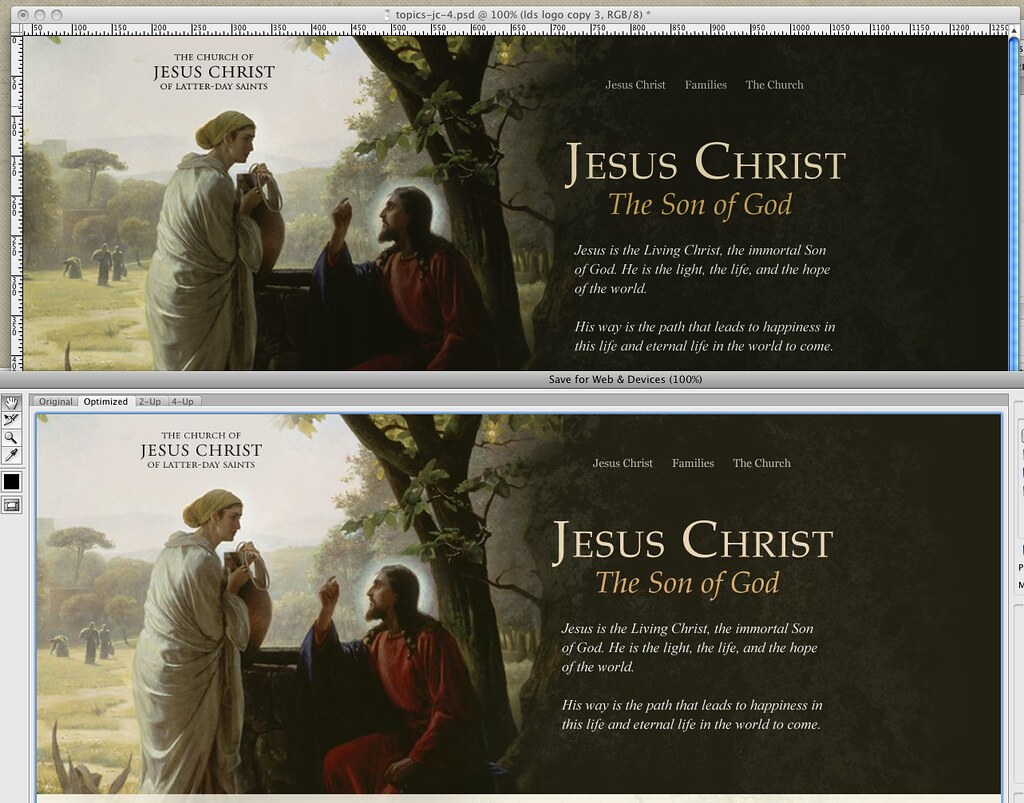
OK so sure, most can’t tell the difference. Still infuriating.
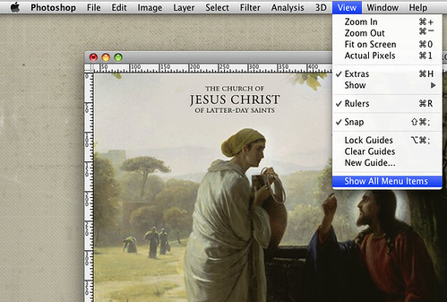
Chris mentioned the above image was a bit washed out, and when met with a fury of whining from yours truly about the issue, calmly pointed me to the View menu (Photoshop CS4). You have to first click “Show All Menu Items” (reason #54 why you should never hire an interface designer with Adobe on their resume). You then are greeted with “Proof Setup” at the very top:
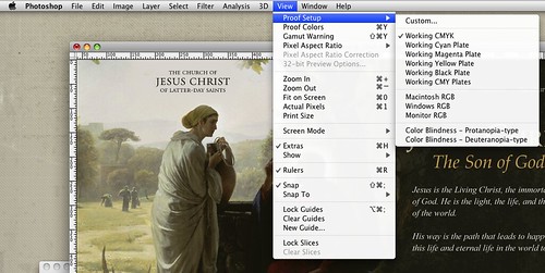
There you have the problem: Photoshop ships with the Proof Setup as “Working CMYK.” Because if you use Photoshop you must be a print designer.
For those of us who aren’t just print designers, simply change it to match your project and machine. In my case, Macintosh RGB, and voila:
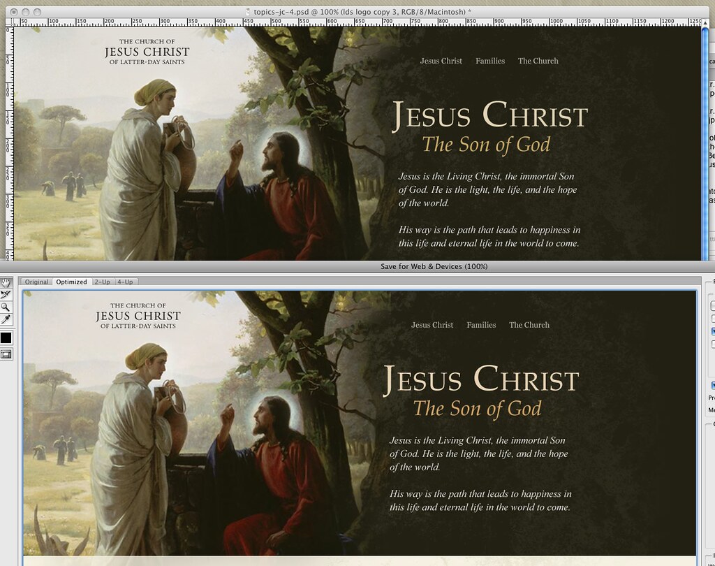
Unfortunately, your new view of a current document will now be washed out. But at least it reflects reality! Now you can fix it accurately, and if you save your workspace, your settings should apply for all new projects, ridding you of this problem forever.
Google, you may now point everyone with Photoshop color problems to this article.
Update: See Josh Bryant’s comment below for a more complete set of steps to solve your Photoshop color headaches.
posted by
jason
on Wednesday, Jun 10, 2009
I’m happy to announce the launch of radio.lds.org, our site for the Mormon Channel radio station. I led the design efforts, while many dozens of others contributed to the development and implementation of the site.

While not without its flaws, the site is a big success internally for a number of design-related reasons:
- After planning to put the site in the current lds.org look and feel, once we put content into the template we realized that the Audio Visual department of the Church needed something much more unique and brandable. Late in the game, I designed a fresh layout, and delivered new CSS and image files to development that required just 1 HTML change to the lds.org template (bonus points if you can figure that out). Despite the ubiquity of standards-driven code in our field, this move baffled everyone on our project team, seeing the entire look of the site change with a new CSS file. There are few things you can do to build trust on a project team as powerful as showing this type of design wizardry. People seriously look like you just used the Force.
- The switch from old look to new look took about 1 week. Whiteboard to Photoshop to CSS, and the AV department was thrilled. With just CSS, we were able to provide AV with a much better website for their channel, while keeping additional development costs to literally 10 minutes.
- I rewrote the lds.org fly-out menus with jQuery, replacing 480 lines of JavaScript (written 3 years ago by Aaron Barker) with 44 lines of jQuery.
There are dozens of other great features behind the scenes on this site, and again tons of other people helped make it happen. Congrats to our IT teams, and the AV teams and production crews on this huge cache of new content that’s now available worldwide.
posted by
jason
on Monday, May 18, 2009
No, I’m not waxing apocalyptic, just thinking about some things after a minor workplace disaster this morning.
I walked in to our work area this morning and found several boxes of my stuff shoved into the middle of the floor and Frank’s desk looking like a tornado zone, with posters and papers stacked haphazardly on the floor, instead of on the desk near the wall where he usually has them.
Apparently an air conditioning unit exploded over the weekend, several floors above us. The water coursed down the inside wall of the building, flooding workspaces on several floors.
This little adventure has caused me to reflect on a couple of things:
- The time for a backup is before you need it. I have not done a systematic backup of my files in too long. Luckily, my laptop was at home with me. But if I had left it at work, it would at least have been splashed and at worst could have been soaked.
- I love my Tufte books; I should be more careful with them. My biggest concern was that the three books I own by Edward Tufte might have been ruined. Luckily, the box they were in appears to have absorbed most of the moisture. I think I’m going to place my most valued and valuable books in a more secure location…
- PDF is waterproof. One damaged item was printout of a downloaded book I purchased a while ago. Gratefully, I still have the pdf I downloaded. I’m glad I didn’t delete it after printing it out.
- The Internet is amazing. I was most concerned about salvaging printed presentation slides from a session the UIE 13 conference last fall. I would have just written Jared Spool and asked for an electronic replacement, but I had taken extensive notes in the margins. The ink had bled a little, but for the most part the pages looked OK—just wet. So I did a quick Internet search on “water damaged books.” The results were amazing.
I discovered that the treatment for fully soaked books was different from wet or partially wet book, which was different than for “damp” books. (My items ranged from “damp” to “partially wet”.) I learned that in the worst cases you can freeze or even freeze dry books until a professional can be brought in to do the job right. (I was fortunately not in such dire straits, but interesting to know!) I learned that time is of the essence, but not to dry books out too quickly under high heat, or else additional damage may occur. I learned that damp bindings can cause mold problems even after the pages seemed fully recovered.
In truth, I found more than I needed to know. All I had to do was interleave a paper towel every 10-20 pages or so, let that sit a while, then stand the book on its edge with the pages fanned out for final drying.
But it was a confirmation of the power of the medium, that within minutes of discovering a relatively obscure and infrequent problem, I had more answers than I could use, right at my fingertips.
That’s all. Nothing too profound, just gratitude that things weren’t as bad as they could have been, appreciation for some people that I never met being generous enough to put their expertise out there for others to benefit from, and some timely reminders that there are things I can do now to prepare for disaster later.
posted by
ted
on Monday, May 18, 2009
Some people talk as if you can make a product “without designing it.” That’s silly. You can’t make a product without designing it any more than you can raise a child without parenting him or her. You may parent poorly or well, but only in cases of extreme neglect could it be said that you didn’t parent at all. Same thing in making products; you either design haphazardly or deliberately, well or poorly, carefully or slothfully—but you can’t avoid Designing.
Designers are often compared to protective parents, watching over “their baby,” reluctant to take criticism of “their baby,” being proud of “their baby.” That’s all well and good—as long as you don’t spoil the child. Good design, like good parenting, requires discipline.
In parenting, one of the biggest risks is that you indulge your child’s every whim under the guise of “loving him or her.” It makes you feel good in the short term. It makes you feel liked. You may enjoy feeling like you’re a good provider because your kids “have it better than you did.” But if you overdo it, you end up with kids who can’t work for themselves, don’t respect you, and are very demanding. Not good for you, not good for them—because you won’t be there in a few years to defend and provide for them. They need to be able to stand on their own merits. The same applies to your design babies.
There is little risk that your design will start making demands on its own, but your own whims (and sometimes even good intentions) must often be curbed. Every time you add a feature, a decoration, a “little something extra”—does it really advance the design functionally or even aesthetically? Or are you “spoiling the child”? Are you adding bells and whistles in order to “keep up with the Joneses,” or are you really just building what’s needed?
Disciplined Design means knowing your audience and their needs.
It means prioritizing and setting limits (to scope, to budget, to resources).
It means saying, “No, you can’t have that right now. Maybe when you’re older.”
It means having a vision of what a product will be when it grows up, but having the patience to realize that it will take time to mature and reach that potential.
It’s saying “No” to some Good things to make room to say “Yes” to the Best things.
It’s applying tough love when your child goes astray, reining in when the design wanders off the straight and narrow path of meeting audience needs and out into the ever-shifting mists of fad and fashion.
So here’s to bringing up a design in the way it should go. Be kind and thoughtful, but also provide discipline, and maybe your “children” will bring you honor and joy, in good Biblical fashion.
posted by
ted
on Monday, Apr 27, 2009
This past weekend, The Church of Jesus Christ of Latter-day Saints held its semi-annual general conference. I had a scheduling conflict with the Saturday morning session, but I still wanted to listen live. The engagement was such that I would be sitting and waiting for most of the time, and so I could listen with very few interuptions. Unfortunately, I was going to be in a place without internet access.
The Church’s General Conference is broadcast over the internet, via C-Band sattelite, and by some local television stations (unfortunately none in my area). It is also shown in chapels around the world, and to Dish Network and Direct TV subscribers. Unfortunately, none of these options would meet my needs.
I of course considered streaming the conference to my Nokia phone, but it only supports RealPlayer, and the AT&T data connection speed around here is too slow and somewhat unreliable. Then it occured to me that if I can’t use my phone as an internet streaming audio device, perhaps I should just use it as a phone.
My final solution was to connect the line-in of my sound card to my Dish Network receiver, and write a brief Python script which caused Skype to call me and play the audio from the conference at the appropriate time. It also called me back if I got disconnected.
The solution was simple, and best of all, it worked flawlessly. The only unfortunate part was that it took me so long to think of it. I’m so used to thinking in terms of internet only solutions that I often forget about the older and sometimes more practicle options like the telephone.
Delivering content via phone is (on a per-user basis) probably never going to be cheaper than doing so via the net, but on the other hand, it is not as expensive as it used to be, nor is it as expensive as most people probably believe. This ironically is due in large part to the internet and Voice over IP, as well as increased competition and free and highly customizable PBX software like Asterisk.
So why am I telling you this? It’s not to sell you on the idea of using the telephone as a content delivery platform, though if it works for your application, go for it. Rather I just wanted to remind us all that as we rush head-long into the future, that we be sure to take full advantage of new technologies when appropriate, but that we also don’t forget the old boring tech that can often complement or even work better than the new. Just because we have AJAX and Flash doesn’t mean that plain HTML and CSS isn’t the better choice for many projects. Even though we can add autocompletion to forms and create flyout menus that look really sweet, that doesn’t necessarily mean that we should.
posted by
cannona
on Wednesday, Apr 08, 2009
We are currently looking to fill two key positions to lead out a global initiative that will focus on the development and launch of a new e-store seamlessly connected to the Church’s Internet presence at lds.org and other Church-owned web sites worldwide.
Design Manager (Job #: 0900015)
Design managers are expected to have solid UI and front-end web development skills, the ability to gather requirements, and have a portfolio that clearly demonstrates that you have exceptional web-focused interaction design skills. For this position you MUST demonstrate design experience with large e-commerce systems or experience designing systems that are for world wide deployments. The perfect candidate would have experience with both e-commerce and designing for an international audience.
e-Commerce Product Manager (Job #: 0900061)
This person will set product priorities, drive shared vision across functional groups, define product requirements, and work across teams to deliver these products and services successfully to a global membership. This person must understand end-to-end supply chain processes to ensure that all supply chain activities both support, and are supported by, a desirable e-store ordering experience.
You can find more detailed information regarding these and other positions at the Church Employment Opportunities site.
posted by
matt
on Thursday, Apr 02, 2009
An architect turned newspaper designer provides insight into a great design success story. “Give power to designers.” via TED.
posted by
pete
on Wednesday, Apr 01, 2009
Refresh this page. Now do it again and this time note the moment that fifty-percent of the page is loaded. Got it? Do you know when it was? What about speed? Can you give me an idea how fast the page is loading? What if you were on a slow connection like the wifi I use on the bus to commute to work? Would you know if the page was loading fast or slow? Would you have an idea of how long you were going to have to wait? Should you switch to another tab and continue reading the news because it’s going to be a while?
If you were using Safari, you’d have an answer for me; other browsers leave you in the dark.
Well, at least that’s how it used to be (save Safari Mobile). Safari 4 Beta was released this morning and with it came a gaggle of exciting new features (including a Web Inspector and Console that can now hang with Firefox’s Firebug plugin). Unfortunately, Apple also removed one of Safari’s greatest features.
While the standard loading indicator for web browsers is a spinning icon, the great minds that designed Safari’s interface decided to innovate and instead take advantage of the functionless (after you have entered a URL and struck the return) address bar and animated a progress meter behind the text. Instead of a nearly useless icon that communicates little more than that the browser is running, Safari’s indicator simply and effectively let’s you know both how much has loaded and how fast it’s loading.

With Safari 3, the browser’s state is clear. With the requested site’s title prefixed by the word “Loading” at the top of the browser and the progress meter status indicator, the state of the browser and the action taking place is immediately obvious to the user. Even viewing this static screenshot, having not physically interacted with the browser and requested the page yourself, you are able to quickly and accurately discern this.

The state of Safari 4 Beta on the other hand is a mystery. I have requested northtemple.com but the browser still displays the title of the previous site. The only indicator that the new site is loading is the small animated “spinner” on the right side of the address bar. Both versions of Safari display the requested URL prefixed by the word “loading” in the Status Bar in the footer, but most users do not have this bar turned on.
Here’s to hoping that it’s absence is just an oversight in the beta.
posted by
wade
on Tuesday, Feb 24, 2009
Good design is Innovative
It does not copy existing product forms, nor does it produce any kind of novelty for the sake of it. The essence of innovation must be clearly seen in all of a functions of a product. The possibilities in this respect are by no means exhausted. Technological development keeps offering new chances for innovative solutions.
Good design makes a product useful
A product is bought in order to be used. It must serve a defined purpose – in both primary and additional functions. The most important task of design is to optimise the utility of a product.
Good design is aesthetic
The aesthetic quality of a product – and the fascination it inspires – is an integral part of the its utility. Without doubt, it is uncomfortable and tiring to have to put up with products that are confusing, that get on your nerves, that you are unable to relate to. However, it has always been a hard task to argue about aesthetic quality, for two reasons.
Firstly, it is difficult to talk about anything visual, since words have a different meaning for different people.
Secondly, aesthetic quality deals with details, subtle shades, harmony and the equilibrium of a whole variety of visual elements. A good eye is required, schooled by years and years of experience, in order to be able to draw the right conclusion.
Good design helps a product to be understood
It clarifies the structure of the product. Better still, it can make the product talk. At best, it is self-explanatory and saves you the long, tedious perusal of the operating manual.
Good design is unobtrusive
Products that satisfy this criterion are tools. They are neither decorative objects nor works of art. Their design should therefore be both neutral and restrained leaving room for the user’s self-expression.
Good design is honest
An honestly-designed product must not claim features it does not have – being more innovative, more efficient, of higher value. It must not influence or manipulate buyers and users.
Good design is durable
It is nothing trendy that might be out-of-date tomorrow. This is one of the major differences between well-designed products and trivial objects for a waste-producing society. Waste must no longer be tolerated.
Good design is thorough to the last detail
Thoroughness and accuracy of design are synonymous with the product and its functions, as seen through the eyes of the user.
Good design is concerned with the environment
Design must contribute towards a stable environment and a sensible use of raw materials. This means considering not only actual pollution, but also the visual pollution and destruction of our environment.
Good design is as little design as possible
Back to purity, back to simplicity.
posted by
foster
on Tuesday, Feb 10, 2009