
Nic found this stellar logo today. I love it when logos have multiple visual interpretations that reinforce the brand. Good logos are really difficult to come up with (at least for me) so I respect what they’ve accomplished here.
Source: Brandstack
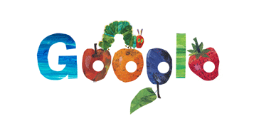
Google’s logo today for the first day of spring is also a tribute to one of my 2-year old’s favorite books, The Very Hungry Caterpillar by Eric Carle. Love it! (Apparently, it’s also the book’s 40th birthday. It wears its age very well.)
![]()
Love this new Museum of London logo, dissected over at Brand New. I don’t agree with his small bits of criticism at all – I love the type, the shapes, and the whole feel of it. The website, on the other hand, seems to dilute the vibrance of the logo by splashing those colors across the header and nav and such. But the logo, I love.

I’ve always been a fan of Google’s changing-yet-always-the-same logo. Here is today’s celebrating the first successful test run of the now completed Large Hadron Collider at CERN.
What’s your favorite Google logo?
![]()
Armin is digging this new HP logo, but I’m pretty baffled at why. The shading is anything but subtle, and the glowing orb and lighting on the HP seems logistically impossible. Wouldn’t the glow from the orb (can an orb glow from the inside?) reflect on the shiny HP? It’s cliche, easy, and about 10 years too late. Maybe if it were spinning, I might feel a bit different..
Friggin’ brilliant.

Love this logo
“Well considering Microsoft stole Windows from [Xerox], I can’t see [Microsoft] complaining Xerox stole a logo.”Commenter on Shortnews, referring to the similarity of Xerox’s new logo to the XBox logo.
For best results, apply liberally to logo and wait just a few seconds.

Bumpersticker in support of “Butterfly Children”.
Aside from promoting a great cause, I really like the design of this logo—the initials of the disorder combine with the remembrance ribbon to form a butterfly. The butterfly has come to symbolize epidermolysis bullosa because sufferers’ skin is “as delicate as a butterfly’s wing.” The skin tears easily and subsequently becomes infected, leading to frequent amputations, full-body swathing, and often premature death. The US Congress has declared this week a National Week of Awareness for this disease. The logo is displayed on bumperstickers, T-shirts, and other items promoting this event, all available online.
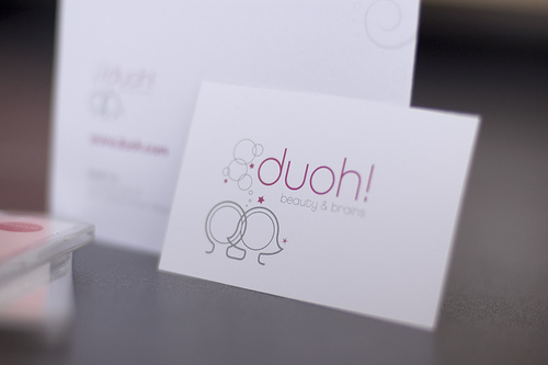
Wonderfully charming logo from Veerle Pieters for her Duoh! brand. Ok ok so I use those words too much. Seriously, check out a sweet writeup about the creative process behind this sugary new logo. When can I buy a Duoh! tshirt?