Annually alistapart has a web design survey which is jam-packed of interested data points about our industry. Their survey is built around the people, how they work, and how they learn. I enjoy reading it each year, but I’ve always wanted to know a little more about the technology behind it all. To that end, here is our first annual web developer survey. Each year we’ll solicit feedback from folks in and out of the NorthTemple community, then pool together the results and post them here.
As a thank you participating, we’ll randomlly send a few lucky readers some NorthTemple/FamilySearch swag.
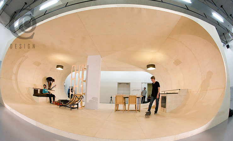
In a great example of practical living thru great design, the founder of Etnies shoes is building a dream house where every surface – even the furniture – is skateable or grindable.
“All designers should think of themselves as Ambassadors of good ideas.”
Love this quote from Scott Berkun’s 5 Dangerous Ideas for Designers presentation at the DMI’s “Make It Happen” event, citing either himself or someone he heard that day.
It’s not always about having the briliiant idea yourself—it’s about recognizing it, regardless of the source.
If you haven’t watched this, do it now. it is a great introduction to the lean movement. Designers should be clamming to build products under this approach. Here’s the abstract, which was clearly written by a publicist.
“The Lean Startup movement is taking hold in companies both new and established to help entrepreneurs and managers do one important thing: make better, faster business decisions. Vastly better, faster business decisions. Bringing principles from lean manufacturing and agile development to the process of innovation, the Lean Startup helps companies succeed in a business landscape riddled with risk.”
“Follow our rules, or get out and don’t come back until you can.”
Mark Hurst claims counterintuitively that this blog entry is “one of the most pro-customer experience posts I’ve seen in awhile.” He then makes a persuasive argument for one of the hardest but most important principles in design—your product probably can’t please everyone. Try to please everybody and you end up pleasing no one. Find your target and aim true.
Last week at FamilySearch, Eishay Smith came to talk to our org about Continuous Delivery. His company wealthfront.com, which manages a quarter of a billion dollars in an SEC regulated environment, pushes code from commit to production in less than 10 minutes, about 50 times a day. Full talk here. Imagine how this would impact your work, if you could test features against a subset of real users at this pace.
If that sounds good, we’re working on it. Come help us.
Former colleague August de los Reyes pointed me to a 1932 typography article by Beatrice Warde posted on Design History:
Imagine that you have before you a flagon of wine. You may choose your own favorite vintage for this imaginary demonstration, so that it be a deep shimmering crimson in color. You have two goblets before you. One is of solid gold, wrought in the most exquisite patterns. The other is of crystal-clear glass, thin as a bubble, and as transparent. Pour and drink; and according to your choice of goblet, I shall know whether or not you are a connoisseur of wine. For if you have no feelings about wine one way or the other, you will want the sensation of drinking the stuff out of a vessel that may have cost thousands of pounds; but if you are a member of that vanishing tribe, the amateurs of fine vintages, you will choose the crystal, because everything about it is calculated to reveal rather than to hide the beautiful thing which it was meant to contain.
Even a tee-totaling Mormon like myself can appreciate the point: the best design is invisible. Warde applied it to typography specifically, but the same applies to design in general. Often, our goal in design should be to get out of the way, so that people can consume the content or perform the task that they came for. I think too often we get caught up up in the decoration and adornment of our own particular golden goblets, and don’t pay enough attention to the content and tasks that are so central to the experience.
What do Al Jazeera, the US State Department, and the Church of Jesus Christ of Latter-day Saints all have in common? They were the three finalists nominated for “Best Live Video Event” by Brightcove!
“Good practice focuses on the process, while work focuses on the outcome. When doctors, musicians, and pilots are practicing, they are not doing the entire job. They are looking at the process of the work, often repeating the same step multiple times.”
I was a little skeptical about how I could truly “practice” user research techniques, but Spool’s article on Developing a UX Practice of Practicing actually had some great examples of that… Sounds fun! Now, can I make space in my schedule for this… ?
“People should get their information from the smallest number of sources that will keep them informed. Everything else in the universe—blogs, magazines, podcasts, Twitter streams, etc.—you just ignore, and you don’t feel guilty about it. You have to say “no” to the infinity of media sources out there while saying “yes” to a chosen few—very few.”
Looking forward to the free The Myths of Innovation webcast by Scott Berkun on June 9. Enjoyed an earlier version of this talk at UIE a year or two ago.
“I’m going to begin with a provocative claim: I believe CSS is one of the most difficult-to-master computer languages we have. … Simply put; it’s a styling language. A language for designers, not developers. Some of the most experienced programmers I’ve worked with struggle to comprehend CSS for this very reason.”
One of several common usability problems for iPad apps identified in usability testing by Jakob Nielsen in an interesting article on the current state of iPad usability.
There are many things I love about working for the LDS Church. Being able to walk through Temple Square on occasion is one of them. (That doesn’t happen as often since our department moved to Riverton, but I still get downtown now and then, and others can go more frequently.)
This photo was taken with my phone at the conclusion of a service project and team building day, spent helping to landscape the grounds adjacent to Temple Square. (That’s another thing I love about working here—the emphasis on service.)
Essential UX Layers—an interesting model from Jared Spool for tying together your vision, design principles, personas, scenarios, and user stories (or feature designs or use cases or whatever). He presents this as a way to help user experience design fit into an agile development world, but the layers would work well in traditional dev methods as well.
An important point that might be lost on some readers—many of the layers (all?) are rooted in user research; you don’t just make stuff up and expect to solve real problems for real people.
“Knowing that the name would be widely displayed and not just used as a login credential would prevent people from being stuck with unfortunate names like SuperStud on a professional site.”
Something that has been on my mind lately as we have been interviewing for interaction designers – there are a lot of designers out there, but not enough thinkers.
This article from Eric Karjaluoto @ smashLab is an exceptional read on what we should be trying to achieve with the title of “designer”.
The point I’m trying to make is that there’s a lot of opportunity for us—as thinkers—to provide great value to our clients. We won’t, however, do this if we continue to hold tightly on to the notion of designers being purely visual practitioners. I’ve said this before, and I’ll say it again: design is about facilitating outcomes, not selecting colors. Selection fromPut Down Your Crayons, April 11th, 2011, Eric Karjaluoto

.jpg)
