john dilworth archives
There are plenty of good reasons for making your text type small as long as you don’t compromise the readability and resolution. That said, I’d like to suggest that you make your small type just a little bit bigger.
Small, readable type is not bad
Designers are known for their love affair with tiny type, and there’s no doubt about it, when viewing a design as a whole, small text type can look better on screen than big type.
It appears to look better because a block of type at small sizes becomes texture instead of individual words. We don’t have to read textures, we just visually soak them in. This is important because words are pictures, and if you can control the texture of the type while maintaining readability, you can use type to aid communication on many different levels. This is known as “typographic color” and is a very important part of any design project.
There are many things you can do to make small type more readable. Adjust the contrast, increase the leading (line-height), give it a bit more word spacing, etc..
Small type (a bit bigger) is better
There are 3 important reasons to make your text type just a little-bit bigger, readability, resolution, and hierarchy.

Readability
You might be able to read tiny type, but there are people who can’t. I recently corrected my nearsightedness with lasik surgery and find that I prefer having the type just a bit bigger. I’m getting all too tired of using CMD+ to make the fonts bigger in Firefox. Spare your readers that extra effort — I can’t recall a time I’ve intentionally made the type smaller.
Resolution
The smaller you make your type, the fewer pixels you are using to make up the details of each character. The smaller you make your type, the less it looks like the type designer intended it to look. There are pixel fonts that help out here a bit, but in any case, the bitmap versions of these fonts are trying to imitate the true nature of the character, and they just can’t do it with out more pixels.
The difference between 12 and 10 pixel type is not just 2 pixels, the difference in resolution is 34 total pixels which equates to a 38% difference. That’s right, 10px type has potentially 38% less resolution than 12px type. Sure you can still make out the words, but you’ve eliminated all the subtleties of hundreds of years of typographic design elements that were put there to make things easier to read.
Typographic Hierarchy
This is probably the most overlooked reason for making your type bigger. If you’ve carefully designed your content’s typography and you’ve made it as small as you can while retaining readability and resolution, you should still make it bigger.
When designing for the web, especially for dynamic content, make sure you leave room for the addition of type that may need to be a little bit smaller.
Annotations, captions, credits, and footnotes all require typographic distinction. You may not want a caption to be exactly the same size as your body copy, and differentiating with color and typeface at small sizes may not produce the desired effect.
If readability, and resolution aren’t enough to convince you, don’t deny yourself the flexibility of being able to go just a bit smaller and still retain the integrity of your design.
posted by
john
on Wednesday, Dec 13, 2006
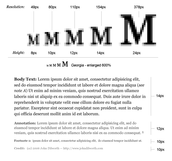
Make Your Small Type a Little Bit Bigger – this diagram shows the loss of resolution in small type, and the need to make your text type a little bit bigger in order to accommodate type that should be a little bit smaller.
posted by
john
on Wednesday, Dec 13, 2006
“People use a Dell. They are an Apple.”
Seth Godin writes about Brand as mythology
posted by
john
on Tuesday, Dec 12, 2006
When you break out the holiday decorations and start cutting paper snowflakes, use this one to impress all your friends.
posted by
john
on Tuesday, Dec 05, 2006
Take a moment to check out Adobe’s new color theme generator, Kuler. Very nice.
posted by
john
on Monday, Dec 04, 2006
The Type Trust has some great unique typefaces at reasonable prices. The quality and style of their fonts remind me a little bit of Emigre and T26.
Of special note: an upcoming typeface by one of the Type Trust designers.
posted by
john
on Friday, Dec 01, 2006
“They’re here to stay. They are verbatims. And yes, they’re REAL.”
Adverbatims
posted by
john
on Monday, Nov 20, 2006
For design inspiration Design Melt Down categorizes CSS web sites based on design style, color, and site type. A bit more deliberate than the run-of-the-mill CSS galleries.
posted by
john
on Wednesday, Nov 08, 2006
When using the basic question mark alone just doesn’t suffice, you can always throw one of these at the end of your sentence.
- (‽) the interrobang (&8253;)
- (.∼) the snark or sarcasm mark (.∼)
Basic Rules
When you need to add a little “umph” to a question, just end it with the interrobang&mdasha combination of the exclamation and question marks. The interrobang can also be substituted by using both the question mark and the exclamation mark. (!?)
The snark can be useful for signifying irony such as sarcasm.
Oh really?.~
posted by
john
on Monday, Nov 06, 2006
Check out pages from the Designer’s Survival Handbook (a special preview)
posted by
john
on Thursday, Nov 02, 2006
A brief description and usage rules for two typographic elements, the middle dot and the bullet.
- (·) the middle dot (·)
- (•) the bullet (•)
Basic Rules
The middle dot (·) or interpunct was used in ancient latin script before the usage of the space to represent word boundaries. The middle dot is also used in foreign languages (especially asian scripts) where word spacing is not used. While the character is not often used in English, it can be a useful typographic element. Try it as a divider in horizontal navigation instead of the vertical bar (|).
Bullets are used to introduce elements in a list. In most (if not all) cases, lists should follow HTML markup rules for unordered lists (<ul></ul>). The appearance of bullets should be stylized using CSS.
posted by
john
on Wednesday, Nov 01, 2006
“Appropriateness, Assistance, Connectedness, Convenience, Efficiency, Health, Intelligence, Personalization, Protection, Simplicity, Sustainability, and User creativity”
a list of 12 consumer values that drive technology related innovation – from a study by Social Technologies.
posted by
john
on Wednesday, Nov 01, 2006
With 2007 quickly on its way, remember that nothing says “I’m a designer” like having a Pentagram Typographical SuperSize Wall Calendar hanging behind your desk.
posted by
john
on Monday, Oct 30, 2006
Fractions such as: ½, ¼, ¾, and other math symbols should all be displayed properly using the appropriate HTML entity. While there is not an HTML solution for typesetting every possible fraction or mathematical equation, there are basic entities that cover the most commonly used fractions and math symbols.
- (½) one-half (½)
- (¼) one-fourth (¼)
- (¾) three-fourths (¾)
- (⁄) fraction slash (⁄)
- (×) times symbol (×)
- (÷) divide symbol (÷)
Basic Rules
If you must create fractions you should use the fraction slash (⁄) instead of the typical forward slash on the keyboard. Fractions could also be created by using a combination of <sup> and <sub> tags with the fraction slash, although there may be issues with line-height (some browsers seem to add line-height when the superscript and subscript tags are used).
Example: 1⁄14 (does not display properly on IE).
When displaying dimensions (such as screen resolutions) or multiplication statments the times symbol should be used and not the letter X.
Example: Use (1024×768) not (1024X768)
posted by
john
on Monday, Oct 30, 2006
·
1 comment
Skype 2.0 for Mac OSX now supports video along with free computer to land-line calls through 2006 (Seems to work out of the gate without configuration).
posted by
john
on Monday, Oct 30, 2006
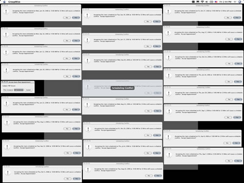
Groupwise on OSX (!?) – after selecting “accept all instances” button. (large version)
posted by
john
on Friday, Oct 27, 2006
The ellipsis is is used to indicate deleted or missing text. It is not to be confused with 3 periods.
- (…) the ellipsis (…)
Basic Rules
The ellipsis should be set using the HTML entity (…) and not substituted with three periods. If the ellipsis comes at the end of a sentence, it should be followed by the appropriate punctuation (….),(…,),(…?)and (…!).
The ellipsis (the 3 period version) is often used in email or chat to indicate that more text is to come. While useful and most often understood, this usage may not be appropriate in other applications.
posted by
john
on Thursday, Oct 26, 2006
·
0 comments
“the more generic the person for whom the designer is designing, the less likely the experience will be exciting, memorable or unique.”
Tom Guarriello in Experiencing Experience (UX Magazine)
posted by
john
on Thursday, Oct 26, 2006