design archives
“The six phases of a design project:
1. Enthusiasm
2. Disillusionment
3. Panic
4. Search for the guilty
5. Punishment of the innocent
6. Praise for the non-participants
”
on the wall of the Greater London Council Architects Department (via How Designers Think)
posted by
john
on Tuesday, Sep 05, 2006

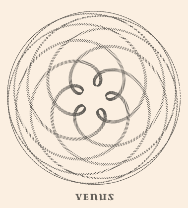
The orbit of Mercury around the Earth
posted by
john
on Thursday, Aug 31, 2006
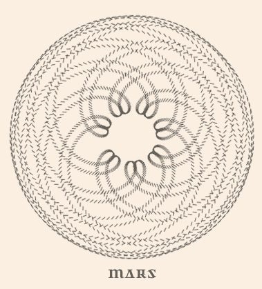
I recently ran across a diagram that showed the “orbit” of the planet Venus around the Earth. Sure, we all know that the planets go around the Sun, but for thousands of pre-Galileo years, the Earth was the center. It’s very simple to draw, explain, and show the orbit of the planets around the Sun, and we all understand the concept of heliocentricity without a problem. It’s simple, The Earth goes around the Sun, the planets go around the Sun, we’ve got it.
However, if you try to describe, or draw the orbit of the planets from a geocentric perspective, it can be quite difficult. There is a pattern, it does repeat, and it actually creates a nice design, but it is very complex to illustrate and explain.
So it goes with design, sometimes you need to change your perspective in order to visualize the solution in its most simple form. Sometimes you need to find ways to help your users change their perspective so that they can see the problem from your perspective. Sometimes your users are already visualizing the problem from the simplest perspective, and you change it, or redesign it to work from your perspective.
As designers it’s our job to visualize things from different perspectives, hunting down the simplest, and most elegant solution, and bringing that to our users.
posted by
john
on Thursday, Aug 31, 2006
“It is the spectrum, not the color, that makes color worth having, and it is the cycle, not the instant, that makes the day worth living.”
Unknown source, qtd by Richard Saul Wurman in Information Anxiety
posted by
ted
on Thursday, Aug 31, 2006
“If your words aren’t truthful, the finest optically letter-spaced typography won’t help. And if your images aren’t on point, making them dance in color in three dimensions won’t help…If you look after truth and goodness, beauty looks after herself.”
Edward Tufte
posted by
john
on Tuesday, Aug 29, 2006
“On Graphical Excellence— Graphical displays should induce the viewer to think about the substance rather than the methodology, graphic design, the technology of graphic production, or something else.”
Edward Tufte
posted by
ted
on Tuesday, Aug 29, 2006
Luke Wroblewski, in his latest column at uxmatters.com, Refining Data Tables, takes a look at several interface design solutions that enable users to find their way through large tables of data.
“Users often need to add, edit, delete, search for, and browse through lists of people, places, or things within Web applications. As a result, the design of tables plays a crucial role in such an application’s overall usefulness and usability. But just like the design of forms, there’s more than one way to design tabular data.”
posted by
randy
on Monday, Aug 28, 2006
Andrei Herasimchuk over at Design by Fire makes a simple request to John Warnock that would go a long ways towards improving the state of design on the web. Brilliant! I hope this goes somewhere.
posted by
tadd
on Monday, Aug 28, 2006
Dan Saffer from Adaptive Path writes about what it means to be an Interaction Designer and what it takes to become one. So You Want to Be an Interaction Designer 2006 is a great read for understanding what we are trying to do here.
posted by
john
on Monday, Aug 28, 2006
I don’t know if they still do this, but Microsoft used to hold an annual Design Day. The design community at Microsoft would come together for a day of talks, panels, food and fun.
The highlight, for me, was the Team Speed Design contest. Four teams of four designers each competed to show off their design skills. The teams came from different product groups around the company. It was held in an auditorium with a stage and some whiteboards. One by one each team would come in, receive the design problem, and be given 20 minutes to create and present a solution. The other teams were kept away from the auditorium so they wouldn’t see or hear anything until it was their turn. Each contestant wore a microphone and the entire process was carried out in front of a live audience.
After each performance a panel of judges gave critique on the design. Scores were awarded based on things like process, simplicity, and aesthetics. Finally, the winning team was announced.
This is an intense, challenging competition. Imagine compressing a design project into an utterly, ridiculous time frame and then being asked to allow a 100 people to watch and listen while you work. It was good fun, but there was a bit of team and personal pride involved. Teams would practice multiple times before the event. The teams came to win.
My favorite design problem was the parallel parking problem. Each team was asked to design a new system that would help drivers parallel park their cars. One team had three members who didn’t own cars. The hysterical moment was when the only team member who did have a car, pantomimed step by step for the others what its like to parallel park a car. As the “car” backed up, with her hands on the “wheel”, she slowly stepped backwards looking over her shoulder all the while talking the others through what she was doing. It was a “had-to-be-there” moment, but it was pure comic gold.
This week I’ve been taking in all the news on the self-parking Lexus. It has two parking modes: the “provide help for you” mode and the “do it for you” mode. I wish I could go back in time and compare the designs from that speed design contest to the shipping Lexus design. I wonder how close the Microsoft designers got with 20 minutes of work.
posted by
tadd
on Saturday, Aug 26, 2006
Yahoo’s brand is one to envy, in my opinion. They have really stepped up their design quality in just the past year. Tech.yahoo.com is a great example of that. And while Yahoo’s pages are still a little heavy content-wise, they look and feel good.
We also talk a lot here about how their different brand extensions – yahoo.com, tech.yahoo, finance.yahoo, and even yodel are all different but still pull in the recognizable Yahoo! brand in a way that retains the smaller brands of those sites but still is 100% Yahoo.
And, their sites are css-driven and tableless, tho with a total disregard for validation (yahoo.com has 200 errors!). Still, they certainly have the design edge over Google and Microsoft, at least for now.
posted by
jason
on Thursday, Aug 24, 2006
When I first got into software usability and design, I did it because I was tired of working as a technical writer, whose primary function was to describe how to work around software that didn’t work right. First as a usability engineer, now as an interaction designer, it’s become my job to prevent problems in the first place.
The more I do this kind of work, the more I realize it’s not just a business enterprise, it’s an ethical enterprise—not just to solve a business problem, but to “do no harm” along the way and ideally even to make using software a pleasurable experience.
When I worked at a software company in a previous job, I created a 99 second video collage of highlight clips from field studies and usability tests entitled “99 Seconds of User Pain” and showed it at an internal design event. It was a horrific barrage of puzzlement, expletives (tastefully edited of course), and even some tears and head-banging. The point was not to make fun of our users, but to show the depth of frustration we as a company were inflicting on them.
The video was a hit; the audience gasped and moaned and laughed at themselves—not at our poor users. People (even those working for large monolithic software companies) don’t generally want to hurt other people. They just don’t realize they are doing exactly that a lot of the time.
It’s our job as UX professionals to show developers the Golden Rule in action, and to keep them (and us) from breaking it. Not that users always know what they want—because they don’t. But they do know when they are in pain. It’s our ethical responsibility to relieve it, and even replace it with satisfaction or (heaven forbid) enjoyment.
posted by
ted
on Thursday, Aug 24, 2006
“A designer knows he has achieved perfection not when there is nothing left to add, but when there is nothing left
to take away.”
Antoine De Saint-Exupery, 1580
posted by
randy
on Wednesday, Aug 23, 2006

Designing from nature.
The simple elegance of a world untouched by human hands… a world complete in harmony with everything around it. The sounds of birds dodging trees, water wrestling rocks and the wind trying to knock off my hat.
Design with simple elegance!
posted by
rob
on Wednesday, Aug 23, 2006
In our jobs, working for the LDS Church, we work on projects that do not generate financial income. This is very different than the corporate world that I’m used to, but also a very good thing. The projects we work on do not generate income, but they do use financial resources of the Church, and the bar is set very high to use those resources in the most effective way possible. This environment requires an extra level of vigilance and “project soul searching” that may not happen (although it probably should) in the corporate world. In this quest for meaning, I’ve been bombarded with questions. The process of questioning doesn’t always get to the answer. In fact, if you’ve got all the answers, the chances are that you don’t really understand the problem. The purpose of questioning is to gain a better understanding of the problem, where your solution fits in, and what effect it will really have on your customers and end users.
- What am I doing?
- Why am I doing it?
- Who am I doing it for?
- Why do they need it?
- Is it really an issue for them, or is it for me?
- Is what I am doing useful?
- Is it necessary?
- Am I really hungry already?
- What is the Issue?
- Why is it an Issue?
- How important is the Issue?
- What would happen if I didn’t try to solve the issue?
- Are there other options for addressing the issue?
- Is there already a solution that addresses the issue?
- Has the existing solution been implemented?
- If so, why hasn’t that fixed the issue?
- What is this isn’t really the issue?
- Is there an issue bigger than the issue I think I’m trying to solve?
- Where am I going to go for lunch?
- Is there a smaller, more focused issue that I haven’t thought of that would be easier to solve?
- What is the proposed solution?
- Why is that a solution and not a new problem?
- What is the objective of that solution?
- Who is going to use that solution?
- Why are they going to use it?
- What is the solution going to change?
- How are you going to know that it will really change?
- How important is that solutions, really?
- Is that solution possible?
- Are you sure that it is not possible?
- How much money do I have for lunch?
- Do you have the resources (time, money) to implement the solution?
- Do you really want to implement the solution?
- Are there situations or circumstances where the solution won’t work like you expect it to?
- Are there other solutions that this new solution will replace?
- Are there new solutions that must be developed because of this solution?
- Is it lunch time yet?
Andy Rutledge makes some good points on this also in his article “Seek Understading, Not Answers”
posted by
john
on Wednesday, Aug 23, 2006