wade preston shearer archives
The Butterfly Circus by Joshua Weigel, Doorpost Film Project 2009 Short Film Contest grand prize winner.
posted by
wade
on Tuesday, Feb 02, 2010
“I used to think that, as a designer and a somewhat creative person, it was my calling to bring form to things I saw in my mind. In the creative act of making things, people would understand my thoughts and feelings through the work, in perfect translation. We would shape things with our hands based on notions of utility and delight, and provide them to others for repeated physical (and mental) consumption and use. If well-crafted, it would fulfill a clear human need.
“Now, I feel quite different. The act of form-giving is not a means to a clear end. Our senses continually map and remap in reaction to the elements that order our physical world, harmonizing those perceptions with the world we construct in our minds. Neither is more precise than the other, or ‘real’ in any standard sense of the word. Physical form and thought of form, messy, human interplay: yin and yang.”
From The Blind Man and the Cheeseburger, by David Sherwin
posted by
wade
on Wednesday, Jan 20, 2010
case study
In our quest to design simple, intuitive, and efficient things, we must be careful to not over-design. I have run into several examples recently where I believe the designer (or more often, the business employing them) is trying too hard—too hard to be everything, too hard to have too many options, too hard to up-sell, too hard to be original or innovative, too hard to be too simple—and has failed. A fine line is walked between questioning traditions and standards for irrelevance, age, or oversight, and respecting them for their tenure of existence. A delicate balance must be struck between production costs, competition, patents, marketing, aesthetics, work-flow, and usability. While we most often are not the one with the final say, I believe it’s a designer’s duty to satisfy a project’s many requirements simultaneously while diligently advocating usability—resisting and preventing the mistake of over-designing.
I am increasingly amazed at how often I find myself asking under my breath, “didn’t they try using this?” How did they get so far from their original idea? Why are these features in here? Why does it include the kitchen sink? Why are corporations so afraid that every service, department, and product has to be represented in everything? Why is the mantra less is more so easily forgotten?
Consider the Designing The Stop Sign video that appeared on YouTube several months ago. It humorously tells the story of a corporation charged with designing a stop sign, the agency attempting to complete the project, and the unfortunate result. “Welcome to corporate creativity,” the video’s producer says, “where groupthink and endless revisions help good ideas get executed.”
Thankfully it’s not that bad, right? Well, it’s really not that unrealistic. My point in discussing this video however isn’t simply to poke fun again at the corporate world or to bemoan the role of a designer. After we’re all done laughing (or crying), there is an important lesson to be learned.
You have a choice as a designer: are you going to make crap or are you going to build something great? Yes, I understand that most work as a graphic artist is commissioned and governed by your client, a board of directors, stock prices, an executives upcoming promotion, conversion rates, retention rates, and the current phase of the moon, but if you do not extend yourself beyond the process of production, you have sold yourself short and done a terrible disservice to your client, their customers, and yourself.
You are the advocate for the user. You must speak up. You must teach and train. You must question decisions and “requirements.” If you don’t, no one will. You must earn your client’s trust and help them understand the value in ensuring that something is not just usable, but useful. You must have skills and ideas. You need to be able to suggest alternatives and be able to back them up. Your opinion and training isn’t sufficient. There are tools to prove beyond a doubt what is and isn’t working. Suggest them. Implement them. Use them.
Consider the following three examples covering industrial design, interface design, and interaction design.
Washing Machine

Let’s look at my washing machine. What a mess! No, not the lint dust, the controls! How do you use this? How long does it take to decide what the options are and how much confidence will you have in the accuracy of your selection once it has been made? Why have they combined four options into two knobs? There’s plenty of space on the machine for additional dials. Would it really have increased the production costs for them to add two more knobs? Was it somehow easier for the electrical engineer to program and wire the circuitry with only two input devices? Why can’t there be one knob for wash temperature, one for rinse temperature, one for extra rise, and another for the end of cycle bell? Why does it have to be so hard to use such a simple device?
Well, it doesn’t have to be. They have simply over-designed it. Someone—could have even been a designer—probably thought “let’s keep this simple. It will look more elegant and refined if there are fewer controls.” There might have even been comments made about it being more approachable and less daunting if they kept it simple. Perhaps it really was easier to build this way. Perhaps it really made a difference in the production cost to combine functions like this. But is it worth it? I shake my head every time I put in a load of laundry wondering why it has to be so difficult to use. A control that makes a selection between three options or on and off should not require a key.
Ecommerce

Next, Amazon. Their current design has been in place for a while now and I still have trouble logging in. Look the header over. Do you have any idea where to log in? The words “sign in” are there, but they are not a button or a link. I understand that I can sign in to get personalized recommendations, but I’m not very interested in that (at least at the moment), I simply want to sign in. I’m not a new customer, so I see no point in clicking that link and I doubt attempting to access my cart or my lists will do much good until I have authenticated. “Your Account” seems like the best option but that still seems like something that will not yet be available. Why is there no “log in” or “sign in” link? Why have they made it so difficult to use their site? Don’t they want me to purchase their products?
Of course they do. They have simply over-designed it. The marketing department is trying to up-sell me on the latest promotion, the product department wants to ensure that I am aware of and using the latest-greatest feature, legal is terrified that the company’s latest patents aren’t listed prominently on the home page, and usability pushed down, back, and behind until it is nearly completely lost.
Interestingly, there are actually three links across the header of the site that take you to the log in form (and three more with a second step), but none of them communicate this to the user.
Blogging Software

Any active user of the open-source blogging software WordPress knows how wonderful the 2.7 upgrade was. After months of work by a team of volunteers, a completely new interface was released. A major effort behind the update was increasing usability and in many ways they succeeded. There are a few elements however that fail, such as the bulk editing and delete. These two options have unfortunately been hidden within a drop menu that is followed by an apply button. Using this software on a daily basis to publish for multiple online journals, I frustratingly admit that I have to search for how to delete every time I use it. Why is it buried in a menu? Especially if there are only two (usually one) options in the menu? Why is the action titled “apply?” Why does something so simple have to be so complicated? Do they want to discourage bulk actions?
No, I don’t think so. They have simple over-designed it. Although, in this case I it might be better named as under-designed. Their table pattern has obviously received a lot of attention. They have implemented great features such as filtering and not cluttering the view with individual record controls until you hover over them with the mouse. I’m sure the choice of control for the build actions was selected because it matched the filter, but this was a mistake. One size does not fit all. Uniformity does not always result in success. Why are the bulk actions and the filter crammed so close together such that it is nearly impossible to distinguish one from the other? If each instance of the data table pattern only provides one or two bulk actions then why can’t they simply be represented by individual icons, links, or buttons?
Conclusion
In the end, I encourage you to think. Don’t take the easy way out. Don’t cut and paste. Just because a pattern worked in application A doesn’t mean that it will work in application B. Work tirelessly to promote usability and simple, effective design. Fight over-design with every resource you have and utilize technologies for testing and tracking user behavior and auto-optimizing interfaces. Encourage your clients to question and review their requirements and ensure that they have not strayed from their original goal. An application or tool that does one thing really well is much, much better than one that fails at hundred things.
posted by
wade
on Monday, Jun 29, 2009
Adobe released an optional plug-in for Photoshop today that disables the multi-touch zoom and rotate features introduced with the new CS4 and unibody MacBook combination. While I find many of the new multi-touch gestures quite handy, I agree with John Nack that “on the latest systems (with the enormous trackpads), it can be too easy to zoom or rotate accidentally.” The most frustrating part though is there is no way to reorient the image back to zero degrees once you have rotated it. I am surprised that such an oversight made it to production. Honestly, if the rest of the Photoshop user-base rotate images as infrequently as I do, I feel safe in my assumption that the implementation of this feature was motivated more by marketing than research.
posted by
wade
on Wednesday, Feb 25, 2009
Refresh this page. Now do it again and this time note the moment that fifty-percent of the page is loaded. Got it? Do you know when it was? What about speed? Can you give me an idea how fast the page is loading? What if you were on a slow connection like the wifi I use on the bus to commute to work? Would you know if the page was loading fast or slow? Would you have an idea of how long you were going to have to wait? Should you switch to another tab and continue reading the news because it’s going to be a while?
If you were using Safari, you’d have an answer for me; other browsers leave you in the dark.
Well, at least that’s how it used to be (save Safari Mobile). Safari 4 Beta was released this morning and with it came a gaggle of exciting new features (including a Web Inspector and Console that can now hang with Firefox’s Firebug plugin). Unfortunately, Apple also removed one of Safari’s greatest features.
While the standard loading indicator for web browsers is a spinning icon, the great minds that designed Safari’s interface decided to innovate and instead take advantage of the functionless (after you have entered a URL and struck the return) address bar and animated a progress meter behind the text. Instead of a nearly useless icon that communicates little more than that the browser is running, Safari’s indicator simply and effectively let’s you know both how much has loaded and how fast it’s loading.

With Safari 3, the browser’s state is clear. With the requested site’s title prefixed by the word “Loading” at the top of the browser and the progress meter status indicator, the state of the browser and the action taking place is immediately obvious to the user. Even viewing this static screenshot, having not physically interacted with the browser and requested the page yourself, you are able to quickly and accurately discern this.

The state of Safari 4 Beta on the other hand is a mystery. I have requested northtemple.com but the browser still displays the title of the previous site. The only indicator that the new site is loading is the small animated “spinner” on the right side of the address bar. Both versions of Safari display the requested URL prefixed by the word “loading” in the Status Bar in the footer, but most users do not have this bar turned on.
Here’s to hoping that it’s absence is just an oversight in the beta.
posted by
wade
on Tuesday, Feb 24, 2009
case study
During some recent testing, we discovered that two of the most critical icons in our application failed for color-impaired users. My current project is an accounting application which contains many screens that utilize a common pattern for adding and removing. This pattern makes use of individual icons for each action. The icon for add is a plus symbol set within a green circle and the icon for remove is an “x” set within a red circle.
To the majority of users there is enough contrast between the symbols and the color for the user to distinguish between the two icons and to use them confidently and accurately. For a color-impaired user, however, this is a much more difficult task.
Color blindness is categorized into three main categories: deuteranopia, protanopia, and tritanopia. The first is common, affecting eight percent of males. The second is rare and the third is very rare. The first two are similar in that they drop out red leaving the user with a color spectrum that only includes yellows, browns, and blues. Bad news for our icons and quite unfortunate since red and green and internationally know for go/safe and stop/bad. In regards to our icons, color is out, leaving these users only the symbol to distinguish between the icons. And, with the same symbol used for both, only rotated forty-five degrees, they aren’t left with much.

Our solution was to change the shape of the “remove” icon to a box. With a third characteristic, the color-impaired users are now left with two characteristics instead of just one. The contrast between the square and the circle is also much more distinct than the plus sign within them as well. Here is how they turned out:

In hindsight, I’m not sure why we didn’t set the “remove” icon in a separate shape to begin with as it is such an usability improvement even for normal users.
While we did have a few color blind users to validate our designs, I’d like to mention an excellent free utility that we use to test our prototypes called Color Oracle. It is built by Bernhard Jenny at the Institute of Cartography in Zurich. It allows you to alter your computer’s color display for the entire system such that you see it in the way that a color bind user would. It has settings for each of the three main categories and allows you to toggle between them and back to normal by means of a single click in a menu added to the menu bar.
posted by
wade
on Saturday, Feb 07, 2009
case study
In interaction design, we talk a lot about user testing. After we have put together some rough prototypes, we like to put them in front of our users, give them some scenarios, and observe them attempt to perform some predetermined tasks. Something that I think is often overlooked however is observing the user using their current system. Most of the time the applications that we are designing are replacing current systems—even if the “system” isn’t a software application and it is paramount that we understand it.
I had the opportunity to spend a few hours with Nic observing some of the employees from the Finance and Records Department yesterday using a system that manages check disbursements. Several times while we were there I thought about how much we were learning and how grateful I was for the opportunity to be there, but then stopped as I came to the word opportunity. Understanding the user’s needs and workflow should not be a luxury. How are we supposed to design an application that improves upon their current system if we don’t understand the current system?
Especially, I want to point out the user’s workflow and pain points. Just understanding what the current system does is not enough. We need to know how the user users the system. How does the way that user A uses the system compare or contrast from the way that user B uses the system? What are their frustrations? What is the number one thing that they would change if they were a programmer and could alter the app? What steps (mechanical or mental) do they take to get through each of the process that they perform regularly?
We must observe their environment and how they interact with the software physically. This step is overlooked a lot in the pre-design user testing since we are so focused on defining functional requirements. What equipment does the user have? Where do they sit? What equipment other than their computer is required to complete their tasks? What fine motor skills are required? How does this task fit into the rest of the tasks that they are required to perform?
Interaction design involve more than how the user users the software. The system is greater than the software. We must be efficiency engineers. The design solution must take into consideration the user’s environment. Our job is greater than making using the application an efficient and pleasant experience; we have succeeded if we have improved their entire workflow.
posted by
wade
on Saturday, Feb 07, 2009
case study
Stumped? Have a question that you are trying to answer? Trying to solve a tough design challenge? Well, quit trying to do it yourself! I know; it’s hard. Most of us are independent and head-strong. We’re opinionated and over-confident. We’re artists.
I’ve learned something important recently and it’s to get over it. I don’t have all of the skills or strength necessary, and I can’t do it alone. I need my wife, I need my friends, I need my colleagues, and most of all, I need Jesus Christ. Where are you sitting right now? What’s in your studio? What are you listening to? Tired of wasting time? Tired of struggling without progress? You need to “search diligently in the light of Christ.”
It’s true, dealing with clients, selecting the right hue, or debugging a javascript error isn’t really choosing between “good and evil,” but I believe Moroni’s counsel can apply to all aspects of our lives where we are searching for good. He teaches that the “Spirit of Christ is given to every man, that he may know good from evil” and if we know how to judge and do it within the light of Christ, we will find the answer. No, God doesn’t directly care if you make the button red or orange, but he does care about you and your success. He does care about your project and if your business is working and that requires a happy client.
Your environment makes a big difference. Make sure you are standing in holy places. Don’t offend it with your entertainment, decorations, or conversation. “A bitter fountain cannot bring forth good water.” Truth can only be found amidst that which “inviteth to do good, and to persuade to believe in Christ.” What magazines are you reading? Where are you meeting your client for lunch? You are not strong enough to look across the room at the world and to not have it influence you’re decisions, your emotions, and your creativity.
Close your eyes. Pray for the Spirit to be with you. Listen. Concentrate.
You will find your answer. You will find the strength you need. But you won’t do it alone.
posted by
wade
on Sunday, Jan 11, 2009

Emtype, a small foundry in Barcelona hosuing the solo designer Eduardo Manso, has released a new font family entitle Geogrotesque and it is gorgeous. I try to reserve that word for only the truly beautiful but believe that this example deserves such praise.
From the press release: “Although the type family has a geometric or ‘technological’ construction, the rounded finish provides it a warm appearance, making the typefaces nicer and nearby. Geogrotesque has been conceived to be used as a display typeface in publications or intermediate length texts, most of all the Thin and Ultralight weights which were meant to be used in big sizes.”
posted by
wade
on Friday, Dec 05, 2008
“Designers need to stop thinking that they’re creating experiences. They’re allowing them to unfold with sound design decisions.”
Bryan Zmijewski on why user experience design does not exist. I think he is spot on. We do not create experience, we design applications that allow experiences to happen. We are interaction designers. Just semantics? I don’t think so. It’s important to remember that the user isn’t a marionette.
posted by
wade
on Thursday, Dec 04, 2008
“Perfect is the enemy of good enough. When your product or service is good enough, get it out, because cash flows when you start shipping. Besides, unwanted features, not perfection, come with more time. By shipping, youll also learn what your customers truly want you to fix. It’s definitely a trade-off your reputation versus cash flow so you can’t ship pure crap. But you can’t wait for perfection either.”
Even though we don’t sell our product, I found the third step in Guy Kawasaki’s article The Art of Bootstrapping timely as we work to employ a more agile approach to software development.
posted by
wade
on Friday, Nov 28, 2008

This beautiful combination of musical notation and typography comes from a poster advertising an art expo opening today in Stockholm, titled The Art of Music.
From the curator: The Art of Music reflects upon the profound influence that music has on art and simultaneously art has on music and recognises their common creative approach. The leading idea of the show emphasises the fact that artists tastes in music are always strongly related to their work. Each artist has been asked to design the poster for the concert of his or her dream, including the line-up of choice and in any venue imaginable whether existing or not.
posted by
wade
on Friday, Nov 28, 2008

Gmail is now skinnable. It hasn’t been rolled out to GAFMD accounts yet, but looks like it’s available to all standard users. Most of the themes are actually pretty nice; although I won’t see them much as I rarely use a web-client for email. For when I do though, these are some nice new options. The best change is simply how they tightened up the interface. They don’t provide the option of creating your own yet. I wish the themes persisted across the other apps (calendar, docs, etc).
posted by
wade
on Thursday, Nov 20, 2008
case study
Visiting with Rob a few days ago about our role as experience architects, he mentioned that we are creators and that our work is to lead people.
My first thoughts when he said those words were about Heavenly Father: how He is the Master Creator and how His entire work is centered around leading people. As our Father, he is the ultimate architect, crafting experiences—such as our lives on this Earth—to lead us and to guide us so that we may become like Him and return Home to live with Him again. I then thought of His Son, Jesus Christ, and how He completed the largest and most significant design project in the history of this world when he lead and orchestrated it’s creation.
What an honorable field to be in! What a noble job! What a luxury to have such role models to look up to occupationally! These thoughts struck me and have lingered in my mind since then, including thoughts of what I can learn from Their example and specifically how I can apply them to my current projects. This morning, I took the opportunity to review the story of the creation to see what more I could learn. Below are some verses that I stopped on and thoughts that accompanied them.
“In the beginning God created the Heaven and the Earth. (Genesis 1:1)”
Organization. The Hebrew word that “created” it is translated from means to organize. It describes shaping, fashioning, and forming as a divine activity. Can the work that we do be spiritual even if it’s an application interface displaying financial records? Absolutely; in fact, it should be. We should be seeking the guidance of the Spirit in everything we do. Creation is a process of collecting the best materials, utilizing the best knowledge, collaborating and corroborating with experts and peers, and then meticulously crafting something wonderful and new.
“…and God saw that it was good. (Genesis 1:10)”
Quality. I don’t believe that this means that He looked down in surprise and thought “nice… that turned out well.” No, He understood that His work was important, that it will affect many people, and that it needed to be right. His work included ensuring not just that it was done, but that it was done correctly; he “watched those things which they had ordered until they obeyed. (Abraham 4:18)”
“And God blessed them, and God said unto them, be fruitful, and multiply, and replenish the earth, and subdue it: and have dominion over [my creations]. (Genesis 1:28)“
User-centered. God constructed His work such that it empowered those that would use it. It was for them and therefore it was constructed in a manner that was usable and useful to them. It contained the features that they needed to accomplish their tasks and in a way that would be pleasant to do so.
“And on the seventh day God ended his work which he had made and he rested on the seventh day from all his work which he had made. (Genesis 2:2“
Reflection. We have been commanded to honor the Sabbath, but why? The most important reason is to take at least one day out of our week to actively worship Him who gave us life, but there is much more to this seven day pattern. We must not run faster than we have strength; physically, emotionally, or creatively. We must take time to meditate and to reflect upon our work.
“And the Gods prepared […and then…] came down and formed these generations […] according to all that which they had said… (Abraham 4:21; 5:4-5)”
Preparation. Stringing that quote across three verses is a stretch I know, but the pattern is there. They prepared and planned before they executed. The words prepare and organize are used fourteen times in chapter four. They didn’t rush into their work and didn’t produce something on a whim. Designing for experience requires much more methodical processes. You must architect, design, and scope. How do you expect your product to be a success without first defining what it is supposed to be and the steps required to complete it?
posted by
wade
on Sunday, Nov 02, 2008
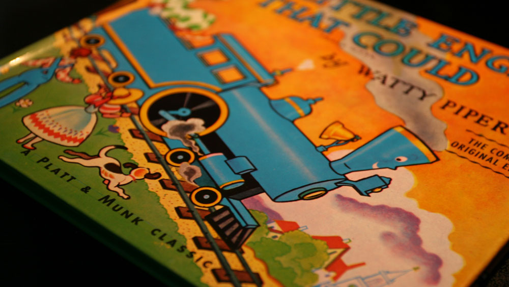
Reading stories to my kids this morning, I was impressed by the hand-drawn type on the cover of The Little Engine That Could and found it interesting that you can still see the rules the artist drew to guide his baseline and x-height. It’s interesting how typography has been both blessed and injured by advancements in technology. Even the best designers among us get lazy and let the computer do too much. Here’s a casual reminder for you this morning to not forget that it’s just a tool and that it’s still up to you to make sure that your type is set perfectly. An example of this is the introductory line in the book that our team is currently reading. I was shocked to see that the last word was hyphenated. It looked horrible. It’s sad that the publisher let that go to print.
posted by
wade
on Sunday, Nov 02, 2008
“In the era of the Numerati, designers may have to trade
the glory of fashioning great monuments of design
for the pursuit of a fulfilling creative process.”
Dmitri Siegel with Design Observer, discussing Stephen Baker’s new book The Numerati.
posted by
wade
on Wednesday, Oct 22, 2008

What I really meant by “an application or tool that does one thing really well is much, much better than one that fails at hundred things” was “an application or tool that does one thing really well is much, much better than one that does hundred things mediocre.”
John Gruber said that same thing in today’s article about mobile phone keyboards:
“Apple tries to make things that many people love, not things that all people like.”
posted by wade on Tuesday, Jul 07, 2009