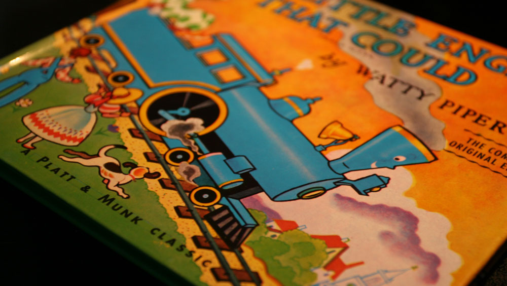
Reading stories to my kids this morning, I was impressed by the hand-drawn type on the cover of The Little Engine That Could and found it interesting that you can still see the rules the artist drew to guide his baseline and x-height. It’s interesting how typography has been both blessed and injured by advancements in technology. Even the best designers among us get lazy and let the computer do too much. Here’s a casual reminder for you this morning to not forget that it’s just a tool and that it’s still up to you to make sure that your type is set perfectly. An example of this is the introductory line in the book that our team is currently reading. I was shocked to see that the last word was hyphenated. It looked horrible. It’s sad that the publisher let that go to print.