article archives
Among the many bars and meetups at SXSW 2007, the North Temple team invites to you break rank and enjoy a uniquely different kind of gathering. On Saturday, March 10, several members of our team will offer a behind-the-scenes look into interaction design at the Church of Jesus Christ of Latter-day Saints. Come and learn what it takes to manage the many websites and applications of a organization with more than 12 million members, and share experiences from your organization.
What: North Temple Meetup @ SXSW
Who: Designers, developers, and managers
When: Saturday, March 10 @ 7:00pm
Where: Hilton Garden Inn (formerly Capitol Place), 500 I-35 N, Downtown Austin (directions)
No suits, no ties. Admission is free, and our soda & dessert refreshments might be the most sober “bar” you’ll encounter this year at SXSW. See you there!
(Please RSVP at Upcoming.org)
posted by
cameron
on Monday, Feb 26, 2007
Nice video capturing some of the progression of the web to the Web 2.0 point at which we find ourselves. Presented by Information Aesthetics (infosthetics.com).
“A (infographical?) movie, constrained to just text & pictures, explaining Web 2.0 & how it effects affects global society.”
Take a look here: web2.0 in 5 minutes
(via Steven)
posted by
randy
on Tuesday, Feb 06, 2007
A few days ago I posted about Ta-Da List, noting how friendly the sign-up experience was. Connor Boyack of sustaind pointed me to another online to-do list with a really friendly sign-up and a catchy name: Remember the Milk. Like Ta-Da List, it had a short, friendly sign-up, with some nice real-time validation features that let you know as soon as you typed whether your username was available, whether your password was valid, etc. But once I got into it, I could see that the makers of Remember the Milk had run smack into the classic dilemma: “Do I make it drop-dead easy, or do I include all the features many users want?”
While both are nice products, Ta-Da List and Remember the Milk seem to have taken different approaches to this basic question.
Ta-Da list is minimal-list (pun intended). You create a list. You add items. You move items around. You share. You check things off. And that’s really about it. I appreciated the clean UI, the no-frills approach. Until I found a “frill” that I really wanted.
Two frills in fact:
- Let me prioritize, please! Yes, I can change the order, but it takes extra clicks and the priority is not explicit. Call me a Franklin Covey groupie, but I like my A, B, C’s and my 1, 2, 3’s.
- Let me access my list anywhere, please! One thing I was hoping I would gain from an online to-do list was the ability to access the list from multiple computers, including my beloved Blackberry. Sorry, can’t see how to do that with Ta-Da list. It is not mobile-friendly, which is interesting given the fact that it has a pretty narrow feature set to support.
So I was grumbling about Ta-Da list as I tried to prioritize my tasks while sitting on the bus with my Blackberry.
Now along comes Connor’s note about Remember the Milk. The first two things I check for? Prioritization and mobile access. And lo and behold, it’s there! But so is a lot of other stuff—Groups, Contacts, Tags, Due Dates, details when you hover over a task, etc. And frankly a UI that’s pretty good, but not great. And certainly nowhere near as clean as Ta-Da List.
The Designer in me wants to say, “Use Ta-Da List on principle. Support the reduction of Design Pollution!”
But the User in me wants to say, “If it doesn’t have the features I need, what use is it? Users of the World Unite!”
37Signals would probably say, “That’s fine if our product is not for you. We’re building something simple for people who just need what we’ve provided (and who hopefully will want to upgrade to backpack).”
Time will tell. I’m probably going to go with my User and see if Remember the Milk does it for me. But if Ta-Da List ever offers those two features, I will be back in a heartbeat.
posted by
ted
on Tuesday, Jan 30, 2007
If you haven’t already checked out 37signals’ Ta Da List, you should. Most of the buzz I’ve heard is about the simple, no-nonsense interface of the list itself. Maybe so—I haven’t played with it much yet. But what impressed me was how easy and truly friendly the sign-up UI was.
The form is conversational without being silly, and doesn’t worry about breaking grammar conventions to do so. For example, we have some incomplete sentences (“And enter that password again”). Some of the field labels are questions (“What’s your full name?”), while others are commands (“Choose a username”). The use of contractions also helps convey a less formal tone.
In a short time, you’re ready to hit the Create Account button, after having had a friendly little conversation with a helpful form. In that short time, you’ve already started to get a feeling you’re going to like this app…
First impressions like that are priceless.
posted by
ted
on Friday, Jan 26, 2007
Cameron linked over to D. “CMYK” Keith’s recent article on Tips for a better design review process, a topic on which I’ve been collecting thoughts to discuss here. The act of presenting, explaining, and defending your designs before stakeholders and customers should be a skill to be mastered by every great designer.
Design is communication. It requires it. Great designers should be excellent communicators, whether that be visual, oral, or written. Designers should dress well and accurately communicate with their personal presentation (which is our answer to Jason Fried’s question about suits). Designers’ homes and offices are often well designed and organized (tho painting kitchens Orange Toffee is questionable, Paul). The language and verbal presentation of a designer should also be refined and should communicate their message in a way that can be understood by that specific audience.
And the ability to stand in front of two or several dozen stakeholders and defend your design is one that is required anywhere design is critical (really anywhere you’re being paid for your design).
I recently experienced this in one of our biweekly prototype reviews, where new designs are presented and approved. Our designers are business analysts, visual designers, interaction designers, user researchers, information architects, and in this case, orators. I presented a section of the web application to a room of 20 or so top-level executives in one of the Church’s departments, and was tasked with explaining my design choices, defending those decisions, and mediating a roomful of helpful and not-so-helpful suggestions (sometimes from managers with little or no experience in that specific field).
Keith outlines good tips to becoming an excellent defender of design, and I’ll apply a couple of them to our work here:
- Know Your Stakeholders: This is key. Figure out who is in charge and who has been empowered to make decisions for the application or site. These few will have the ultimate say on increasing scope or for specific direction.
- Make Considered Design Decisions: I learned quickly working here that every design must be fully considered and have rationality. Be able to explain your work, and when you’re in the design process, imagine explaining it to 20 execs. This will also come in handy when your trusty developer comes to you with a “better” way to design that form control.
- Set Expectations / Ask For Specific Feedback: It is key with our group of stakeholders to continually explain the idea of prototypes, and to ask for and welcome feedback of all types. We’ve had a lot of success with this iterative design process of creating and approving prototypes before the work is programmed, and these reviews are key to that success.
- Be Prepared For The Phantom Stakeholder: I actually enjoy the stakeholder who comes into the room knowing nothing about the application or section. This keeps me on my toes and helps to see the app from an outsider’s point of view. Welcome these opportunities to defend even the most basic aspect of your design.
And I’ll add one more to this list:
- Lead the horse to the water, but don’t drown him: Robbie “Balboa” Thomas taught me this a few weeks ago, and I’m sure I’ll write more on the subject later. We should make the horse want to drink so badly that he’s running down to the watering hole himself, salivating at the very thought of the water. Great designers know what direction the design should go. Stakeholders don’t always have that same vision. Instead of forcing that direction upon them and drowning the horse in the lake, communicate in a way that the customer wants that direction so badly that they’re begging you for it. You get bonus points if the horse walks away from the hole thinking it was their idea to drink.
Design reviews are a must! They will strengthen your design and give you the critical feedback to make your work truly useful and impactful. What’s more is you’ll gain a confidence in your work that is impossible to gain elsewhere. Welcome and embrace these chances to elicit feedback and use them as reasons to make sure every design decision is completely bulletproof.
With these tips in mind, head into your next review prepared to communicate. Your design, your hours of hard work, require it.
posted by
jason
on Tuesday, Jan 23, 2007
We’re holding another LDS TechTalk this week, this time in Provo, UT. Here’s the info:
- Tuesday, Jan 23rd, 6:30 PM
- Stake Center at 1021 S 500 W in Provo
- Topics include: CIO Keynote, Interaction Design, LDS Tech Community, Development & QA, and more.
- You can attend up to 3 different 30 minute presentations of your choosing.
I had a great time presenting last week in Salt Lake and I’m honestly really looking forward to doing it again. If you’re into Design and the LDS Church and would like to learn more about how our team works, my talk is for you.
Have fun!
Map to the Stake Center
posted by
tadd
on Monday, Jan 22, 2007
I got a funny request today, one that illustrates how cool our software development process is. The Lead QA on my project (let’s call him Blackbeard) asked me to put a watermark on my prototypes so he can tell at a glance that he’s looking at my prototype and not the actual working software. With multiple tabs open, it’s hard to tell which is which. And that is precisely the point! So I’m adding a watermark.

We’ve also been asked recently to put real data into the prototype to aid in the user feedback loop. My fear is without the tell-tale fake data we put in, our users might run into the same problem!
Our process we’ve developed here at the Church has the Interaction Designer working out all aspects of the user interface and feature set in a high fidelity (XHTML/CSS) prototype before the developers ever see it. This way, stakeholders and users can see what they’re actually going to get, not some bloated bullet list of hard-to-understand functions and use cases.
We then sit and work closely with the developers and QA to make sure what we’ve promised visually is being fulfilled in the working software.
The downside, it seems, is when the actual app is too close to the prototype and everyone gets confused.
posted by
jason
on Monday, Jan 22, 2007
This Thursday night our department is putting on a TechTalk.
Date: Thursday, Jan 18th
Time: 6:30PM – 8:00PM
Place: Joseph Smith Memorial Building
50 South Temple, Salt Lake City
The goal of the TechTalk is two-fold: to share information about what’s going on in our department and to get to know the LDS Tech community better. If you’re into tech and the Church, you are the target audience for this. Our CIO, Joel Dehlin, will be presenting as will several of the Directors.
I’ll be presenting on Interaction Design. I plan to cover the following topics:
- Our Interaction Design team, its purpose, its role
- Our use of rapid, iterative, high-fidelity prototyping
- Our use of web standard HTML and CSS
- How we work with dev and qa teams
- and lots of Q&A
If you’re into design and how it gets done in a large organization, my talk is for you. If you’re in the Salt Lake area Thursday night, drop on by and say hi. I’ll be one of the big chubby white guys up front. I hope you can make it.
Also, we’re holding a repeat of the event next Tuesday evening in Utah Valley for the southerners who’d like to avoid the drive. I’ll post more details on that soon. We’re also planning to do more of these outside of Utah. I’ll announce those plans when they settle.
posted by
tadd
on Tuesday, Jan 16, 2007
Lessons in interaction design can come from the most unlikely sources—your four year old daughter who has just lost a tooth, for example.
She had been wiggling her first loose tooth for a few days, and it finally came out last night. When telling my wife what she expected under her pillow in return for her tooth, she said in fine alliterative fashion, “I want dollars and diamonds. Cause I’m a girl.” The interaction design lesson? Know your audience and what they want and expect.
The tooth fairy, however, apparently has budget constraints. Supply of lost teeth is high and constantly being replenished, while demand for spare organically grown teeth is quite low. So the tooth fairy did not in fact deliver diamonds nor dollars last night, but rather two shiny quarters. What do we learn for interaction design? Customer requirements must be weighed against budget and timeline; quality design is just one of the elements of a successful project.
Finally, though she did not get what she explicitly asked for, my daughter was thrilled with her silvery coins. You see, “diamonds and dollars” were probably just the words she used to convey her desire for “something shiny and spendable”. Those weren’t her words, but it’s what she meant by them. The interaction design lesson: Customers do not always know what they need, or even what they mean by what they say. It’s our job to take requirements, clarify them, push back to the simplest design that meets those requirements—not to play the Yes-Man to our client.
Thank you, Tooth Fairy, and we’ll see you again soon.
(More design insights from the next visit of the Tooth Fairy…)
posted by
ted
on Wednesday, Jan 03, 2007
Earlier today I had the pleasure of leading a user acceptance test of our facilities application. We work with users constantly, but this is the first time I put this work in front of a room full of people who had never used my application. The result? They loved it! Our long hours of research and iterative prototyping paid off big time as we observed smiles and nodding heads all around (in agreement, not yawns).
As I walked the room observing these people using our application, I began to see even more real-life situations where the app will improve their daily work. This is an app that will help manage the many properties and facilities of our Church, and thousands of people around the world will be affected by these little pixels I sweat over every day.
I realized again that as designers we have the unique ability to improve the lives of our users. Especially designing applications, the designer is in a position to help the user work better, faster, and more efficiently. Even the slightest design element can add or subtract seconds or minutes from the user’s tasks, resulting in more or less productivity – a fact brought home again today seeing how these real people were using my work.
One specific set of screens will be used hundreds of times by each user over a few weeks of the year. If I can save that user one minute with a better design, he will save 100 minutes that year. There are several dozen users in his position, so that one design can save several days of time.
Another more dramatic example is seen in another of our screens, designed to aid in the scanning of millions of paper documents. Each of the millions of documents has to be tagged and logged into the system prior to being scanned en masse. If my screen can shave off one second for every million documents tagged, I will have saved them 2778 hours of work.
That’s 347 work days, almost a year and a half of work.
Of course, the validity of that data can be questioned, as there are humans involved and those things can never be truly estimated.
But the point is valid. Imagine the amount of time saved or lost by design decisions made in mega-applications like Microsoft Word or Gmail. Balance that against the time saved by having word processors and email in the first place. Interesting thinking.
So take a few extra minutes the next time you’re designing an application that will be used every day. Try to shave off a second or two. The result of your few moments of thought could mean years to your users.
posted by
jason
on Wednesday, Dec 20, 2006
I learn something new every day. You can force a page break in your printouts with CSS by using the page-break-before and page-break-after properties.
These are supported by all modern browsers (including Safari although not listed above) so can be freely used to get better control over the printed versions of your pages.
posted by
aaron
on Thursday, Dec 14, 2006
There are plenty of good reasons for making your text type small as long as you don’t compromise the readability and resolution. That said, I’d like to suggest that you make your small type just a little bit bigger.
Small, readable type is not bad
Designers are known for their love affair with tiny type, and there’s no doubt about it, when viewing a design as a whole, small text type can look better on screen than big type.
It appears to look better because a block of type at small sizes becomes texture instead of individual words. We don’t have to read textures, we just visually soak them in. This is important because words are pictures, and if you can control the texture of the type while maintaining readability, you can use type to aid communication on many different levels. This is known as “typographic color” and is a very important part of any design project.
There are many things you can do to make small type more readable. Adjust the contrast, increase the leading (line-height), give it a bit more word spacing, etc..
Small type (a bit bigger) is better
There are 3 important reasons to make your text type just a little-bit bigger, readability, resolution, and hierarchy.
Readability
You might be able to read tiny type, but there are people who can’t. I recently corrected my nearsightedness with lasik surgery and find that I prefer having the type just a bit bigger. I’m getting all too tired of using CMD+ to make the fonts bigger in Firefox. Spare your readers that extra effort — I can’t recall a time I’ve intentionally made the type smaller.
Resolution
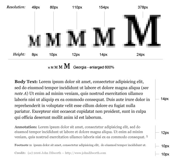
The smaller you make your type, the fewer pixels you are using to make up the details of each character. The smaller you make your type, the less it looks like the type designer intended it to look. There are pixel fonts that help out here a bit, but in any case, the bitmap versions of these fonts are trying to imitate the true nature of the character, and they just can’t do it with out more pixels.
The difference between 12 and 10 pixel type is not just 2 pixels, the difference in resolution is 34 total pixels which equates to a 38% difference. That’s right, 10px type has potentially 38% less resolution than 12px type. Sure you can still make out the words, but you’ve eliminated all the subtleties of hundreds of years of typographic design elements that were put there to make things easier to read.
Typographic Hierarchy
This is probably the most overlooked reason for making your type bigger. If you’ve carefully designed your content’s typography and you’ve made it as small as you can while retaining readability and resolution, you should still make it bigger.
When designing for the web, especially for dynamic content, make sure you leave room for the addition of type that may need to be a little bit smaller.
Annotations, captions, credits, and footnotes all require typographic distinction. You may not want a caption to be exactly the same size as your body copy, and differentiating with color and typeface at small sizes may not produce the desired effect.
If readability, and resolution aren’t enough to convince you, don’t deny yourself the flexibility of being able to go just a bit smaller and still retain the integrity of your design.
posted by
john
on Wednesday, Dec 13, 2006
Settle down, trekies. Here’s a nice excerpt of the previously linked article I work at my church, over at the blog of our CIO Joel Dehlin. It might answer a few questions about why any of us work here, or why a church could need a group of over a dozen top notch, world class designers.
From his article:
Think about it, though. The LDS Church:
- uses a global satellite system to broadcast general conference translated into hundreds of languages.
- has web sites which service almost 5 millions users per month with over 40 million unique page views per month.
- builds and services thousands of chapels and hundreds of temples all over the world.
- has a large-scale welfare operation which manufacturers, packages, inventories, and distributes goods all over the world and which mobilizes massive relief operations in emergencies.
- keeps track of, supports and distributes the Gospel message for over 12 million members.
- has an employee base and mission-critical systems to support the varied Church functions: missionary and temple work, priesthood leadership, tax, finance, investments, printing, translation & distribution of content, collection of tithes, employee travel, human resources, and many more.
The LDS Church is huge, and for those that are members, we believe it will only get bigger. Being a part of this revolution of sorts here is an amazing thing to behold.
If you are LDS, have the design chops we’re looking for, and want to be part of this, please contact us.
posted by
jason
on Sunday, Dec 10, 2006
Here’s a conclusion to Jason Fried’s post yesterday: The difference between trying something and using something. Designers must design for trying and using. As designers we want both experiences to have positive results, so we have to design for both. However, if you ever have to choose between the two, lean towards “using”.
iPod is my favorite example of this. Try handing an iPod to someone who has never used one before and ask them to find and play “I am the Walrus” by the Beatles (assuming your iPod is properly equipped with the classics). Most will fumble around for quite a bit before they get the hang of the wheel and the center button. However, once they “get it”, it’s all goodness. The experience is optimized for “using” at the expense of the “trying” experience and that makes a huge difference.
P.S. Jason’s comment about the shallow nature of most reviews today is spot on. I find most tech product reviews in the range of mildly amusing to useless. There’s a huge opportunity for a new type of reviewer or review model to come forward with in-depth, “using” reviews. I’ll be the last person to step in line to buy a Zune. The size affects the “trying” before you even pick it up. However, I have to wonder if the tone of the Zune reviews would change if all the reviewers were forced to use the device as their primary music device for 30 days before they wrote anything. I know we’d get a clearer, fairer picture of how good or bad that product really is.
posted by
tadd
on Thursday, Dec 07, 2006
We can finally announce that Cameron Moll, the man who needs no introduction, has accepted an offer to join our group of designers. He comes in as Principal Interaction Designer here at our User Experience Group of the LDS Church.
Cameron brings with him vaults of world-class experience that are already being put to use, both with a few of our hundreds of internal and public-facing projects, and our group of designers, upon whom he’ll have a huge influence on professional and personal levels.
Other perks we’re looking forward to include wicked worn treatment on everything, word-of-the-day updates (veritable, savvy, astute), and free swag from his monthly speaking engagements.
Cameron, welcome.
posted by
jason
on Monday, Dec 04, 2006
We’re happy to welcome Ben Willis as one of our newest Interaction Designers! Ben recently moved from Kansas City, Missouri working for Cerner as one of their application designers. We were very impressed with his portfolio and experience during our interviews with him. We’re excited to have him here. He is currently leading one of our projects and is doing excellent work. Welcome Ben!
posted by
gilbert
on Sunday, Dec 03, 2006
We’re on a secret mission to get our organization to adopt Ruby on Rails. Tadd is totally into it. John, Brian, Todd and I are into it. Northtemple.com and Crowdctrl are on rails. And now Amazon has put Rails through its ringer of security and scalability tests and adopted it for a new project. Are there still arguments against Rails? I’d just be happy if a few of my developers had heard of it.
If you haven’t experienced the joy and productivity that is Ruby on Rails, take it for a spin. Even designers (and managers!) can do it!
posted by
jason
on Wednesday, Nov 29, 2006
Regardless of what you think of Jakob Nielsen’s site design, when Jakob talks, a lot of people in the HCI community listen. His latest AlertBox identifies what he calls three stages of the digital divide: the Economic Divide, the Usability Divide, and the Empowerment Divide. I think we can agree that economics, usability, and user empowerment are all issues on today’s web… but are they all really “divides,” and are they really coming in “stages”?
Aside from the self-serving use of his AlertBox to push the Nielsen Norman Group’s various reports (which are nevertheless often useful and in my opinion reasonably priced), I’ve got some nitpicks with this characterization.
First let’s identify the non-issue: The Economic Divide. It’s real, but as Nielsen points out it is shrinking fast in the developing world as PC costs come down. Nielsen cites a $379 Dell system, well within reach for most American families. Businesses and governments are both working to lower costs even more so that people in impoverished countries have a chance to join in (see all the hoopla about the $100 Computer Project for instance).
So far I agree with Nielsen. Having money makes a difference in gaining access to technology, though this divide is rapidly shrinking. (Hopefully we on the design side won’t erase these gains by bloating sites and software that are intended for the masses, making them unusable for lower end machines and slower networks. No, Jason, I’m not critiquing your post on bigger downloads, since you’ve got an audience on the higher end of technology.)
But then we come to his Second Stage, the Usability Divide. This he describes as “far worse than the economic divide” because most computers remain “so complicated that many people couldn’t use a computer even if they got one for free.” I don’t argue the point that usability is a problem. But for a problem to be a “divide” it must be an issue of “haves” and “have nots”; some people must “have usability” and others must “not have usability.”
Forgive an old English major, but what Nielsen describes is not a usability divide; we’re all plagued with the poor usability on the desktop and on the web. Don’t get me wrong—usability is a barrier to entry for people without experience or education, and we in the industry should lower that barrier. But the fact is that everybody needs (or at least wants) better usability, and not just the uneducated. This is not an issue that divides us. Furthermore, it’s been a problem for a long time; if it’s a stage, it’s been concurrent with the economic stage all along.
Similarly, Nielsen’s Third Stage, the Empowerment Divide, is neither a divide nor a stage. Nielsen states: “Even if computers and the Internet were extraordinarily easy to use, not everybody would make full use of the opportunities that such technology affords.” True enough. People don’t customize their homepage. They don’t sign up for blogs that they might be interested in. They use default services and applications they find on their desktops. They lurk on online communities without contributing. They don’t do a lot of things that we in our wisdom know would be good for them.
But where is the Divide? Are some people unfairly targetted? Are the oppressed masses really unempowered once everything is easy to use? Or is it really the Laziness Divide or the Don’t-Really-Care Divide or the Don’t-Have-Time-to-Optimize Divide? I myself am currently in this last camp; I have a brand new Macbook, chock full of usability and fabulous design, but my transition from my beloved tablet is slow, and not just because I used to work for Microsoft. (Did I just shoot my credibility?) Optimization and personalization and a switch to anything new takes time and energy, which are in short supply right now. It has a cost. Other things (namely my pregnant wife, my two projects about to launch, and my other kids) take precedence over learning a new (if incredibly desireable) OS.
So I guess at this point, if optimization is easy and obvious, there is still such a thing as personal choice, and people will choose to exercise it or not. That’s as it should be. It is not the job of the design or HCI or business community to force people to do good things for themselves. Provide sensible defaults, good value for the money, and a great experience out of the box, all based on sound design and usability principles.
And then to paraphrase Joseph Smith, who knew nothing about computers but a lot about choices, we can only let them govern themselves.
posted by
ted
on Tuesday, Nov 21, 2006
I am shocked to realize that a few on our team have not been introduced to the goodness that is Textmate. Yes, it seems pretty vanilla at first. But oh man.
Check out this list of screencasts about all the wonders of Textmate.
Specifically, for your prototyping needs, watch this screencast about ultrafast ways to code and edit HTML with Textmate.
Get on the bus! This is the best $50 I’ve spent on software. Ever.
posted by
jason
on Friday, Nov 10, 2006
When using the basic question mark alone just doesn’t suffice, you can always throw one of these at the end of your sentence.
- (‽) the interrobang (&8253;)
- (.∼) the snark or sarcasm mark (.∼)
Basic Rules
When you need to add a little “umph” to a question, just end it with the interrobang&mdasha combination of the exclamation and question marks. The interrobang can also be substituted by using both the question mark and the exclamation mark. (!?)
The snark can be useful for signifying irony such as sarcasm.
Oh really?.~
posted by
john
on Monday, Nov 06, 2006