web archives
case study
The Interaction Framework (IxF) is the result of a collaboration between members of the Interaction Design Team in Church’s Information and Communication Systems Department. The goal of IxF is to make development and prototyping faster, to ensure best practices in UI design and ultimately to save sacred tithing funds and make the user experience better for the folks who use our apps. We are excited to formally announce this project and introduce you to some of the work we’ve been involved in.
Simpler Interfaces, Smaller Scope
We intentionally left out some of the kinds of interactions that encourage apps to grow too big. Conventions like modals, drop-menus, and others often lead to intractably large and complex apps. Apps that would be better if they were smaller, and more manageable from a development perspective.

Best UI Practices
This seems obvious, but in reality, it takes a lot more determination than you might think. We simply won’t support every interaction out there. We pick the best way we know of to do something and forget the rest. Later, if we find a new interaction that’s better, we’ll flush the old one with antipathy and move forward.


Performance
Let’s be honest. As technologists, we’re pretty spoiled when it comes to bandwidth. We’ve probably blocked from our minds the painful memories of a 56 k modem. The problem is that even on high bandwidth connections, slow application performance can kill the user experience, no matter how pretty it is. We have and will continue to make speed a top priority in the IxF.


Forward Thinking
We’re looking to the future by supporting emerging standards like mobile/touch access and ARIA for accessibility, etc. We’re also heavily leaning on the latest advances in CSS3 and HTML5 as it makes sense to do so.

Two Styles, A Thousand Flavors
Naturally, we can bend this framework do to whatever we need for various projects, but out of the box, we will only support two fundamental approaches to UI design. We call them “Web Style” and “Desktop Style”

Web Style
Web style is what we’re used to for most apps and makes an appearance in mobile devices like the iPhone. It often means drilling into a page, accomplishing some action and then going back out again. It’s more hierarchical and simplifies apps by giving you only one thing on a screen at a time. It’s a great approach if your app is small or if it will be used by many people who are continuously new to the app.
Desktop Style
Desktop Style allows for a lot more on a page at a time, while keeping it organized and clear. Outlook is an example of this. It uses multiple panes/panels and can show a lot of data at a time.
Desktop style is great for users who don’t mind a little more complexity in return for speed. It also helps maintain context by keeping the user on one screen as much as possible. That said, it also works great for some simple apps as well, like a calendar or address book.
Master/Detail is your Friend
So one of the most helpful things you can provide to a user is context. Master/Detail is a handy pattern for providing this because it’s an “instructive” interface. It allows the user to see a set of data, click on one and see its details while keeping the dataset on the screen. It helps keep the user from being disoriented in any way.
We like this pattern so much, we’ve added significant support for it in the IxF with three patterns we support for data sets: Tables, Lists and the Finder component. All three of these provide hooks for working within the Panel component.
Some of the hooks we added are keyboard (arrow) navigation and built in fetching of data via AJAX to the detail panel of a layout.

Conclusion
We’re excited about the momentum we have behind this project and the success we have already seen internally as it is being implemented. We are also eager for the family of applications that will be arriving soon through new development and re-signing and the usability and research and development benefits it will provide. We intend to keep you posted on our work.
posted by
wade
on Thursday, Jun 24, 2010
case study
It continues to perplex me how so many basic interaction conventions did not make it onto the web. With each browser revision, we’re slowly improving experiences online, but so much of it is simply catch-up and not new innovation. Sure, it was born as a method for structuring and sharing documents, but once we started building things with it that involved interaction, why didn’t we at least start with what we knew thus far? Simple patterns designed decades earlier are slowly starting to show up on the internet but so many are still not even technologically possible.
It’s unfortunate because it limits the internet’s potential. By requiring experienced users to learn new behaviors, requiring users to deal with a sub-set of features, or lowering standards and expectations by providing new users with a sub-par experience, we are doing them a great disservice.
Avoid pagination
Nowhere else but on the web do we paginate through data. I can imagine why this convention was utilized: bandwidth will always be an issue for applications that do not store data locally. Perhaps that can be improved with caching and pre-fetching anticipated content. Whether the data is there or not however, why can’t we pretend that it is? Consider the continuous-scroll (such as Bing’s image search) or load-more (such as Twitter) conventions. Data, especially tabular data, is a list. You’re reading down columns. Paginating left-to-right makes little sense, especially when you start sorting the columns. Even if you have to break the data into chunks and paginate, a vertical metaphor makes much more sense than horizontal. Avoid pagination, but if you must employ it, make it top, bottom, up, and down, like a window showing you a portion of a long list.
Filter instead of search
While it doesn’t work for massive data sets such as the entire web, stop making users search for content. Imagine a photo gallery application that launches with a blank screen and nothing but a search bar. It seems ridiculous, but why then do we approach most data sets in the same fashion? An application has been launched for a specific purpose. Assume the most common task and present it to the user. If the entire dataset is not local, load the first sub-set. Instead of requiring the user to search blindly to find what they want, let them filter down the data set. In many instances this can be done with javascript in the browser (client side or even through a remote call) and can be substantially faster than searching and then wading through results.
Master/detail and edit mode
Another convention that has plagued web applications since their inception is edit mode. It’s amazing how much time this small workflow has wasted. Browse, select, load, edit, save… browse, select, load, edit, save… again and again. Why refresh the page? What if you’re not sure which record you want? It can be much more simple to allow the user to arrow up and down through a list with details or with content appearing to the side! Second, if the application is for working with data, the fields should be editable, or provide an option to toggle in and out of edit and view mode on an application-level. Most desktop software doesn’t have view mode. Why does the web? Apple’s new iPad, which implemented the master/detail convention as a standard through it’s interface, is gratefully inspiring the use of this convention now in many applications.
Keyboard navigation
Make sure that users can navigate your application quickly and efficiently. Start by ensuring that your tab order is set and that you can effectively move between all form elements. Arrowing up and down through lists and data tables is crucial. Help your user out by allowing them to jump to the top and bottom of lists with page up and down. Allow them to expand and collapse details with the left and right arrows. Select items with the space bar. Other advanced keyboard shortcuts can include jumping between columns, toggling panels, and moving in and out of modes. There are a few javascript libraries and scripts that make implementing these a snap. Ensure that you are careful to manage focus, however, so you don’t conflict with typing. Some shortcuts can be as simple as single letter keys (as with Gmail) but most should require a modifier. I recommend both control and option/alt together for cross-browser compliance.
Control input and avoid validation
Lastly, I would like to discuss input. This area is improving greatly, especially with some of the new input types coming with HTML 5, but it still amazes me how many forms contain bare input fields. Users hate filling out forms, but they hate error notices worse. Why not anticipate their mistakes? Why not correct them inline as they work? If the field is for a credit card, why accept any character besides integers? If a code has to be in a specific format, then provide a hint and mask the input as it is keyed in. Auto-fill delimiters and spaces so the user doesn’t have to type them. Use Ajaxax to immediately validate fields that must be unique instead of after the user has filled out and submitted the entire form. Provide feedback inline, next to the problem. Size fields so that they indicate the amount of text that should be entered and limit them with the maxlength attribute.
Conclusion
Looking back, we have come a long way. Today’s web is a much better experience than it was a decade ago when we first started laying out pages and submitting forms. Giving credit where it is due, the masters of the web have done amazing, creative things with the tools available to them. But we must continue to challenge the archaic metaphors that were born out of technological limitations or the lack of interaction as a text-formatting medium grew into a software platform. We’ve solved most of these interaction issues long ago. We’ve been using them for decades on the desktop. It’s time to stop playing catch-up and to start building software right. We should be building on what we know and then making it better. Your application will be more intuitive and familiar. Your users will thank you.
posted by
wade
on Wednesday, Jun 16, 2010
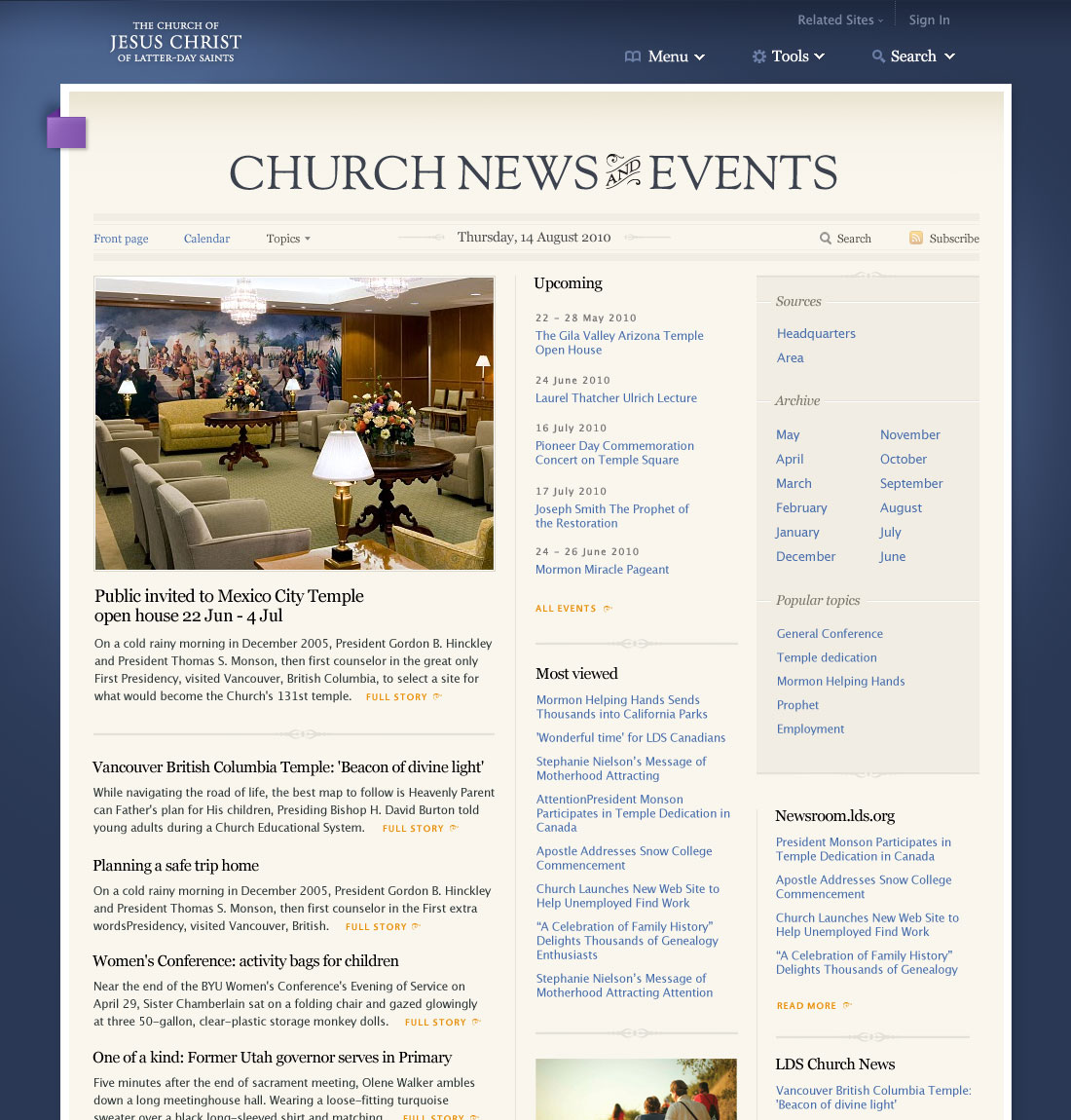
This is a preview of the front page of the news and events section coming in the new lds.org. It will be up on the beta site in the next few weeks. It will provide an aggregate of articles and new content being published on the site and by official Church news services.
posted by
wade
on Wednesday, Jun 16, 2010

My attempt at making a web site look like the logo-plastered walls of any corner store in Guatemala. Also my attempt at Latin Alternative Rock. Listen here.
posted by
davidlindes
on Tuesday, Feb 02, 2010
case study
Today we launched an update to the Church’s Perpetual Education Fund website. The new website features selected stories from over 40,000 individuals who have been able to better their lives through education opportunities made available to them through PEF loans.
The site also contains information about the program, and instructions for individuals who may apply for loans. The site was launched in 4 languages (English, Spanish, French and Portuguese) and will service areas around the world.

The Perpetual Education Fund is an incredible program and has a direct impact on the lives of the individuals and families who are able to benefit from it.
Please take a look at the new site!
posted by
john
on Wednesday, Jan 20, 2010
“CSS is the weakest link in the web developers toolbox. The problem goes deeper than CSS’s lack of variables. Unlike the “function” in programming, CSS has no fundamental building block.”
Chris Eppstein, the author of Compass writes up a solid argument for the need of abstraction in stylesheets. I’ve been toying around with Compass and the Sass language over the past few weeks and things look very promising.
posted by
john
on Monday, Sep 21, 2009

MacRabbit, the maker of CSSEdit, has introduced a new web development tool called Espresso. While I’m a Coda man, and many around the office here use TextMate, I’m glad to see another good option on the horizon. It certainly looks promising. (Via Pedro.)
posted by
clifton
on Friday, Sep 19, 2008
Ars Technica has an article today titled Report: Mobile Internet use has reached “critical mass”. “Using the Internet from mobile devices is a lot more popular than some of us realize, and even more surprising is the fact that the US leads the pack when it comes to mobile Internet usage… It should be noted, however, that while the US may lead in mobile Internet use, other countries lead in terms of mobile being the primary way that their population gets online. In Russia, Brazil, and India, mobile lines far outnumber landlines, and as those countries continue to flourish, they will become a greater driving force in mobile Internet use.” The article also talks about which devices are most commonly used to browse the web, and the top device is probably not what you’d guess.
posted by
cannona
on Wednesday, Jul 09, 2008
Could web accessibility become law? Many folks are trying. It will be interesting to see if this effort succeeds, and if so, which sites are covered.
posted by
cannona
on Wednesday, Jul 09, 2008
You guessed it, they make their interface accessible. If you are not able to use a mouse or see the screen, you are basically out of luck when it comes to Google Docs. The best you can do is read what others have wrote, and even that is a bit awkward.
Granted, it will not be easy for Google to substantially alter this situation with current popular techniques, but it should be made a lot simpler with the Accessible Rich Internet Applications (WAI-ARIA) standard being worked on by the The World Wide Web Consortium.
For those who are not aware, ARIA is a proposed standard which, among other things, seeks to bridge the gap in communication between the screen reader and dynamic web applications. It allows you to tell a screenreader user, for example, that a particular element on the page is a drop-down menu, add enhanced keyboard functionality, and draw the users attention to elements that change. It is a very promising standard which is already seeing some support in the latest versions of screen readers, and a few of the very recently released browsers.
But getting back to Google, I believe that inaccessibility will very likely hold them back in the market. It is true that the vast majority of users don’t even know what accessibility is, and if they do, they probably don’t pay it much attention. So how could it substantially effect them in the market? There seems to be a growing trend within a few companies, but more within government, to discourage the usage of inaccessible products when accessible alternatives exist. I believe that at least some of the efforts being put forth by companies to make their products more accessible can be directly attributed to these regulations and policies. Of course, I don’t wish to imply that it’s entirely a business decision, as I am sure many companies do it because they care. However, having a little market pressure never hurts.
Right now, Microsoft Office works great with any screenreader worth speaking of, and if you’re the person responsible for deciding what software your organization will use and you have a mandate to consider accessibility in your decision, MS Office has a big advantage that might be difficult to overcome.
Nevertheless, because of the afore mentioned market pressure, and because of Google’s promising history of making virtually all of their other web applications accessible, I am quite optimistic that I too will soon have the opportunity to use Google Docs.
posted by
cannona
on Friday, May 30, 2008
I haven’t had a chance to use it on a project yet, but this seems like a great tool to be used in conjunction with Firebug. Ahhh, the power of Javascript is simply amazing.
posted by
rick
on Thursday, Dec 20, 2007
There so many ways to resize type on the web, but I find this one not only produces excellent results, but also seems to be the least complicated of the bunch.
posted by
rick
on Tuesday, Nov 27, 2007
Looking for inspiration? Craving instruction? Bored and need something to read? Look no further; here is the Official NorthTemple Uber List of Inspirational Instructional Books, Conferences, and other stuff. Enjoy!
Conferences/Workshops
Edward Tufte
An Event Apart
Design, Usability, and Software Development Books
The Design of Everyday Things
Author: Don Norman
The Inmates are Running the Asylum
Author: Alan Cooper
Designing with Web Standards
Author: Jeffrey Zeldman
Getting Real
Author: 37Signals
Designing for Interaction: Creating Smart Applications and Clever Devices
Author: Dan Saffer
Designing Interfaces: Patterns for Effective Interaction Design
Author: Jenifer Tidwell
Designing the Obvious: A Common Sense Approach to Web Application Design
Author: Robert Hoekman Jr.
Defensive Design for the Web
Author: 37signals, Matthew Linderman, Jason Fried
Transcending CSS: The Fine Art of Web Design
Author: Andy Clarke, Molly E. Holzschlag
Bulletproof Web Design
Author: Dan Cederholm
CSS Mastery: Advanced Web Standards Solutions
Author: Andy Budd, Simon Collison, Cameron Moll
Don’t Make Me Think: A Common Sense Approach to Web Usability
Author: Steve Krug
The Elements of User Experience: User-Centered Design for the Web
Author: Jesse James Garrett
Universal Principles of Design: 100 Ways to Enhance Usability, Influence Perception, Increase Appeal, Make Better Design Decisions, and Teach Through Design
Author: William Lidwell, Kritina Holden, Jill Butler
The Elements of Typographic Style
Author: Robert Bringhurst
Business
Leadership and Self-Deception: Getting out of the Box
Author: The Arbinger Institute
Small Is The New Big
Author: Seth Godin
Religion
The Standard Works
Conference Talks
To Draw Closer to God
Author: Henry B. Eyring
The Lord’s Way
Author: Dallin H. Oaks
Temple And Cosmos
Author: Hugh Nibley
Literature
Les Miserables
The Lord of the Rings
Ender’s Series
Blogs and Magazines
Authentic Boredom
456 Berea Street
Subtraction
A List Apart
Speak Up
Brand New
Design Observer
Boxes and Arrows
UX Magazine
UX Matters
Vitamin
Core77
Get Results Blog
Signal vs. Noise
Trizle
Reference
The Elements of Typographic Style applied to the Web
John Maeda’s Laws of Simplicity
UI Garden
Professional Organizations
Interaction Design Association
AIGA
posted by
rick
on Monday, Jun 25, 2007

iPhoney is not an iPhone simulator but instead is designed for web developers who want to create 320 by 480 (or 480 by 320) websites for use with iPhone. It gives you a canvas on which to test the visual quality of your designs.
posted by
rick
on Friday, Jun 22, 2007
The reason web applications should never break the back button in the browser. For the first month of using Gmail, this was my number one gripe. I eventually got over it, but it took a concerted effort.
posted by
foster
on Tuesday, Mar 06, 2007
Nice video capturing some of the progression of the web to the Web 2.0 point at which we find ourselves. Presented by Information Aesthetics (infosthetics.com).
“A (infographical?) movie, constrained to just text & pictures, explaining Web 2.0 & how it effects affects global society.”
Take a look here: web2.0 in 5 minutes
(via Steven)
posted by
randy
on Tuesday, Feb 06, 2007
“You cannot copy the internet (nor TV programming) and expect success on mobile. The mobile is the newest mass media. It is as different as the internet was from TV, or TV was from radio. You need to understand what works.”
Tomi Ahonen, in a massive but enlightening response on Authentic Boredom
posted by
jason
on Friday, Jan 26, 2007