usability archives
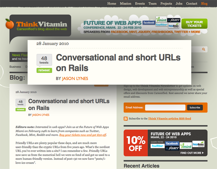
Props to our own Jason Lynes for his article over at Think Vitamin. Love the idea of conversational URLs and even though I don’t speak Rails I got a good idea of what he did.
Nice work Jason!
posted by
aaron
on Friday, Jan 29, 2010
Some useful design tips for comparison shopping interfaces from Get Elastic. Brings me back to my Carpoint days at Microsoft… It’s tough to put a lot of data across multiple products into tight columns, but it can be done well. Have you seen some good examples?
posted by
ted
on Wednesday, Jan 20, 2010
“Usability is like cooking: everybody needs the results, anybody can do it reasonably well with a bit of training, and yet it takes a master to produce a gourmet outcome.”
Jakob Nielsen, effectively treading the fine line between easing fears of Big Usability and talking people out of hiring his firm. From a good article on striking the right balance on usability.
posted by
ted
on Tuesday, Dec 22, 2009
How the art of visual design plays a role in usability: A usability review of Microsoft and Apple websites.
Beyond the initial PC vs. Mac appearance of this article, it really points to how a great design team has worked to unify a company and present a unified message. No matter the size of your company, I think every design team struggles with focusing the company in one direction, especially when there are many people contributing to product development and content.
No small feat.
posted by
emmy
on Friday, Sep 11, 2009
Jakob Nielsen recently ran a Twitter post through 5 rounds of iterative design to get the impact he wanted. At first blush I was thinking, “That sounds like a lot of effort to optimize a Tweet!” But if you are using twitter as a marketing medium, I guess it makes sense. (Far as I can tell, these were just design rounds; he wasn’t running a user study or anything.)
See his article for lessons learned in each round, from concision to focus, impact, and re-tweetability. (There, I’m making up new words right and left.)
He finishes the article with a notable quote: “Text is a UI. It’s a common mistake to think that only full-fledged graphical user interfaces count as interaction design and deserve usability attention. ... In fact, the shorter it is, the more important it is to design text for usability.”
posted by
ted
on Monday, Aug 24, 2009
case study
In our quest to design simple, intuitive, and efficient things, we must be careful to not over-design. I have run into several examples recently where I believe the designer (or more often, the business employing them) is trying too hard—too hard to be everything, too hard to have too many options, too hard to up-sell, too hard to be original or innovative, too hard to be too simple—and has failed. A fine line is walked between questioning traditions and standards for irrelevance, age, or oversight, and respecting them for their tenure of existence. A delicate balance must be struck between production costs, competition, patents, marketing, aesthetics, work-flow, and usability. While we most often are not the one with the final say, I believe it’s a designer’s duty to satisfy a project’s many requirements simultaneously while diligently advocating usability—resisting and preventing the mistake of over-designing.
I am increasingly amazed at how often I find myself asking under my breath, “didn’t they try using this?” How did they get so far from their original idea? Why are these features in here? Why does it include the kitchen sink? Why are corporations so afraid that every service, department, and product has to be represented in everything? Why is the mantra less is more so easily forgotten?
Consider the Designing The Stop Sign video that appeared on YouTube several months ago. It humorously tells the story of a corporation charged with designing a stop sign, the agency attempting to complete the project, and the unfortunate result. “Welcome to corporate creativity,” the video’s producer says, “where groupthink and endless revisions help good ideas get executed.”
Thankfully it’s not that bad, right? Well, it’s really not that unrealistic. My point in discussing this video however isn’t simply to poke fun again at the corporate world or to bemoan the role of a designer. After we’re all done laughing (or crying), there is an important lesson to be learned.
You have a choice as a designer: are you going to make crap or are you going to build something great? Yes, I understand that most work as a graphic artist is commissioned and governed by your client, a board of directors, stock prices, an executives upcoming promotion, conversion rates, retention rates, and the current phase of the moon, but if you do not extend yourself beyond the process of production, you have sold yourself short and done a terrible disservice to your client, their customers, and yourself.
You are the advocate for the user. You must speak up. You must teach and train. You must question decisions and “requirements.” If you don’t, no one will. You must earn your client’s trust and help them understand the value in ensuring that something is not just usable, but useful. You must have skills and ideas. You need to be able to suggest alternatives and be able to back them up. Your opinion and training isn’t sufficient. There are tools to prove beyond a doubt what is and isn’t working. Suggest them. Implement them. Use them.
Consider the following three examples covering industrial design, interface design, and interaction design.
Washing Machine

Let’s look at my washing machine. What a mess! No, not the lint dust, the controls! How do you use this? How long does it take to decide what the options are and how much confidence will you have in the accuracy of your selection once it has been made? Why have they combined four options into two knobs? There’s plenty of space on the machine for additional dials. Would it really have increased the production costs for them to add two more knobs? Was it somehow easier for the electrical engineer to program and wire the circuitry with only two input devices? Why can’t there be one knob for wash temperature, one for rinse temperature, one for extra rise, and another for the end of cycle bell? Why does it have to be so hard to use such a simple device?
Well, it doesn’t have to be. They have simply over-designed it. Someone—could have even been a designer—probably thought “let’s keep this simple. It will look more elegant and refined if there are fewer controls.” There might have even been comments made about it being more approachable and less daunting if they kept it simple. Perhaps it really was easier to build this way. Perhaps it really made a difference in the production cost to combine functions like this. But is it worth it? I shake my head every time I put in a load of laundry wondering why it has to be so difficult to use. A control that makes a selection between three options or on and off should not require a key.
Ecommerce

Next, Amazon. Their current design has been in place for a while now and I still have trouble logging in. Look the header over. Do you have any idea where to log in? The words “sign in” are there, but they are not a button or a link. I understand that I can sign in to get personalized recommendations, but I’m not very interested in that (at least at the moment), I simply want to sign in. I’m not a new customer, so I see no point in clicking that link and I doubt attempting to access my cart or my lists will do much good until I have authenticated. “Your Account” seems like the best option but that still seems like something that will not yet be available. Why is there no “log in” or “sign in” link? Why have they made it so difficult to use their site? Don’t they want me to purchase their products?
Of course they do. They have simply over-designed it. The marketing department is trying to up-sell me on the latest promotion, the product department wants to ensure that I am aware of and using the latest-greatest feature, legal is terrified that the company’s latest patents aren’t listed prominently on the home page, and usability pushed down, back, and behind until it is nearly completely lost.
Interestingly, there are actually three links across the header of the site that take you to the log in form (and three more with a second step), but none of them communicate this to the user.
Blogging Software

Any active user of the open-source blogging software WordPress knows how wonderful the 2.7 upgrade was. After months of work by a team of volunteers, a completely new interface was released. A major effort behind the update was increasing usability and in many ways they succeeded. There are a few elements however that fail, such as the bulk editing and delete. These two options have unfortunately been hidden within a drop menu that is followed by an apply button. Using this software on a daily basis to publish for multiple online journals, I frustratingly admit that I have to search for how to delete every time I use it. Why is it buried in a menu? Especially if there are only two (usually one) options in the menu? Why is the action titled “apply?” Why does something so simple have to be so complicated? Do they want to discourage bulk actions?
No, I don’t think so. They have simple over-designed it. Although, in this case I it might be better named as under-designed. Their table pattern has obviously received a lot of attention. They have implemented great features such as filtering and not cluttering the view with individual record controls until you hover over them with the mouse. I’m sure the choice of control for the build actions was selected because it matched the filter, but this was a mistake. One size does not fit all. Uniformity does not always result in success. Why are the bulk actions and the filter crammed so close together such that it is nearly impossible to distinguish one from the other? If each instance of the data table pattern only provides one or two bulk actions then why can’t they simply be represented by individual icons, links, or buttons?
Conclusion
In the end, I encourage you to think. Don’t take the easy way out. Don’t cut and paste. Just because a pattern worked in application A doesn’t mean that it will work in application B. Work tirelessly to promote usability and simple, effective design. Fight over-design with every resource you have and utilize technologies for testing and tracking user behavior and auto-optimizing interfaces. Encourage your clients to question and review their requirements and ensure that they have not strayed from their original goal. An application or tool that does one thing really well is much, much better than one that fails at hundred things.
posted by
wade
on Monday, Jun 29, 2009
Jakob Nielsen’s Alertbox today proclaims that we we should Stop Masking Passwords. He claims the usability costs are too high, especially on mobile devices where typos are more common.
I was skeptical, but he has some great points, the most important being that the greatest security risks when you are entering a password are really electronic—someone snooping your password through an unsecure connection. Someone watching your screen can just as easily watch your keyboard to see what keys you tap. But most of the time this is irrelevant, since you are at home and not really being stalked by an over-the-shoulder snooper.
And to cover the occasional Internet kiosk scenario, he suggests providing a checkbox that will let users decide whether they want to mask their password. I like it! Virtual equivalent of cupping your hand around the keypad at an ATM.
Now that I think about it, I have recently noticed that when I type a password on my mobile phone, it briefly shows the last character I typed before replacing it with an asterisk. (Is that an Opera Mobile feature?) That seems to be a concession to some of Nielsen’s points regarding mobile password entry. But I wonder whether it really makes sense either. If it’s visible to you briefly, then it’s visible to a snooper briefly too. But what are the chances that someone can see that teeny tiny text you are taptapping on your phone anyway???
So I guess he’s convinced me! Death to the Asterisk!
posted by
ted
on Wednesday, Jun 24, 2009
Interesting Alertbox from Jakob Nielsen finding that “non-profits would collect much more from their websites if only they’d clearly state what they are about and how they use donations. ... Sadly, only 43% of the sites we studied answered the first question on their homepage. Further, only a ridiculously low 4% answered the second question on the homepage.” In other words, content usability and message design are as important as functional usability, especially if you are asking for money!
posted by
ted
on Monday, Mar 30, 2009
“New technology + same old thinking = same old outcome with a buggy
interface.”
Mark Hurst, in his latest Good Experience newsletter. Some important thoughts here about how a change in technology without a change in commitment to customers simply results in more efficient ways to annoy, frustrate, and exploit people.
posted by
ted
on Tuesday, Mar 24, 2009
Refresh this page. Now do it again and this time note the moment that fifty-percent of the page is loaded. Got it? Do you know when it was? What about speed? Can you give me an idea how fast the page is loading? What if you were on a slow connection like the wifi I use on the bus to commute to work? Would you know if the page was loading fast or slow? Would you have an idea of how long you were going to have to wait? Should you switch to another tab and continue reading the news because it’s going to be a while?
If you were using Safari, you’d have an answer for me; other browsers leave you in the dark.
Well, at least that’s how it used to be (save Safari Mobile). Safari 4 Beta was released this morning and with it came a gaggle of exciting new features (including a Web Inspector and Console that can now hang with Firefox’s Firebug plugin). Unfortunately, Apple also removed one of Safari’s greatest features.
While the standard loading indicator for web browsers is a spinning icon, the great minds that designed Safari’s interface decided to innovate and instead take advantage of the functionless (after you have entered a URL and struck the return) address bar and animated a progress meter behind the text. Instead of a nearly useless icon that communicates little more than that the browser is running, Safari’s indicator simply and effectively let’s you know both how much has loaded and how fast it’s loading.

With Safari 3, the browser’s state is clear. With the requested site’s title prefixed by the word “Loading” at the top of the browser and the progress meter status indicator, the state of the browser and the action taking place is immediately obvious to the user. Even viewing this static screenshot, having not physically interacted with the browser and requested the page yourself, you are able to quickly and accurately discern this.

The state of Safari 4 Beta on the other hand is a mystery. I have requested northtemple.com but the browser still displays the title of the previous site. The only indicator that the new site is loading is the small animated “spinner” on the right side of the address bar. Both versions of Safari display the requested URL prefixed by the word “loading” in the Status Bar in the footer, but most users do not have this bar turned on.
Here’s to hoping that it’s absence is just an oversight in the beta.
posted by
wade
on Tuesday, Feb 24, 2009
Nielsen/Norman Group is offering a free report on Rich Internet Applications”. It’s from 2002 and most of the apps reviewed are Flash-based—but hey, it’s free :-) And most of the findings focus on the interaction itself, not the technology. Quick skim looks promising…
posted by
ted
on Monday, Dec 15, 2008
“You have to tell [them] your job role twice, your
job title once, and the language you prefer to speak 3 times—all
in English.”
Jared Spool, dazed by the number of hoops needed to pass through just to get to see (not buy) a product catalog of branded merchandise for a major technology company. (From a re-print of a year-old post on sign-in mistakes to avoid.)
posted by
ted
on Tuesday, Dec 09, 2008
“It takes a strong
UX practitioner to stand up to an ill-informed team who think that Agile is about
speed rather than about better project control, and who subsequently think that user
experience work is a waste of time.”
Looking forward to reading the rest of Nielsen/Norman’s Best Practices for User Experience on Agile Development Projects
posted by
ted
on Monday, Dec 01, 2008
Many of the newer cool phones are moving to a touch screen only interface (iPhone, G1 [when closed], Storm, etc). They are also supporting the ability to view the same websites that we design for the desktop. This is naturally pretty cool in that they get all those bells and whistles we designed and we don’t have to create a second version of our site specifically for them.
The other day I was on my iPhone, navigating around a site where some of the links didn’t look like links and you wouldn’t think they were links by their placement. I’m going to guess that the designer thought:
- These links aren’t very important
- The user can use their mouse to hover over things to find what is a link and what isn’t (making the user do extra work isn’t very nice btw)
- The user can tab to these links and will discover them that way (still not very nice)
Well as an iPhone user, the links were important, I didn’t have a mouse (cursor really as I can still click), and I didn’t have a tab with which to hop around. The only reason I clicked on them was because I was familiar with the site and knew they were there.
In this new world where mobile devices can see our regular sites, we need to be even more diligent in going back to basics of making sure links are easily viewable. As I mentioned above, it’s not very nice to expect a user to move their mouse over any given word to see if it is a link or not. Our senior generation can’t see subtle differences in color. Now we have devices that don’t have a mouse as we currently understand it and can’t hop between links with a tab key or joystick.
There naturally needs to be a fine line between big bold links and design. I wouldn’t want my page littered with default blue underlined links everywhere. But skewing too far to subtlety, while more aesthetically appealing, may not be very user friendly in general, and out right unusable on these newer devices.
posted by
aaron
on Monday, Dec 01, 2008
“It’s so hard to find things.
I’m finding it hard to not blame you.”
My wife Caryn, experiencing the joys of using lds.org.
posted by
jason
on Tuesday, Nov 18, 2008
“Turn off your internal problem-solver and just listen to people.”
Indi Young explaining her genius approach to usability in the lastest A List Apart
posted by
sam
on Monday, Oct 13, 2008
New in Gmail Labs: Stop sending email you later regret. This isn’t a joke, and it’s genius. Enable “Mail Goggles,” and Gmail will ask you a few math problems before it sends your email to make sure you’re sober enough to really mean what you just wrote. The feature is only active late at night in your timezone, and only on weekends, when some people might be prone to doing things they regret.
Love this idea, of designing things to be harder to encourage a certain behavior. We did something similar in our new Mission Office application here internally, making certain financial actions harder by requiring extra clicks or making the controls slightly obscure to discourage using them. Speed bumps are another example of using “poor” design to lead your user to act a certain way.
posted by
jason
on Tuesday, Oct 07, 2008
“Companies and organizations still
can’t explain what they do in one paragraph.”
Jakob Nielsen on the ubiquitous but often uninformative “About Us” page.
posted by
ted
on Monday, Sep 29, 2008
I know TV is all about advertising, and what with DVRs all the rage these days, TV studios are scrambling to figure out how to make money. Hulu.com seems to be getting it right, with totally unobtrusive ads that don’t get in the way of watching TV. But on NBC.com, home of one of the founding studios behind Hulu, totally obtrusive and irrelevant ads litter the site like the offerings my neighbor’s little dog left in my yard before he mysteriously disappeared. I even had to watch an ad before I watched one of the new Olympic-themed ads for the Office.
Yes, I had to watch an ad before watching an ad.
I have to think NBC is getting paid way more for ads on full episodes of the Office than the small annoying ones they show before ads of the Office. Taking 8 minutes out of my half hour to show ads is one thing – taking 20 seconds before a 30 second ad is another. Is NBC a little too focused on making money?
Perhaps they are falling victim to a classic blunder – target fixation. Being so focused on an end goal can make you forget to pay attention to what’s happening around you, and what you might be doing that is detrimental to achieving your goal. Oftentimes target fixation can result in actually colliding with the target (not applicable to archery).
How could NBC fix things up? Maybe NBC.com doesn’t have to generate revenue on its own, maybe it can simply advertise NBC’s core business of making good television. Or maybe following a simple rule can help us all avoid a similar fate: paying attention to our surroundings and how our work is effecting people. Does NBC know their website reminds me of my backyard?
Do you know how your work is being perceived? How many people has your product alienated today?
posted by
jason
on Monday, Aug 11, 2008
Interesting interview of Dana Chisnell by Jared Spool on why recruiting for usability participants should not be driven by standard demographics, but instead be more focused on task familiarity, skills, and behavior. I think this applies to our design thinking too; demographics reinforce stereotypes and can obscure the real audience issues you should be focusing on.
posted by
ted
on Wednesday, Jul 02, 2008