typography archives
“We may not obscure the old truths: we must not despise the new.”
Stanley Morison speaking on the importance of studying the past and how it relates to embracing the future – from his introduction to “Four Centuries of Fine Printing” 1949 edition.
posted by
john
on Monday, Oct 01, 2007

FF Meta Serif
—Designed with Kris Sowersby and Erik Spiekermann. Available starting in October 2007 from FontShop International. For those of us (this is for you, Chris) who couldn’t get enough of Meta Sans it in the late 90’s.
posted by
john
on Wednesday, Sep 26, 2007
Running out of things to read?
There are over 100 essays and articles on Typography available at Typotheque.
posted by
john
on Tuesday, Sep 18, 2007
In regards to the approach that Apple takes to typography and pixel rendering compared to the approach of Microsoft:
Apple generally believes that the goal of the algorithm should be to preserve the design of the typeface as much as possible, even at the cost of a little bit of blurriness.
Microsoft generally believes that the shape of each letter should be hammered into pixel boundaries to prevent blur and improve readability, even at the cost of not being true to the typeface.
It is interesting to me how philosophical approaches to design can make a difference in the minutiae of design details.
via Coding Horror
posted by
john
on Friday, Aug 17, 2007

John asked, When was the last time you gave credit to the guy who designed your type? So one of the first things I checked after standing in line for only 5 minutes at Smith’s last night with three of my kids was to flip to the last page of Harry Potter and the Deathly Hallows to find the above. So maybe appreciation of typography isn’t dead after all!
posted by
ted
on Saturday, Jul 21, 2007

When was the last time you gave credit to the guy who designed your type? This appears on the last page of “The Prophet” by Kahlil Gibran, published in 1923.
posted by
john
on Friday, Jul 20, 2007
Check out this flickr photoset from a few old type specimen books. The type specimen pool also looks like a worthy distraction if you’ve got a few more minutes to spare.
Online type catalogs just don’t have the same appeal do they? (thanks Frank…)
posted by
john
on Thursday, May 17, 2007
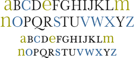
Beautiful font here plus a cool concept: “The plan for simplifying and improving our alphabet, entitled “Alphabet 26 was first presented in Westvaco Inspirations 180 in 1950. It recommended the use of only one symbol for each of the 26 letters.”
(via SVN)
posted by
jason
on Wednesday, Feb 28, 2007
From Usability News, Reading Online Text: A Comparison of Four White Space Layouts. Very interesting study on how readers comprehend and digest content online.
posted by
jason
on Monday, Jan 22, 2007
“It is better to have a document whose unified character gives it its own dignity and presence than to have a pile of visual odds and ends, each calling attention to itself in a deafening babel of competing typographic voices. Besides, the subject matter ought not to depend on visual cosmetics to fascinate the reader.”
Jan V. White in Graphic Design for the Electronic Age
posted by
ted
on Friday, Dec 29, 2006
Here’s a great sampling of beautiful Iranian Typography via mezzoblue. This kind of stuff really makes you realize that there is little difference between words and pictures.
posted by
john
on Wednesday, Dec 13, 2006
There are plenty of good reasons for making your text type small as long as you don’t compromise the readability and resolution. That said, I’d like to suggest that you make your small type just a little bit bigger.
Small, readable type is not bad
Designers are known for their love affair with tiny type, and there’s no doubt about it, when viewing a design as a whole, small text type can look better on screen than big type.
It appears to look better because a block of type at small sizes becomes texture instead of individual words. We don’t have to read textures, we just visually soak them in. This is important because words are pictures, and if you can control the texture of the type while maintaining readability, you can use type to aid communication on many different levels. This is known as “typographic color” and is a very important part of any design project.
There are many things you can do to make small type more readable. Adjust the contrast, increase the leading (line-height), give it a bit more word spacing, etc..
Small type (a bit bigger) is better
There are 3 important reasons to make your text type just a little-bit bigger, readability, resolution, and hierarchy.
Readability
You might be able to read tiny type, but there are people who can’t. I recently corrected my nearsightedness with lasik surgery and find that I prefer having the type just a bit bigger. I’m getting all too tired of using CMD+ to make the fonts bigger in Firefox. Spare your readers that extra effort — I can’t recall a time I’ve intentionally made the type smaller.
Resolution
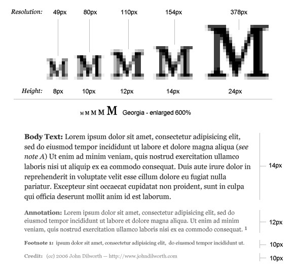
The smaller you make your type, the fewer pixels you are using to make up the details of each character. The smaller you make your type, the less it looks like the type designer intended it to look. There are pixel fonts that help out here a bit, but in any case, the bitmap versions of these fonts are trying to imitate the true nature of the character, and they just can’t do it with out more pixels.
The difference between 12 and 10 pixel type is not just 2 pixels, the difference in resolution is 34 total pixels which equates to a 38% difference. That’s right, 10px type has potentially 38% less resolution than 12px type. Sure you can still make out the words, but you’ve eliminated all the subtleties of hundreds of years of typographic design elements that were put there to make things easier to read.
Typographic Hierarchy
This is probably the most overlooked reason for making your type bigger. If you’ve carefully designed your content’s typography and you’ve made it as small as you can while retaining readability and resolution, you should still make it bigger.
When designing for the web, especially for dynamic content, make sure you leave room for the addition of type that may need to be a little bit smaller.
Annotations, captions, credits, and footnotes all require typographic distinction. You may not want a caption to be exactly the same size as your body copy, and differentiating with color and typeface at small sizes may not produce the desired effect.
If readability, and resolution aren’t enough to convince you, don’t deny yourself the flexibility of being able to go just a bit smaller and still retain the integrity of your design.
posted by
john
on Wednesday, Dec 13, 2006
Make Your Small Type a Little Bit Bigger – this diagram shows the loss of resolution in small type, and the need to make your text type a little bit bigger in order to accommodate type that should be a little bit smaller.
posted by
john
on Wednesday, Dec 13, 2006
Compose to a Vertical Rhythm is an article on web typography by Clearleft’s Richard Rutter. “On the Web, vertical rhythm – the spacing and arrangement of text as the reader descends the page – is contributed to by three factors: font size, line height and margin or padding. All of these factors must be calculated with care in order for the rhythm to maintained.”
posted by
jason
on Tuesday, Dec 12, 2006
The Type Trust has some great unique typefaces at reasonable prices. The quality and style of their fonts remind me a little bit of Emigre and T26.
Of special note: an upcoming typeface by one of the Type Trust designers.
posted by
john
on Friday, Dec 01, 2006
We are loving the typography and uniqueness of this UC-Berkeley Department of Spanish and Portuguese site. Excellently designed, and great inspiration.
posted by
jason
on Thursday, Nov 09, 2006
A brief description and usage rules for two typographic elements, the middle dot and the bullet.
- (·) the middle dot (·)
- (•) the bullet (•)
Basic Rules
The middle dot (·) or interpunct was used in ancient latin script before the usage of the space to represent word boundaries. The middle dot is also used in foreign languages (especially asian scripts) where word spacing is not used. While the character is not often used in English, it can be a useful typographic element. Try it as a divider in horizontal navigation instead of the vertical bar (|).
Bullets are used to introduce elements in a list. In most (if not all) cases, lists should follow HTML markup rules for unordered lists (<ul></ul>). The appearance of bullets should be stylized using CSS.
posted by
john
on Wednesday, Nov 01, 2006
Fractions such as: ½, ¼, ¾, and other math symbols should all be displayed properly using the appropriate HTML entity. While there is not an HTML solution for typesetting every possible fraction or mathematical equation, there are basic entities that cover the most commonly used fractions and math symbols.
- (½) one-half (½)
- (¼) one-fourth (¼)
- (¾) three-fourths (¾)
- (⁄) fraction slash (⁄)
- (×) times symbol (×)
- (÷) divide symbol (÷)
Basic Rules
If you must create fractions you should use the fraction slash (⁄) instead of the typical forward slash on the keyboard. Fractions could also be created by using a combination of <sup> and <sub> tags with the fraction slash, although there may be issues with line-height (some browsers seem to add line-height when the superscript and subscript tags are used).
Example: 1⁄14 (does not display properly on IE).
When displaying dimensions (such as screen resolutions) or multiplication statments the times symbol should be used and not the letter X.
Example: Use (1024×768) not (1024X768)
posted by
john
on Monday, Oct 30, 2006
Web design is 95% typography. Key quote: “Information design is not about the use of good typefaces, it is about the use of good typography.” Be careful, though—don’t go thinking IA is the be all, end all of the web. Just one arrow in the quiver, my friends.
posted by
jason
on Thursday, Oct 26, 2006