design archives
“Knowing that the name would be widely displayed and not just used as a login credential would prevent people from being stuck with unfortunate names like SuperStud on a professional site.”
From Workflow Expectations: Presenting Steps at the Right Time, an Alertbox from Jakob Nielsen. Good article on the importance of holistic design and good timing.
posted by
ted
on Tuesday, Apr 26, 2011
Something that has been on my mind lately as we have been interviewing for interaction designers – there are a lot of designers out there, but not enough thinkers.
This article from Eric Karjaluoto @ smashLab is an exceptional read on what we should be trying to achieve with the title of “designer”.
The point I’m trying to make is that there’s a lot of opportunity for us—as thinkers—to provide great value to our clients. We won’t, however, do this if we continue to hold tightly on to the notion of designers being purely visual practitioners. I’ve said this before, and I’ll say it again: design is about facilitating outcomes, not selecting colors. Selection from Put Down Your Crayons, April 11th, 2011, Eric Karjaluoto
posted by
emmy
on Monday, Apr 18, 2011
I was checking out a site referred to me by a friend at work: Safe Mothers, Safe Babies (SAFE). She said they needed some design help, so I thought I’d take a look. (You can contact them if you’re interested in helping out—looks like a great cause, helping mothers and babies in Uganda.)
As I browsed the site, there were clearly a lot of opportunities to spiff things up, but not that many that truly hindered understanding or use of the site. At least until I came to their multimedia gallery:
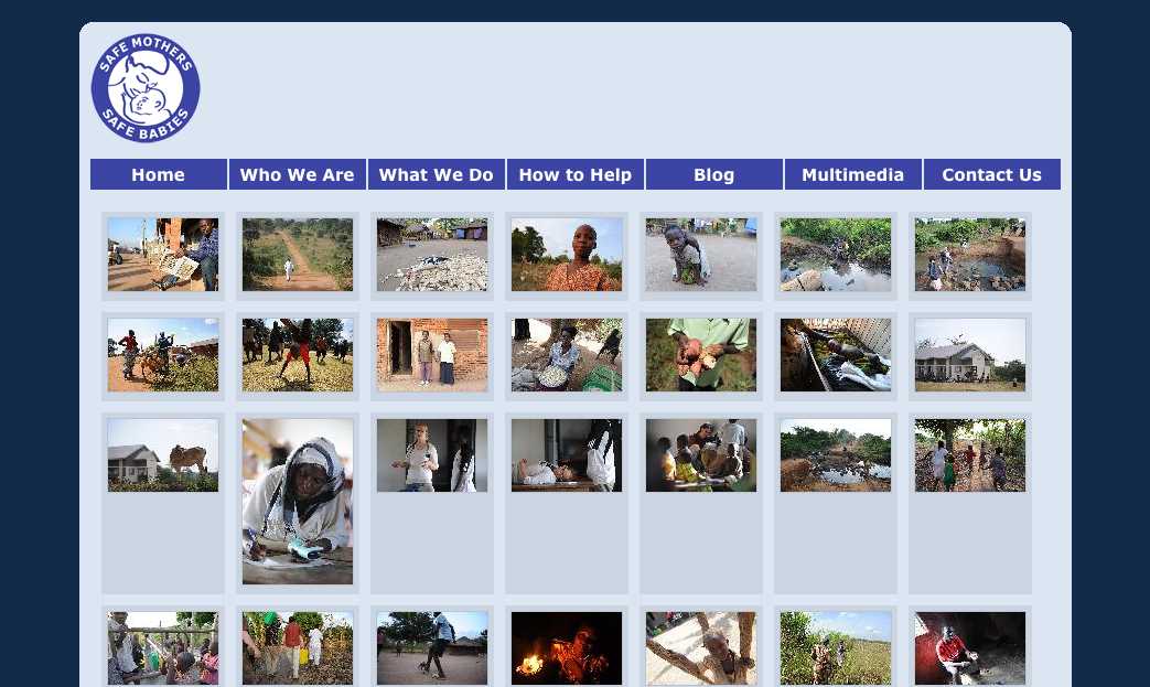
Interesting photos, but I am not sure what they are about. There are no labels on each photo to help me out, so I start looking for clues. At that point a new problem emerges. See it?
Seven nav links aligned pretty closely with seven columns of images. Without a closer examination, some folks might think that the nav links are related somehow to the content aligned beneath them—that they are column headings. Human beings are are meaning-makers, so we stretch and strain to figure out the relationship, to define a connection that isn’t really there. Confusion or at least a loss of time is the likely result. In worse cases, it might actually lead you to assume something that isn’t so—that the last column shows actual photos of the group’s headquarters or something, for example.
It struck me that this is a type of visual “tombstoning”—an unintentional (and often humorous) alignment of headings in newspaper or magazine layouts. Here’s an example from an About.com article on tombstoning:

Really? Dead Bugs Drink Wine? Were they dead before or after they drank it? Either way, that’s pretty interesting… but not what the authors or editors intended!
There’s obviously a lot more to say about The Principle of Proximity, but it’s good to keep in mind that:
It is not enough to group things that should be grouped.
You must also avoid grouping things that should not be grouped.
And if you’re interested in helping SAFE dig up and replace those visual tombstones, drop them a line—I’m sure they’d appreciate it!
posted by
ted
on Wednesday, Mar 23, 2011
case study
I just finished an article by Jared Spool entitled Creating Great Design Principles: 6 Counter-intuitive Tests. It was a good read that took me back about sixteen months to the time we started a revision of the Church’s Online Store by defining 8 or 9 guiding principles to help us focus. The new store launched without fanfare last June, with a more public launch in September after some refinements were made. Those principles had a big impact on design decisions, how products were highlighted on the site, and how we measured success. So this article was of particular interest to me, and I wondered how our principles would stand up to Spool’s “counter-intuitive tests.”
Here are his six tests, with a little elaboration on how our design principles fared when put up to these standards. (Since I haven’t checked with my stakeholders I did not feel comfortable listing those principles outright in this article.) If you want to apply these tests to your own design principles, I’d highly recommended reading the original article for additional context.
Test #1: Does It Come Directly From Research?
In our case, No, our principles did not come directly from research. We did gather a lot of input from key stakeholders, and conducted some research on key experiences we needed to support. Maybe not surprisingly, I think that the experiences we researched most are among the best on the Store—clothing display, for example.
Test #2: Does It Help You Say ‘No’ Most Of The Time?
Yes, several of our principles helped our stakeholders say No. Maybe one of the biggest examples was in helping us maintain a more reverent atmosphere on the site rather than a commercial one. Big blaring fonts? No. Flashing banner ads? No. More promotions than products on a page? No. Stronger “store” branding? No. Sales and coupons? No. Focus on “finding products to help you learn and live the Gospel of Jesus Christ…” ? YES.
Test #3: Does It Distinguish Your Design From Your Competitors’?
In our case, the main competition was Church-owned brick-and-mortar Distribution Centers and catalog ordering by phone. Few of our principles directly challenged this competition and some actually strove for harmony between the different distribution channels. One principle around ease of use did get close—we wanted it to be so easy that someone who had ready access to a physical store would still want to use the online store. While not very specific, this really helped us stretch, especially as it related to clothing, where fit and feel are so important.
Test #4: Is it Something You Might Reverse In A Future Release?
This test was truly counter-intuitive to me; Spool claims here that “Great principles aren’t ever-truisms. They are only useful for right now. By thinking through scenarios of when you’d reverse them later, you help define what it means to follow that principle now.”
None of our principles met that test. In fact one of them explicitly strove for long-term stability and consistency over time and cultures. But I can see his point; design principles that are too generic (and therefore approach universality) may not help you hone the edge of your Cut List.
Test #5: Have You Evaluated It For This Project?
This is a follow-on to the previous principle. Just because something was a guiding principle for the previous release does not automatically make it a guiding principle for the next release.
I was about to say that this didn’t apply to the Online Store… and then realized we have done several updates to the store without ever re-examining our guiding principles, or at least creating some focus statements for our minor releases. Maybe it’s time…
Test #6: Is Its Meaning Constantly Tested [and refined]?
Our principles relating to atmosphere, cost, and ease-of-use were re-visited many times in new contexts. Do we show prices on category pages or not? Is the cost of this customization to the e-commerce platform worth the usability improvement or not?
This test was another counter-intuitive one for me—wouldn’t it be better if the meaning were clear now and for always? We certainly don’t want patently ambiguous principles, but principles that require refinement as you drill down into design are not necessarily a bad thing; it keeps the team engaged in the principles and talking with each other about meaning and goals.
“Most Design Principles Fail Many Of The Tests”
Spool concludes with the depressing observation that your design principles probably don’t pass many of these tests. But “don’t despair. Start having the conversations. The best principles change as the team’s perspectives on design matures. Don’t be afraid to let your principles grow into something that will guide your team to create user experiences your customers will thank you for.”
I have to agree!
posted by
ted
on Wednesday, Mar 02, 2011
Check out this new online Encyclopedia of Interaction Design. The contributor list reads like a who’s who of design, information architecture, usability, and user experience gurus! Definitely going to be spending some time here…
posted by
ted
on Thursday, Feb 17, 2011
“In design, we often talk about making our interfaces consistent. Yet what are we really talking about? The common misconception is we’re looking to match up the look and feel of other parts of our design, or other designs.
However, what truly makes a design consistent is when we meet our users’ expectations.”
Good quote from an interesting article with an interesting title:
Rabbis, Tropes, and Visually Consistent Designs .
Something for my inner English major as well as my outer designer. I encounter this misconception regularly in discussion with product sponsors and stakeholders.
posted by
ted
on Wednesday, Oct 20, 2010
Interesting article on mental models from Jakob Nielsen. If mental models are “based on belief, not facts,” how do you influence those beliefs—or conform to them?
posted by
ted
on Monday, Oct 18, 2010
“Sorting a list of options alphabetically has two main benefits. [First,] if users know the name of the thing they want, they can usually find it in the list pretty quickly. [Second,] lazy design teams don’t have to work on figuring out a better structure.”
From Nielsen’s recent Alertbox, Alphabetical Sorting Must (Mostly) Die. Sound advice, yet often ignored because it really is work to find a viable alternative. Witness a section in our recently released online store, where we tried to order a long list by importance… but are finding that with a long list (several pages), that’s probably not going to be very usable.
posted by
ted
on Wednesday, Oct 06, 2010
“Edwin Land, inventor of the Polaroid camera, once said that his method of design was to start with a vision of what you want and then, one by one, remove the technical obstacles until you have it. I think that’s what Steve Jobs does. He starts with a vision rather than a list of features.”
Fred Brooks, in interview by Wired’s Magazine’s Kevin Kelly about his new book The Design of Design
posted by
wade
on Sunday, Aug 22, 2010

OXO’s angled measuring cup, via an article on Good Experience: “Customers never said they wanted an angled measuring cup. In fact, users weren’t even aware that there was a problem to be solved. Consumers didn’t say, “I wish I could read the markings more easily.” They muddled through without complaint. And yet the innovation came directly from observing customers. How? Simply by observing the customer experience.”
(By the way—this brand appears to be sold at Kohl’s; Bed, Bath & Beyond; and Sears to name a few… so I might just drop in a buy there rather than pay shipping…)
posted by
ted
on Wednesday, Aug 18, 2010
“For practicing User Experience Designers, one of the most important laws isn’t Fitts’s Law, which helps us understand how to design interactive elements. Nor is it Hick’s Law, which describes how long people take to make decisions.
It’s Sturgeon’s Law, which tells us that 99% of everything is crap.”
The pull-no-punches opening to Jared Spool’s article today on
5 indispensible skills for UX mastery, which he lists as:
Sketching, Storytelling, Critiquing, Presenting, and Facilitating.
I like that list.
posted by
ted
on Tuesday, Aug 03, 2010
Nice article on interviewing users by Jakob Nielsen—strengths and weaknesses, when and when not to interview. Fits in with what I’ve experienced with contextual inquiry, especially the importance of focusing interview questions on what users are doing right now.
posted by
ted
on Monday, Jul 26, 2010
“Self Design only works in those instances when you are the user and there’s a lot of users just like you.”
Closing quote from an interesting article by Jared Spool on the pros and cons of designing for yourself, using 37signals as a prime case.
I find that most people believe—without any real evidence—that most people are
“just like them.”
There’s the rub, eh?
posted by
ted
on Thursday, Jul 22, 2010
As I’m sitting here working on a revision of the Church’s online catalog, I just perused a great summary of 10 reasons to not copy Amazon by GetElastic. Good advice for me, and just about everybody who’s not Amazon.
posted by
ted
on Friday, Jul 09, 2010
“Design, stripped to its essence, can be defined as the human capacity to make our environment in ways without precedent in nature, to serve our needs, and give us meaning in our lives.”
Enjoyed this quote this morning by John Heskett in his book Toothpicks and Logos.
posted by
wade
on Friday, Jun 25, 2010
case study
It continues to perplex me how so many basic interaction conventions did not make it onto the web. With each browser revision, we’re slowly improving experiences online, but so much of it is simply catch-up and not new innovation. Sure, it was born as a method for structuring and sharing documents, but once we started building things with it that involved interaction, why didn’t we at least start with what we knew thus far? Simple patterns designed decades earlier are slowly starting to show up on the internet but so many are still not even technologically possible.
It’s unfortunate because it limits the internet’s potential. By requiring experienced users to learn new behaviors, requiring users to deal with a sub-set of features, or lowering standards and expectations by providing new users with a sub-par experience, we are doing them a great disservice.
Avoid pagination
Nowhere else but on the web do we paginate through data. I can imagine why this convention was utilized: bandwidth will always be an issue for applications that do not store data locally. Perhaps that can be improved with caching and pre-fetching anticipated content. Whether the data is there or not however, why can’t we pretend that it is? Consider the continuous-scroll (such as Bing’s image search) or load-more (such as Twitter) conventions. Data, especially tabular data, is a list. You’re reading down columns. Paginating left-to-right makes little sense, especially when you start sorting the columns. Even if you have to break the data into chunks and paginate, a vertical metaphor makes much more sense than horizontal. Avoid pagination, but if you must employ it, make it top, bottom, up, and down, like a window showing you a portion of a long list.
Filter instead of search
While it doesn’t work for massive data sets such as the entire web, stop making users search for content. Imagine a photo gallery application that launches with a blank screen and nothing but a search bar. It seems ridiculous, but why then do we approach most data sets in the same fashion? An application has been launched for a specific purpose. Assume the most common task and present it to the user. If the entire dataset is not local, load the first sub-set. Instead of requiring the user to search blindly to find what they want, let them filter down the data set. In many instances this can be done with javascript in the browser (client side or even through a remote call) and can be substantially faster than searching and then wading through results.
Master/detail and edit mode
Another convention that has plagued web applications since their inception is edit mode. It’s amazing how much time this small workflow has wasted. Browse, select, load, edit, save… browse, select, load, edit, save… again and again. Why refresh the page? What if you’re not sure which record you want? It can be much more simple to allow the user to arrow up and down through a list with details or with content appearing to the side! Second, if the application is for working with data, the fields should be editable, or provide an option to toggle in and out of edit and view mode on an application-level. Most desktop software doesn’t have view mode. Why does the web? Apple’s new iPad, which implemented the master/detail convention as a standard through it’s interface, is gratefully inspiring the use of this convention now in many applications.
Keyboard navigation
Make sure that users can navigate your application quickly and efficiently. Start by ensuring that your tab order is set and that you can effectively move between all form elements. Arrowing up and down through lists and data tables is crucial. Help your user out by allowing them to jump to the top and bottom of lists with page up and down. Allow them to expand and collapse details with the left and right arrows. Select items with the space bar. Other advanced keyboard shortcuts can include jumping between columns, toggling panels, and moving in and out of modes. There are a few javascript libraries and scripts that make implementing these a snap. Ensure that you are careful to manage focus, however, so you don’t conflict with typing. Some shortcuts can be as simple as single letter keys (as with Gmail) but most should require a modifier. I recommend both control and option/alt together for cross-browser compliance.
Control input and avoid validation
Lastly, I would like to discuss input. This area is improving greatly, especially with some of the new input types coming with HTML 5, but it still amazes me how many forms contain bare input fields. Users hate filling out forms, but they hate error notices worse. Why not anticipate their mistakes? Why not correct them inline as they work? If the field is for a credit card, why accept any character besides integers? If a code has to be in a specific format, then provide a hint and mask the input as it is keyed in. Auto-fill delimiters and spaces so the user doesn’t have to type them. Use Ajaxax to immediately validate fields that must be unique instead of after the user has filled out and submitted the entire form. Provide feedback inline, next to the problem. Size fields so that they indicate the amount of text that should be entered and limit them with the maxlength attribute.
Conclusion
Looking back, we have come a long way. Today’s web is a much better experience than it was a decade ago when we first started laying out pages and submitting forms. Giving credit where it is due, the masters of the web have done amazing, creative things with the tools available to them. But we must continue to challenge the archaic metaphors that were born out of technological limitations or the lack of interaction as a text-formatting medium grew into a software platform. We’ve solved most of these interaction issues long ago. We’ve been using them for decades on the desktop. It’s time to stop playing catch-up and to start building software right. We should be building on what we know and then making it better. Your application will be more intuitive and familiar. Your users will thank you.
posted by
wade
on Wednesday, Jun 16, 2010
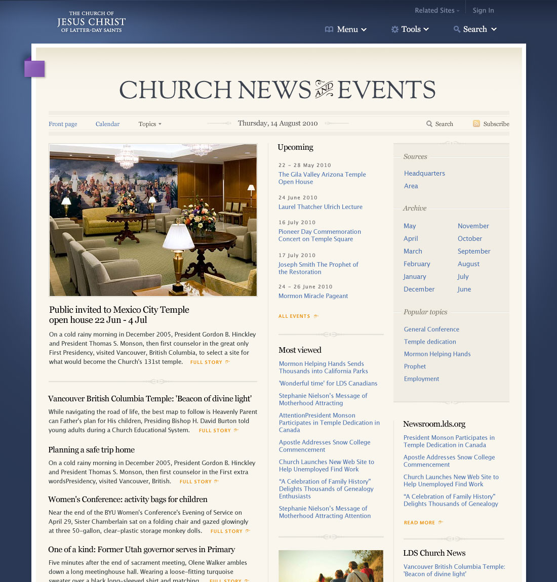
This is a preview of the front page of the news and events section coming in the new lds.org. It will be up on the beta site in the next few weeks. It will provide an aggregate of articles and new content being published on the site and by official Church news services.
posted by
wade
on Wednesday, Jun 16, 2010
“ticky-techie tactics”
My favorite (and also alliterative) quote from Mark Hurst
in his most recent Good Experience newsletter, outlining
three overlooked lessons about the iPad.
(He and Rob Foster appear to be very much on the same page…)
posted by
ted
on Tuesday, Apr 06, 2010
“Great ideas can’t be tested.
Only mediocre ideas can be tested.”
Legendary advertising icon George Lois, from the t-shirt series
The Ten Commandments of George Lois.
posted by
jason
on Tuesday, Mar 30, 2010
