design archives
“It’s really hard to design products by focus groups. A lot of times, people don’t know what they want until you show it to them.”
Steve Jobs, Business Week, May 25, 1998 (via)
posted by
gilbert
on Wednesday, Jan 10, 2007
“There’s a storm brewing in designland. A backlash is gathering momentum, and what’s more, some of its chief dissidents are design’s leading lights” – an interesting read from Core77
posted by
john
on Wednesday, Jan 03, 2007
Lessons in interaction design can come from the most unlikely sources—your four year old daughter who has just lost a tooth, for example.
She had been wiggling her first loose tooth for a few days, and it finally came out last night. When telling my wife what she expected under her pillow in return for her tooth, she said in fine alliterative fashion, “I want dollars and diamonds. Cause I’m a girl.” The interaction design lesson? Know your audience and what they want and expect.
The tooth fairy, however, apparently has budget constraints. Supply of lost teeth is high and constantly being replenished, while demand for spare organically grown teeth is quite low. So the tooth fairy did not in fact deliver diamonds nor dollars last night, but rather two shiny quarters. What do we learn for interaction design? Customer requirements must be weighed against budget and timeline; quality design is just one of the elements of a successful project.
Finally, though she did not get what she explicitly asked for, my daughter was thrilled with her silvery coins. You see, “diamonds and dollars” were probably just the words she used to convey her desire for “something shiny and spendable”. Those weren’t her words, but it’s what she meant by them. The interaction design lesson: Customers do not always know what they need, or even what they mean by what they say. It’s our job to take requirements, clarify them, push back to the simplest design that meets those requirements—not to play the Yes-Man to our client.
Thank you, Tooth Fairy, and we’ll see you again soon.
(More design insights from the next visit of the Tooth Fairy…)
posted by
ted
on Wednesday, Jan 03, 2007
Here’s a great sampling of beautiful Iranian Typography via mezzoblue. This kind of stuff really makes you realize that there is little difference between words and pictures.
posted by
john
on Wednesday, Dec 13, 2006
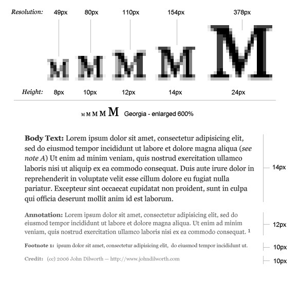
There are plenty of good reasons for making your text type small as long as you don’t compromise the readability and resolution. That said, I’d like to suggest that you make your small type just a little bit bigger.
Small, readable type is not bad
Designers are known for their love affair with tiny type, and there’s no doubt about it, when viewing a design as a whole, small text type can look better on screen than big type.
It appears to look better because a block of type at small sizes becomes texture instead of individual words. We don’t have to read textures, we just visually soak them in. This is important because words are pictures, and if you can control the texture of the type while maintaining readability, you can use type to aid communication on many different levels. This is known as “typographic color” and is a very important part of any design project.
There are many things you can do to make small type more readable. Adjust the contrast, increase the leading (line-height), give it a bit more word spacing, etc..
Small type (a bit bigger) is better
There are 3 important reasons to make your text type just a little-bit bigger, readability, resolution, and hierarchy.
Readability
You might be able to read tiny type, but there are people who can’t. I recently corrected my nearsightedness with lasik surgery and find that I prefer having the type just a bit bigger. I’m getting all too tired of using CMD+ to make the fonts bigger in Firefox. Spare your readers that extra effort — I can’t recall a time I’ve intentionally made the type smaller.
Resolution
The smaller you make your type, the fewer pixels you are using to make up the details of each character. The smaller you make your type, the less it looks like the type designer intended it to look. There are pixel fonts that help out here a bit, but in any case, the bitmap versions of these fonts are trying to imitate the true nature of the character, and they just can’t do it with out more pixels.
The difference between 12 and 10 pixel type is not just 2 pixels, the difference in resolution is 34 total pixels which equates to a 38% difference. That’s right, 10px type has potentially 38% less resolution than 12px type. Sure you can still make out the words, but you’ve eliminated all the subtleties of hundreds of years of typographic design elements that were put there to make things easier to read.
Typographic Hierarchy
This is probably the most overlooked reason for making your type bigger. If you’ve carefully designed your content’s typography and you’ve made it as small as you can while retaining readability and resolution, you should still make it bigger.
When designing for the web, especially for dynamic content, make sure you leave room for the addition of type that may need to be a little bit smaller.
Annotations, captions, credits, and footnotes all require typographic distinction. You may not want a caption to be exactly the same size as your body copy, and differentiating with color and typeface at small sizes may not produce the desired effect.
If readability, and resolution aren’t enough to convince you, don’t deny yourself the flexibility of being able to go just a bit smaller and still retain the integrity of your design.
posted by
john
on Wednesday, Dec 13, 2006
Make Your Small Type a Little Bit Bigger – this diagram shows the loss of resolution in small type, and the need to make your text type a little bit bigger in order to accommodate type that should be a little bit smaller.
posted by
john
on Wednesday, Dec 13, 2006
“People use a Dell. They are an Apple.”
Seth Godin writes about Brand as mythology
posted by
john
on Tuesday, Dec 12, 2006
“Not only can we tap into users’ existing learned behavior, we can actively train users to see our software as intuitive.”
Game design blog Lost Garden, in Building fun into your software designs
posted by
jason
on Monday, Dec 11, 2006
Luke W throws a 1-2 punch with Packaging Design for Web-based Products over at Digital (you get to work with Gilbert Lee?!) Web and The Complexity of Simplicity at the very purple UX Matters. Read them or die.
posted by
jason
on Tuesday, Dec 05, 2006
“I believe the hard part of building software to be the specification, design, and testing of this conceptual construct, not the labor of representing it and testing the fidelity of the representation”
Frederick P. Brooks, in 1987’s ‘No Silver Bullet’, as quoted by Joel on Software
posted by
jason
on Tuesday, Dec 05, 2006
Take a moment to check out Adobe’s new color theme generator, Kuler. Very nice.
posted by
john
on Monday, Dec 04, 2006
Nice article from Jakob Nielsen comparing and contrasting Progressive and Staged Disclosure as ways to manage complexity and keep things simple for most of your users most of the time. But honestly Jakob—take it easy on the bold text!
posted by
ted
on Monday, Dec 04, 2006
The Type Trust has some great unique typefaces at reasonable prices. The quality and style of their fonts remind me a little bit of Emigre and T26.
Of special note: an upcoming typeface by one of the Type Trust designers.
posted by
john
on Friday, Dec 01, 2006

Winter has some great design inspiration…
posted by
ted
on Friday, Dec 01, 2006
Regardless of what you think of Jakob Nielsen’s site design, when Jakob talks, a lot of people in the HCI community listen. His latest AlertBox identifies what he calls three stages of the digital divide: the Economic Divide, the Usability Divide, and the Empowerment Divide. I think we can agree that economics, usability, and user empowerment are all issues on today’s web… but are they all really “divides,” and are they really coming in “stages”?
Aside from the self-serving use of his AlertBox to push the Nielsen Norman Group’s various reports (which are nevertheless often useful and in my opinion reasonably priced), I’ve got some nitpicks with this characterization.
First let’s identify the non-issue: The Economic Divide. It’s real, but as Nielsen points out it is shrinking fast in the developing world as PC costs come down. Nielsen cites a $379 Dell system, well within reach for most American families. Businesses and governments are both working to lower costs even more so that people in impoverished countries have a chance to join in (see all the hoopla about the $100 Computer Project for instance).
So far I agree with Nielsen. Having money makes a difference in gaining access to technology, though this divide is rapidly shrinking. (Hopefully we on the design side won’t erase these gains by bloating sites and software that are intended for the masses, making them unusable for lower end machines and slower networks. No, Jason, I’m not critiquing your post on bigger downloads, since you’ve got an audience on the higher end of technology.)
But then we come to his Second Stage, the Usability Divide. This he describes as “far worse than the economic divide” because most computers remain “so complicated that many people couldn’t use a computer even if they got one for free.” I don’t argue the point that usability is a problem. But for a problem to be a “divide” it must be an issue of “haves” and “have nots”; some people must “have usability” and others must “not have usability.”
Forgive an old English major, but what Nielsen describes is not a usability divide; we’re all plagued with the poor usability on the desktop and on the web. Don’t get me wrong—usability is a barrier to entry for people without experience or education, and we in the industry should lower that barrier. But the fact is that everybody needs (or at least wants) better usability, and not just the uneducated. This is not an issue that divides us. Furthermore, it’s been a problem for a long time; if it’s a stage, it’s been concurrent with the economic stage all along.
Similarly, Nielsen’s Third Stage, the Empowerment Divide, is neither a divide nor a stage. Nielsen states: “Even if computers and the Internet were extraordinarily easy to use, not everybody would make full use of the opportunities that such technology affords.” True enough. People don’t customize their homepage. They don’t sign up for blogs that they might be interested in. They use default services and applications they find on their desktops. They lurk on online communities without contributing. They don’t do a lot of things that we in our wisdom know would be good for them.
But where is the Divide? Are some people unfairly targetted? Are the oppressed masses really unempowered once everything is easy to use? Or is it really the Laziness Divide or the Don’t-Really-Care Divide or the Don’t-Have-Time-to-Optimize Divide? I myself am currently in this last camp; I have a brand new Macbook, chock full of usability and fabulous design, but my transition from my beloved tablet is slow, and not just because I used to work for Microsoft. (Did I just shoot my credibility?) Optimization and personalization and a switch to anything new takes time and energy, which are in short supply right now. It has a cost. Other things (namely my pregnant wife, my two projects about to launch, and my other kids) take precedence over learning a new (if incredibly desireable) OS.
So I guess at this point, if optimization is easy and obvious, there is still such a thing as personal choice, and people will choose to exercise it or not. That’s as it should be. It is not the job of the design or HCI or business community to force people to do good things for themselves. Provide sensible defaults, good value for the money, and a great experience out of the box, all based on sound design and usability principles.
And then to paraphrase Joseph Smith, who knew nothing about computers but a lot about choices, we can only let them govern themselves.
posted by
ted
on Tuesday, Nov 21, 2006
“They’re here to stay. They are verbatims. And yes, they’re REAL.”
Adverbatims
posted by
john
on Monday, Nov 20, 2006
“Only by being made to question our own beliefs can we prevent them from becoming dogma.”
Rob Swan, In Defense of Difficult Clients
posted by
ted
on Tuesday, Nov 14, 2006
For design inspiration Design Melt Down categorizes CSS web sites based on design style, color, and site type. A bit more deliberate than the run-of-the-mill CSS galleries.
posted by
john
on Wednesday, Nov 08, 2006
Looks like Motorola might have some brutal facts to face on their handset usability: Ease-of-use dogs Moto
That’s some pretty tough data on the very popular RAZR. Before anyone else gets comfortable, I’d be surprised if other handset manufacturers fare much better.
posted by
tadd
on Tuesday, Oct 31, 2006
“Before you look at new ways to redesign your Website or research your new marketing plan, make sure you actually have something to advertise. No fluff, no gimmicks, no tricks. Either you have an excellent church environment [or for most of us, an excellent product or service or idea to share] or you don’t.”
Sean Alsobrooks of Church Brilliance in Hello, Website
posted by
ted
on Tuesday, Oct 31, 2006