ted boren archives

I was pondering whether to replace an Options dialog with a beefier-than-normal dropdown this very morning, when up pops Jakob Nielsen’s latest Alertbox. In it he argues in favor of “navigational mega-dropdowns” like the one above. This surprised me, given his past disapproval of the simple kind.
But he says the beefier versions actually overcome the deficiencies of the simple ones. Worth a read. He discourages their use for more robust interactions, though at least one of the positive examples he cites (Office-style ribbons) is used for a simple interaction like selecting a style, not just purely for navigation. So… hopefully that gives me the wiggle room I need to justify my “Options” mega-dropdown…
What do you think? Have you seen success with this kind of thing? Especially for more than basic navigation?
posted by
ted
on Monday, Mar 23, 2009

Google’s logo today for the first day of spring is also a tribute to one of my 2-year old’s favorite books, The Very Hungry Caterpillar by Eric Carle. Love it! (Apparently, it’s also the book’s 40th birthday. It wears its age very well.)
posted by
ted
on Friday, Mar 20, 2009

Bea-utiful Flickr set from Bea Rigby’s sabbatical in Bolivia and Peru. I like the thumbnails as a set almost as much as the individual photos.
We missed you Bea— welcome back!
posted by
ted
on Wednesday, Mar 11, 2009
“Because design problems are so multi-dimensional they are also highly interactive… . It is the very interconnectedness of all [of the relevant] factors which is the essence of design problems, rather than the isolated factors themselves. In this respect designing is like devising a crossword. Change the letters of one word and several other words will need altering necessitating even further changes… .
If there was one single characteristic which could be used to identify good designers it is the ability to integrate and combine.”
Bryan Lawson, in How Designers Think, which I am now finally getting back to finishing. I am encountering this almost every day now. Tweak the background, up the contrast of the text. Up the contrast of the text, fix the associated icon to match. Fix that icon, tweak this icon to better distinguish it. Etc., etc., etc.
posted by
ted
on Tuesday, Mar 10, 2009
Nothing groundshakingly new here, but good reminders on how to optimize your links for search engines. (By Gyutae Park, via LDS Media Talk).
posted by
ted
on Thursday, Mar 05, 2009
case study
In October, I attended a session by Jeff Patton at UIE13 on doing user experience work in agile environments. I found it extremely helpful in understanding how to improve the process on my current team. I have not yet “arrived,” but the principles learned there have had an actual impact on my processes, as opposed to the “feels good but what do I do now” impression you sometimes get from conferences.
In a “re-print” from last August on UIE’s newsletter, Jeff outlines 12 principles for UX in an agile environment. Here’s a summary of the points in his article (originally broken into part 1 and part 2), with notes on how I have applied these principles to my current project:
- Drive: UX practitioners are part of the customer or product owner team.
This one has been part of my philosophy for many years, but it was good to get some validation. I work with a “product manager” to discover and confirm requirements, meet with end users to see how the product will actually be used, and in other ways act as a proxy owner. The product manager has the final say, but the interaction design role has significant input and is the dev team’s interface to product management.
- Research, model, and design up front—but only just enough.
I found in my current project that cartoons, spare wireframes, etc. that run the breadth of the product, but don’t dive to the pixel really helped the team focus at the right level of granularity. Before I was stuck with two extremes—research and prototype everything completely before the 8 month project kicked off, or research prototype only the next 6 week dev cycle. Allowing myself to cover the whole product, but mostly at a “bare requirements” level struck the right balance.
- Chunk your design work.
Organizing and helping product management prioritize the work has been one of the things I do that product management has most valued in my current project. It has allowed us to stage the development in such a way that we can begin to develop, deploy, and test coherent bundles of functionality with end users—before the project end date is so close that changes become too expensive.
- Use parallel track development to work ahead and follow behind.
I am researching and developing one or two cycles ahead of development, while also tailing the team’s current development to make sure it’s implemented as planned. It’s sometimes hard to stay a full cycle ahead, but it’s made easier by the forethought given in #2 above.
- Buy design time with complex engineering stories.
In my case, we front-loaded the project with security work, dev & QA environment set-up, and API work that required little or no UI. This gave me a chance to get ahead without the team getting behind as a whole.
- Cultivate a user validation group for use for continuous user validation.
While I’ve been able to test with several user groups so far as we’ve gone along, I don’t yet have this in place. The strong study participant pool at Microsoft (and people hired to manage and recruit from it) is one of the things I miss most about not working there anymore. (Ellen Gasca, this one’s for you!)
- Schedule continuous user research in a separate track from development.
Again—would love to… but not there yet.
- Leverage user time for multiple activities.
When testing, I gather artifacts, ask if there are important tasks we haven’t covered in the test, and so forth. While I have face-time with end users, I try to make the most of it.
- Use RITE to iterate UI before development.
I’m not sure Jeff’s description of RITE in his article does it justice, so I’ll wax a little more verbose. RITE testing rests on the premise that it is better to remove “big rocks” after a few participants hit them than to watch participant after participant bang their heads against the same problems. Fix the big problems as soon as they are apparent, then test the solution with the next participants. In other words, by the end of the test, you are validating solutions instead of finding problems.
Michael Medlock and his team at the Games division of Microsoft coined the term RITE (Rapid Iterative Testing and Evaluation), codifying a pre-existing but ill-defined practice. RITE makes usability testing more impactful, and reduces the risk of introducing new problems when fixing others. On my current project, I have done RITE studies using paper prototypes before development began (as Jeff suggests above) as well as in a dev environment after a chunk of functionality was working. It works in both cases as long as the dev team can turn around changes quickly. A key is making sure to trying to fix only issues that have a clear cause, a clear solution, and a small price tag. Bigger or more complex problems will still have to wait till after your test is done.
If you haven’t tried it, read the original article and then give it a shot.
- Prototype in low fidelity.
I actually prefer Jeff’s quote of Bill Buxton for this principle: “The idea of high fidelity and low fidelity in prototypes is silly. As far as I’m concerned there’s only right fidelity and wrong fidelity.” Amen. It depends on skills sets, the level of interaction being modeled, the amount of time you have, and a dozen other factors.
For my current project, I am prototyping first with Balsamic Mockups for the high level pre-project design phase in #2 above, and using clickable image maps (basically a Fireworks png with hotspots added in Dreamweaver), heavily annotated for most interaction details. (I give Balsamic Mockups only 2 or 3 stars by the way; very easy to get something up there fast, but very limited set of representations. If they could just add some simple line and shape drawing tools…)
For other projects I have developed the HTML and CSS myself. For certain aspects of testing I’ve used paper prototypes of screenshots supplemented with sticky notes; it all depends.
- Treat prototype as specification.
In other words, don’t over-document, a classic agile principle. Some would argue that the prototype plus a discussion should replace all documentation. But I find that a well-annotated prototype saves QA a lot of pain and makes it easier to both “work ahead and follow behind” (#4 above). Otherwise it’s difficult to keep track of the details of what the team is currently developing compared to what you are researching and prototyping for the upcoming cycle. Also, there comes a time when updating the prototype becomes a waste of time; the QA says, “I’m finding problem X.” The designer says, “You’re right; we should use solution Y.” And the developer just fixes it. You only have to update the prototype if there is a risk that somebody down the line will have missed the conversation and not know what’s going on.
- Become a design facilitator.
While I haven’t yet moved into full-scale participatory design with users, I have done contextual inquiry with key users lately. I also I meet twice a week to review design ideas and confirm requirements with the product manager, and once a week with the dev team or at least the leads to review the designs, get input, and make refinements. As a group, we get it right more often than I would on my own. I am not just throwing designs over the wall at our developers.
Jeff finishes his article with two choice observations from Jim Highsmith, one of the original proponents of agile development.
Someone once said to him, “We can’t seem to finish anything on time. How do we build software and finish sooner?” Jim responded, “Start sooner.”
Later someone complained to Jim about “getting all this software built on time.” Jim answered, “Build less software.”
Getting interaction designers involved early is one way of “starting sooner”; the whole project runs faster and smoother if we have broken the ground first. And as co-owners with product management, we should be constantly looking for ways to “build less software”, to simplify, to prioritize.
Thanks Jeff, for summarizing some great agile principles to design by.
posted by
ted
on Tuesday, Mar 03, 2009

NPR ran an interesting article on sculptor Daniel French’s design of the Lincoln Memorial. The study above is included in the accompanying photo gallery.
It was interesting in particular to note how the design changed as construction began, and the artist could see how the sculpture would interact with the building and lighting. He determined that the scale was all wrong, so the 10 foot sculpture became 19 feet tall and raised on a platform besides. The natural lighting was augmented by internal lighting to offset a spooky effect caused by light from the reflecting pool casting upward shadows off of Abe’s angular cheekbones, kind of like a little kid with a flashlight below his chin on Halloween. (In reviewing the article, I see that these details are covered only in the audio version.)
Great design lessons here—your design lives in a context that is external to it, and you’d better understand that context thoroughly. Also, like it or not, sometimes you can’t understand that context until you view it “in the wild.”
posted by
ted
on Tuesday, Feb 24, 2009

The latest video on the Mormon Messages channel on YouTube is entitled “Create,” by President Dieter F. Uchtdorf. He says, “The desire to create is one of the deepest yearnings of the human soul…. The more you trust and rely on the Spirit, the greater your capacity to create.”
As an aside, I like the Mormon Messages idea. But I hate the fact that a YouTube implementation carries along with it the baggage of “related videos” and “promoted videos” over which viewers and video creators have no control. (That’s why I linked to the Mormon Messages profile page above, rather than to the main YouTube page that will host this specific clip permanently. Otherwise you get a bunch of random, sometimes antagonistic garbage juxtaposed with the inspiring message you intended to highlight.)
I wish YouTube would allow video creators at least a little control over the types of “related” and “promoted” videos that appear, in order to keep messages that are actually unrelated or even antithetical from diluting the message.
posted by
ted
on Monday, Feb 23, 2009

Firescope is a free Firefox add-on from Sitepoint that puts a Reference tab into Firebug. This tab gives an overview of the level of browser support for a selected element and any styles applied to it, plus a link to more information on Sitepoint about elements and attributes. Looks very handy for troubleshooting… Download took about 3 seconds, plus a re-start of Firefox.
posted by
ted
on Wednesday, Feb 18, 2009

I gotta get my 15 year old one of these target alarm clocks… “In Quick Shot mode you have to pull off five perfect shots within 3 minutes. Time mode is a battle for speed each morning to see how quickly you can wake up, react, and blast the target away.” Hopefully after that he’ll be too alert to get back to sleep!
posted by
ted
on Monday, Feb 16, 2009
“Three fourths of 2008 were spent working on this project. I loved every minute of it deeply.”
Comment by Michelle as I was looking over all the great work the team has posted in advance of our second annual design review. The name of her project: “Jetta Robin Barber”. Congratulations on hitting your delivery date! (Loved the project description and photos Michelle!)
posted by
ted
on Friday, Feb 06, 2009
Accessible Gadgets. From radio devices for the deaf and blind, to videophones, to GPS devices for the blind (no, not for in-car use, silly), this NPR article reviews some of the leading edge technologies to serve those with disabilities. Hopefully some of it is actually past the “concept stage” and becomes actually affordable… (The link above also includes an interview with Stevie Wonder on all this stuff… )
posted by
ted
on Friday, Jan 30, 2009
The strange history of lorem ipsum — a radio piece by PRI on our favorite dummy text. Looks like “Lorem” is actually a shortened form of “Dolorem” (pain) caused by a copyist looking for dummy text starting at the top of a page containing the second half of a hyphenated word within a Latin passage by Cicero. Dizzy yet?
posted by
ted
on Wednesday, Jan 28, 2009
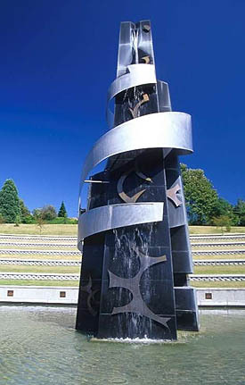
Sculpture at the Martin Luther King, Jr. Memorial Park in Seattle.
When we lived in Seattle, we would usually go to this park on Martin Luther King Day to honor this great man and talk to our kids about what he stood for. I Have Dream must stand as one of the greatest and most inspiring speeches ever.
posted by
ted
on Monday, Jan 19, 2009
“
“No fair! You get to come here every week?”
“I want to live here…”
“Wow. Woah! WOOOW!!!”
”
Top three quotes from my kids at the Draper Temple Open House tonight, from my 9 year old, 4 year old, and 2 year old respectively. The final quote was especially memorable because it was pronounced quite loudly in the Celestial Room, a sacred space where silence or whispers are the norm. But somehow I think God smiled and accepted the compliment.
Less important, but maybe more to the purpose of this blog, the design of the building was wonderful. It is striking from the outside, but it was the interior that shone brightest. I loved the reintroduction of murals into the ordinance rooms, something I have always appreciated about the Salt Lake Temple. I also thought the Celestial Room was wonderful. The room is so much taller than it is wide in either direction that your eye is almost inexorably drawn up to the gorgeous chandelier and then to heaven.
Reservations are still available; come see for yourself. Everyone is welcome, member or not.
posted by
ted
on Saturday, Jan 17, 2009
The Friend magazine has some nice new online features. My younger kids had a great time with the coloring pages a few days ago. Also some audio features and an online gallery for pictures submitted by kids. (Nice to see them in a little larger format than what’s feasible in the printed magazine!)
posted by
ted
on Thursday, Jan 15, 2009
Today in a large team meeting, one of the presenters read the following quote from the October 2008 issue of the Church’s international magazine, The Liahona:
”A Pipe Into a Well of Pure Water”
I am deeply grateful for the great work you have done with LDS.org. Permission to own and access Church materials is extremely limited in our area. Having access to the scriptures and Church materials over the Internet is like having our own pipe into a well of pure waters. Please know that your efforts make a very real difference in the daily lives of our members. What a miracle it is for them to have our Heavenly Father’s message in their own languages.
~Name withheld
This made a couple of deep impressions on me. First, it made me very grateful to live in an area where “permission to own and access” religious materials is not limited, and where my name does not have to be witheld for expressing my beliefs.
Second, it drove home the importance of our internationalization efforts, to bring our message “to every kindred, tongue, and people.”
Lastly, while our group has on occasion talked about being “temple builders” of a sort—creating sacred spaces where people can reflect, or be inspired, or do a good work—I hadn’t ever considered myself a plumber. But what could be a nobler vocation than building “a pipe into a well of pure waters” so that the spiritually thirsty can drink?
posted by
ted
on Tuesday, Jan 13, 2009
case study
Here in Northtemple Land, as in many parts of the United States, we’ve received slightly more than our fair share of precipitation in the last week. I have a long driveway to deal with and no snow blower (something I may need to remedy this year with Grandma’s Christmas check). The combination of heavy snow and a long driveway has resulted in an inordinate amount of time spent outside, with nothing to do but shovel and think.
What I’ve learned: Shovel smart, shovel soon, and shovel often. And what’s more, I think this applies to design as well as driveways, and maybe to any problem-solving effort.
First, let’s define some terms. When engaged in snow-shoveling, the stuff I’m trying to clear out is of course snow. What I’d rather be doing is building a snow fort or sitting inside under a warm blanket on the couch, reading that new book I’ve gotten for Christmas.
When I’m engaged in designing or building software, the stuff I’m trying to clear out is a messy combination of poorly understood requirements, technical problems to surmount, and depending on where I am in the product life-cycle, bugs. What I’d rather be doing is visual and interaction design of the “fun parts” of the system, not requirements gathering, trouble-shooting, or designing the more mundane stuff.
Lesson #1: Shovel soon—before anybody walks on the driveway or worse, drives down it. Often this is inconvenient. You or your spouse may have to stay in the car while the other clears an initial path. Your kids might have to clear the way before they head to the park, sleds in tow. But make sure you shovel before you travel; otherwise, you will have packed snow to deal with. And not just for today, but potentially for weeks and weeks, because once it’s packed, the results will be in your way until it melts or you buy a jackhammer. It’s uneven, slick, and hard to shovel. It also can also interfere with your ability to clear adjacent areas.
In design terms, make sure you uncover and understand the real needs before you design anything, and that you design those basics before anybody builds anything. Otherwise some less important or ill-understood requirement gets implemented first. Or you let loose a developer with a sense of aesthetics that doesn’t match the product vision or user needs, or any number of other problems intrude. Once code is laid down it is much harder to change the design—even if it is the wrong code. I’ve seen too many instances of “this is simple, it doesn’t need Design” turn into “oh, I hadn’t thought of that, but I guess we’ll just stick with what we’ve got, since it’s already built.”
Shovel first, travel second.
Lesson #2: Shovel smart—clear an initial, full-length path before attacking the full width of the problem. On my long driveway at least, I find it a good strategy to clear myself two long paths the full-length of the driveway, an axle-width apart. This gives me a clear path to drive on, even if I don’t accomplish anything else. If I decide to clear the rest of the driveway, it also gives me a clear place to stand without getting too wet, without slipping, and most importantly, without packing the snow under my feet.
In design terms, this means I should figure out what that initial path looks like. What is the bare minimum that can be delivered in the product and still have it meet the core requirements, even if there are other rough spots or missing bells and whistles? Figure out those requirements first, then design and build a bare-bones system to meet those requirements. You will probably have a good idea of other requirements and how they should be implemented, but don’t fully design or build it yet. Make sure you can just get the vehicle down the driveway before you worry about whether you can pop a wheely or perform other fancy maneuvers. (This one is so important that I’ll probably write up more specific design experiences with this later on. Thanks to Jeff Patton and UIE 13 for this one. And of course 37Signals and anybody else involved in actually agile development.)
Lesson #3: Shovel often—before problems get too thick to deal with. There are parts of my driveway where the snow can drift up to 3 or 4 feet unless I keep it cleared after each snowfall. If I get behind, maybe sidetracked by the fun stuff I’d rather be doing, I always pay for it in the long run when a 30 minute job takes 3 hours instead. The additional time is often longer than the sum of the time it would have taken had I just gotten to it earlier and more often. Why? Because the snow packs itself down, partially melts and re-freezes, and a single shovelful gets too heavy to lift, because of both increased volume and density.
So too in design. Combining Lessons 1 and 2, you have to keep the path clear—especially the essential path— not just once, but throughout the process. As design progresses to the important but not crucial features, it’s easy to forget that getting out of the driveway is paramount. As you clear the way for those secondary but still-important features, take care that you don’t accidentally make the main path harder to negotiate.
Also, as implementation begins, don’t allow bugs to accumulate for too long before getting them cleared out. This applies not just to the big important show-stoppers, but also the accumulation of lots of small issues. While each flake or bug might be inconsequential on its own, there comes a point when the whole product can bog down under the collective weight of a mediocre implementation of a great idea. The workarounds developers use to get around these problems end up breaking themselves when the bug is fixed; the developer leaves and the next guy can’t figure out the workaround; the user puts up with the problem long enough that they resist the fix, on the grounds that “it’s different.”
Some of this is just bound to happen on any project; bug-free code doesn’t exist, not at a reasonable cost on a reasonable-sized project anyway. But try to limit it to the non-essential periphery, and don’t allow it to clutter the key functions necessary for success.
* * *
Those reading only for design’s sake can stop here.
For those who want to carry this a step further into “real life”, I find that these principles apply to lots of other situations:
- Interpersonal communication. Remove obstacles to communication early and often. “Clearing the air” once is not enough to maintain important relationships!
- Repentance. Sorry to go religious on you, but the longer moral and ethical lapses fester unresolved, the harder they are to clear them up. Much better to straighten up and fly right now, than to let a matter of a few degrees of error land you in dangerous and unfamiliar ground later on.
- And I bet you can think of others and tell me about them via the comment link below :-)
The End.
posted by
ted
on Friday, Dec 26, 2008

LDS Maps is now live in 16 languages! The site should detect the browser language automatically, or if you want to poke around, there is a language selector at the bottom of the screen. Most of the work for this minor release was on the dev and translation teams, but props are due to Aaron Barker for helping define a new standard for language selection and Rob Foster for the soon-to-be-universal (?) language icon.
Update: Larry Richman provides some additional info about the release, including how to link to a specific language-version of the site.
posted by
ted
on Monday, Dec 22, 2008
“If anyone is interested, I’m thinking of doing a type poster representing the Church Office Building, set in Hobo and Impact. $200? Let me know if ur interested.”
Jason, commenting on the fact that Cameron’s magnificent letterpress poster of the Salt Lake Temple has sold out after only a couple of days.
posted by
ted
on Monday, Dec 22, 2008


