The LDSTech Conference will be held in Riverton, Utah on March 28, 29, and 30. We have several design projects this year that need your help. You can also attend remotely.
If you’re interested in signing up to help with a project, you’ll need to complete a quick bio, skill match and community involvement agreement.
Something that has been on my mind lately as we have been interviewing for interaction designers – there are a lot of designers out there, but not enough thinkers.
This article from Eric Karjaluoto @ smashLab is an exceptional read on what we should be trying to achieve with the title of “designer”.
The point I’m trying to make is that there’s a lot of opportunity for us—as thinkers—to provide great value to our clients. We won’t, however, do this if we continue to hold tightly on to the notion of designers being purely visual practitioners. I’ve said this before, and I’ll say it again: design is about facilitating outcomes, not selecting colors. Selection fromPut Down Your Crayons, April 11th, 2011, Eric Karjaluoto
“No product is an island. A product is more than the product. It is a cohesive, integrated set of experiences. Think through all of the stages of a product or service – from initial intentions through final reflections, from first usage to help, service, and maintenance. Make them all work together seamlessly. That’s systems thinking.”
Beyond the initial PC vs. Mac appearance of this article, it really points to how a great design team has worked to unify a company and present a unified message. No matter the size of your company, I think every design team struggles with focusing the company in one direction, especially when there are many people contributing to product development and content.
Found this accessibility plug in for Firefox by Jon Gunderson, Illinois Center for Information Accessibility. It includes information on your site’s navigation, scripting, styles; generates reports for accessibility and validation based on FAE rules and W3C standards; and provides keyboard enhancements to test binding.
Netvibes just released several upgrades to their personal dashboard product.
Several of the features I’ve enjoyed have been the customizable layout into various grid-based designs. They’ve also improved their thickbox modal experience by allowing the modal box to be draggable, and making the 70% opaque background become lighter if I need to view changes made in real time to the screen behind the modal (specifically when I’m choosing my template design). I also enjoy their RSS feed reader and inline podcast for both audio and video.
Thanks to Cameron for the tip on Netvibes earlier this year, it’s been a great resource.
Today I give up Twitter and go back to reading blogs, talking with friends, and paying attention to life instead of tweeting it.
What I have gained from using Twitter? An amazing ability to write brusquely in 140 characters or less, and a timeline of my thoughts and experiences over the last six months. The timeline is the most valuable, but being brusque is a skill I’d rather not have.
I appreciated both 37Signals and Jeff Croft’s take on why and why not to use Photoshop or a visual comp as part of a prototype workflow. Jeff makes excellent points that established patterns, maturity of a product, and the client’s ability to visualize all influence the need for or lack of a high fidelity visual prototype.
I cleaned out my garage this weekend and looked through a few of my old college text books (why do we save these?). I found a book on art criticism and another on operant conditioning – reflective of my degree in Art Education and Psychology. I was reminded of the article on Coroflot about how interaction designers never start out that way and often find their way into the career. I come from varied fields having little to do with computers, but everything to do with human behavior. I’m a people watcher – portrait artist and behavior analyst, to be specific. So I’ve studied a bit on human anatomy, facial features, gestures, and a little more on operant conditioning of behavior. It’s the latter I’d like to elaborate on because it has an influential place in manipulating the user experience by using our designs to encourage or discourage user behaviors.
Thanks for coming back. Now you know a little more about positive and negative reinforcement, punishment, and extinction. (If you still think punishment means spanking, go back and read the definition.) So the idea is that you can increase a behavior by giving something (positive) or decrease behavior by not giving something (negative). A real life example is I will give my child a half hour of Wii time if she cleans her room. The cleaning behavior increases because of positive reinforcement.* An interaction design example: the user clicks on a part of the screen that is designed to look like a metal button and they get the desired results. The behavior of clicking on metal looking pixels will increase because it provided positive reinforcement. A user could learn to use a different colored button, but consistency across a site or OS will help them learn the behavior faster. An example of negative reinforcement: a user scrolls down to hide the top 15% of the web page which is covered in banner ads. The behavior of hiding the top of a screen is increased because it stops the flashing banner ads. And last, an example of extinction: a web site has broken links. The user will stop clicking on links when nothing occurs. Because neither positive or negative reinforcement occurs (nothing happens), the user’s action of clicking on links eventually stops – and they will most likely leave the site.
This is a little more technical than I planned, but the concept is that we teach our users to use technology through providing rewards for their behavior. If not careful, we can also teach incorrect behavior by reinforcing the wrong actions, leaving our web sites and applications a messy user experience. If our users are struggling with a part of a web application, identifying how the design is teaching behavior through operant conditioning can help us resolve and correct the user experience.
Human behavior is an amazing thing that evolves as our environment changes. As interaction designers, we play an important part in teaching the users to evolve and adapt to new experiences.
Or maybe our users are teaching us...
*A bit friendlier approach to operant conditioning of your children: Love and Logic
Over the last six months, my eyes have gone through an interesting transformation. In October, I went under the laser and with Lasiks, changed my eyesight to 20/15. Prior to the surgery, I had several tests on my eyes, including a “super” dilation. I’m not sure of the medical term, but it meant my eyes stayed dilated for 48 hours, I had a big headache, and really cool farsightedness (hyperopia). I could completely relate to my parents and their trombone reading style. Anything closer than my out stretched hand was completely out of focus.
Before surgery, I had 20/60 vision. Not bad, but I couldn’t read an alarm clock in the dark without squinting. I’ve been near-sighted most of my life and for most of my computer work, I could work without glasses. I also preferred smaller fonts and tiny details.
During my 48 hours of super dilation, being a bit of a computer addict, I kept working. I noticed an interesting effect with my eye sight and the computer screen. The text on most sites was hard to read, so I increased the browser text size. On most sites, this was enough to make it legible. There were a few sites that were almost impossible to read, no matter how large I made the fonts. These were pages that had a dark background and light text. The words danced on the pages and had a halo around them. I confirmed this situation with my eye doctor who has “real” farsightedness. I had never realized how difficult it was to read white text on a black or dark background. It was enough to make me angry because of dizziness I felt after looking at the text.
That experience was six months ago, and today, I went in for a follow up appointment. I received the lucky experience of receiving the dreaded eye drops and the uncontrolled dilation of my eyes. I decided to use the situation to my advantage and perform a vision test on websites.
To confirm my initial thoughts and to add a few:
Light text on a dark background is incredibly hard to read. Hard enough to read that I avoided sites with large areas of light text on dark backgrounds.
Black text on a white background is readable, but jarring.
Black text on a slightly gray or lightly colored background is the easiest to read.
San serif fonts make it difficult to distinguish between rows of text because the slim vertical lines of the letters don’t seem to end.
Serif fonts are the easiest to read, and give an ending point to each letter, allowing smaller text to be legible to strained eyes.
Fonts smaller than 14px are difficult to read.
Overall, Web 2.0 is not fun to look at.
If you’d like to perform this test on your own, and you’ve never suffered from hyperopia or age-distinguishing presbyopia, I suggest you ask your doctor on your next eye exam for dilation drops and do some web surfing shortly after. This useful test has real world application in web design, as most of the population over 40 has some form of farsightedness, or other eye disorders such as macular degeneration. In making our sites truly accessible, visual markup is as important to consider as our html markup.
~ For my next article, I plan on writing about the effects of Lasik surgery: being intolerable of LCD TVs less than 1080p, and any type of monitor except for a glossy Mac Cinema Display.
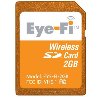
This WI-FI SD camera memory card looks cool. It connects to your computer or website, such as Flickr, Picasa, Facebook or Snapfish, through wi-fi, and automatically uploads your photos when within range of your authorized networks.