In the beginning there was NCSA Mosaic, and Mosaic called itself NCSA_Mosaic/2.0 (Windows 3.1), and Mosaic displayed pictures along with text, and there was much rejoicing.
Yesterday Google Chrome was the 10th most used browser on lds.org, today (so far) it is 7th. Mind you that is only a few hundred visitors, but still fairly impressive for a < 24 hr old browser.
For no prize what-so-ever… name the other 6 browsers that are beating it… in order please =)
Ubiquity is an “experiment into connecting the Web with language in an attempt to find new user interfaces that could make it possible for everyone to do common Web tasks more quickly and easily.”
It is very alpha stage level stuff, but pretty cool looking.
So Microsoft finally released the coolness that is Photosynth that we saw in video form over a year ago (yes, Microsoft has the occasional cool thing).
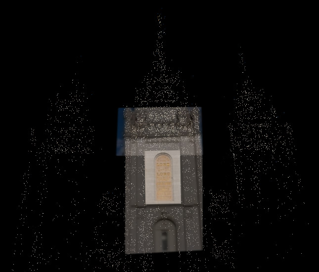
The first thought that came to mind was how cool it would be to have the LDS Temples done as “synths” so that anyone could see all the details of the beautiful architecture.
So I did a quick attempt of Manti and Timpanogos temples from pictures I had taken over the years… which came out so-so.
This morning I dropped by temple square and took quite a few pics of the temple for the specific purpose of using them in a synth. This time the result is much better.
Presenting Salt Lake City Temple Photosynth attempt #1. It has 3 large groupings and then a few rogue photos. Not bad for the first try =)
I’m by no means hinting at any project, but how cool would it be to have official synths of all the temples so we can dive in and see the details from across the globe. Hopefully they will get the social aspect going, and the community can provide that coolness.
(windows only browser plugin required. parallels won’t work. they say bootcamp and vmware 2.02beta will work, but I had no luck with vmware. didn’t try bootcamp. ymmv)
All this talk of Rock Band playing and shirts reminded me of the Guitar Hero spoof shirts… Band Geek Hero. My favorite being the Cowbell Hero (above) which is a great nod to the hillarious SNL skit with Christopher Walken.
What is going on here? The most commonly used button on a browsers toolbar was made a little easier to see and given a bigger hit area. Probably good for the general population who uses it often (alt/apple-left arrow people!). For those that don’t like it luckily you can easily make it the same size as the rest of the buttons. (/me waits for John to come throw something at him)
An alternative, rotary traffic signal designed by Charles Marshall in 1936 & used from the 1940s through 1970s in Australia. 2 rotors pointing at colored sections denote whether traffic in either direction should proceed, prepare, or stop. Based on a traditional clock face, it has the advantage of clearly showing signal phase timing.
It’s downfall was apparently the ability to cope with changing traffic loads. Wikipedia Entry
A question came up today that when floated around to a few people we didn’t have a good answer, so I thought I’d toss it out to the interwebs. Is there any rhyme or reason for the separation of CSS properties that start with FONT and those that start with TEXT (including a few others like color, line-height, etc). For reference here is W3C’s pages on font and text.
Since we don’t have a method for easy response at the moment I’ve created a NorthTemple twitter account to provide your abbreviated responses. As an aside, several of the team here have started twittering recently, and so we may use this NorthTemple account for other stuff in the future. Follow us and wait in eager anticipation for that future day =)
Here’s what you do when you’re a student in the Belgian town of Leuven. You don a blue plastic poncho alongside 1,499 undergraduates, all standing in line at very long table, on which is placed a bottle of Diet Coke and a Mento. On the count of three, having raised your hood, you drop the mint in the plastic bottle, and 1,500 fountains of sticky drink erupt simultaneously.
What makes a design "Googley"? A small team gathered to discuss these questions and define the Googley Design Principles:
1. Focus on people—their lives, their work, their dreams.
2. Every millisecond counts.
3. Simplicity is powerful.
4. Engage beginners and attract experts.
5. Dare to innovate.
6. Design for the world.
7. Plan for today’s and tomorrow’s business.
8. Delight the eye without distracting the mind.
9. Be worthy of people’s trust.
10. Add a human touch.
A worthy set of goals. Check the article for links to more in-depth descriptions of each.
Orbital Sacrament shares some information of what I am guessing was the first sacrament service held in space by an LDS astronaut. Which also reminded me of the trials that needed to be overcome for the first Islamic astronaut. With questions like How does an Islamic astronaut face Mecca in orbit? and How many times a day to pray if they orbit the earth every 90 minutes and are supposed to pray and sunrise and sunset (in addition to other times).
It’s interesting how the experience of religion changes as you enter new frontiers. Similar questions are currently being asked on our team, as we wonder how to make the relatively new frontier of the internet a religious experience.
“A lot of you are going to have to make decisions above your level. Make the best decision that you can with the information that’s available to you at the time, and above all, do the right thing”
Lee Scott, CEO of Wal-Mart, in a memo to area managers in preparation for hurricane Katrina
When Rob Foster, Todd Ericksen and I went to Washington DC to attend a Tufte Conference we made a point to stop by the Vietnam Vetrans Memorial . It was just after twighlight and there were only soft lights illuminating the memorial. The dim lighting set the mood and invited you to look harder to see the detail of the names. You couldn’t help but to find yourself touching the stone and feeling the names of the fallen as you walked along side the memorial. We went to several other monuments and memorials and heard tourists chattering and even yelling, and then to come to this one and hear only the wind in the trees was a very spiritual experience. You were compelled to whisper and show reverence for the hallowed ground on which you walked. As close to the feeling of the temple as I have felt outside of those walls.
This memory was brought about by a link from Cameron to the Interactive Vietnam Veterans Memorial A great way to interact with the wall and see the actual names if you aren’t able to see them in person. The ability to add photos and stories to each name is another great method of making it a very personal experience.