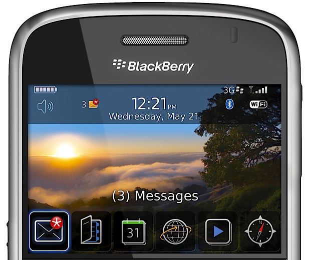
When I first started reading this review of the Blackberry Bold, the home screen UI looked promising. But the further you scroll down and the deeper you dive into the OS, it starts feeling too much like File System Land.
It’s almost as if the designers only had time to make a good-looking home screen so that the phone would sell well (and meet the obligatory marketing requirement of looking iPhone-ish). The rest of the phone’s OS ungracefully degrades the further you explore.
(via Jared).