web design archives
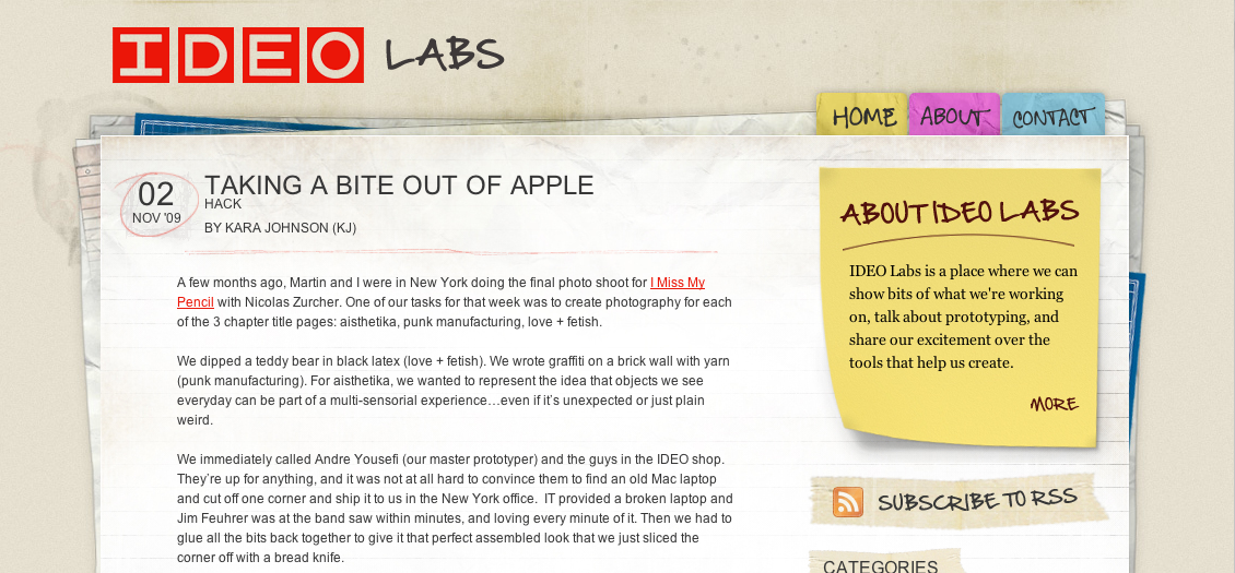
Going the hand-drawn route on a blog design can easily end up looking played out and cliche, but IDEO pulls it off admirably and authentically on labs.ideo.com, their collection of tests and prototypes.
posted by
jason
5 hours ago
·
0 comments
Naz Hamid has a new article on Weightshift called Stuck between an App and a Website, and its a thoughtful look at designing to the project and the humans using it:
Get to know your client well, do the research, do what is right, not what is now and trendy and because Apple/Facebook/xxxxxx does it. Listen, communicate, design well.
It’s all too easy to get wrapped up in a look, a design or an aesthetic. The science fiction of my youth left those impressions but ultimately, it was the human element — the stories that mattered the most, that left the lasting impression. In the end, we’re all trying to make machines more rounded, more curved, more organic, more human.
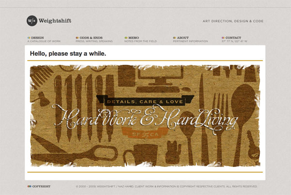
By the way, I hadn’t seen Naz’s new design but it’s equally impressive:
posted by
jason
on Thursday, Nov 12, 2009
·
0 comments
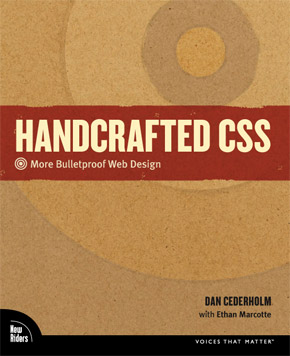
Handcrafted CSS, a new book from Dan Cederholm and Ethan Marcotte, looks to add to the smallish pile of useful CSS books on my shelf. The others are in a large pile in the community library at work.
“This book will show how craftsmanship can be applied to flexible, bulletproof, highly efficient and adaptable interfaces that make up a solid user experience.”
posted by
jason
on Thursday, Jul 02, 2009
·
0 comments
Interesting examples today of innovative internet advertising. In this economy™, companies are finding ad space on the cheap, and Vitamin Water and Apple have two similar but very different approaches:
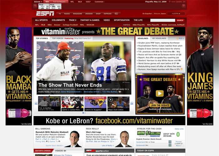
On ESPN.com today, Vitamin Water has 5 ad spaces for their “Great Debate” campaign pitting LeBron against Kobe. Too bad these ads aren’t as good as their TV ads (“You can’t check him!”), and not nearly as awesome as Nike’s Jim Henson throw-back (“whooo!”). Each ad by itself looks fine, but the 4 ads together overwhelm the page and is uninspired and tired, if not annoying.
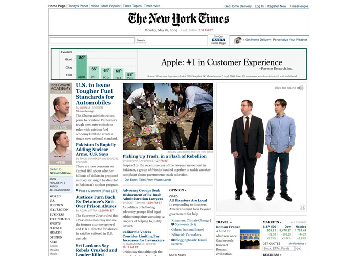
Apple, on the other hand, took over NYTimes.com today with a totally different approach. They’ve got 3 ad spaces here, and each ad interacts with each other. The PC and Mac characters point up to the bar graph, and the Hair Growth Academy guys start pitching in with their opinions mid-way. They’re clearly having some fun here, and employing a much more interesting and engaging experience.
Apple clearly takes the cake on this one, and my guess is they’ll see a better return on those ad dollars as viewers’ eyes stay on their ads for longer and that little Apple logo gets burned ever so deeper into our brain matter.
posted by
jason
on Monday, May 18, 2009
·
3 comments
You can imagine the client meeting for the mint.com redesign – “I want gobs of web 2.0. No! Web 3.0! Shadows, fadients, reflections, bevels, handwriting, huge fonts, huger buttons, glassy Apple effects, the brightest green and the brightest orange you can find, and plants everywhere.”
This is about as hard to look at as Blinksale..
posted by
jason
on Wednesday, Aug 20, 2008
·
3 comments