usability archives
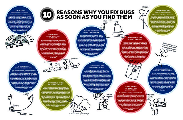
Great poster on why you fix bugs as soon as you find them. Many of the same cases could be made for usability issues (at least the medium to large sized ones). Here’s the short list (via uTest):
- Unfixed bugs camouflage other bugs. (So true for usability issues! This is why I love RITE testing and similar methods; you get those Big Rocks out of the way so you can discover others.)
- Unfixed bugs suggest quality isn’t important. (Amen, especially with regards to usability issues.)
- Discussing unfixed bugs is a waste of time.
- Unfixed bugs lead to duplicate effort.
- Unfixed bugs lead to unreliable metrics.
- Unfixed bugs distract the entire team.
- Unfixed bugs hinder short-notice releases.
- Unfixed bugs lead to inaccurate estimates.
- Fixing familiar code is easier than unfamiliar code.
- Fixing a bug today costs less than tomorrow. (Very true.)
posted by
ted
on Wednesday, Sep 19, 2012
Good post from Jakob Nielsen on the relationship between SEO and usability, including ways in which they complement each other and the ways in which they conflict.
posted by
ted
on Monday, Aug 13, 2012
“Subjecting all designs to usability studies before shipping is prudent risk-management.
Radical innovation is extremely risky. Yes, you might invent the next iPhone. But you’re more likely to invent the next Newton.”
From a good article by Jakob Nielsen on
A/B Testing, Usability Engineering, Radical Innovation: What Pays Best?
The contrasts between A/B testing, usability activities, and just turning a genius loose to invent the next Big Thing are clearly drawn. I would temper Nielsen’s position a bit by emphasizing his final point—that there’s no reason you have to pick just one. If you have a genius on staff, subjecting his ideas to A/B testing and usability testing will only polish his or her brilliance to an even greater sheen…
posted by
ted
on Monday, Mar 26, 2012
“A king brings six men into a dark building. They cannot see anything. The king says to them, “I have bought this animal from the wild lands to the East. It is called an elephant.” “What is an elephant?” the men ask. The king says, “Feel the elephant and describe it to me.” The man who feels a leg says the elephant is like a pillar, the one who feels the tail says the elephant is like a rope, the one who feels the trunk says the elephant is like a tree branch, the one who feels the ear says the elephant is like a hand fan, the one who feels the belly says the elephant is like a wall, and the one who feels the tusk says the elephant is like a solid pipe. “You are all correct”, says the king, “You are each feeling just a part of the elephant.”
“The story of the elephant reminds me of the different view of design that people of different backgrounds, education, and experience have. A visual designer approaches UX design from one point of view, the interaction designer from another, and the programmer from yet another. It can be helpful to understand and even experience the part of the elephant that others are experiencing.” Enjoy™ The Psychologist’s View of UX Design by Susan Weinschenk on UX Magazine.
posted by
shane
on Tuesday, Jan 31, 2012
“Myth #3: People don’t scroll.”
From an interesting “UX Myths” site. Some interesting user experience myths de-bunked. Thanks Christian Smith for pointing me to this!
posted by
ted
on Friday, Nov 04, 2011
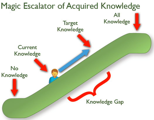
I liked this illustration of the Knowledge Gap in Jared Spool’s recent newsletter article, Riding the Magic Escalator of Acquired Knowledge.
To close the knowledge gap, you either ride the user up the escalator via training, or you bring the target knowledge down the escalator by simplifying the design. Those are really your two main choices, 99% of the time!
posted by
ted
on Wednesday, Nov 02, 2011
Although short on details (he wants you to buy his full reports after all), this post summarizing an updated e-commerce usability report by Nielsen/Norman is worth reading if you’re building an e-commerce site.
posted by
ted
on Monday, Oct 24, 2011
“Swipe Ambiguity”
One of several common usability problems for iPad apps identified in usability testing by Jakob Nielsen in an interesting article on the
current state of iPad usability.
posted by
ted
on Monday, May 23, 2011
“It’s much harder to understand complicated information when you’re reading through a peephole.”
From Jakob Nielsen’s latest Alertbox on research into
comprehension on iPhone-sized displays.
His conclusion: “[W]ebsites … must design a separate mobile version for optimal usability. Specifically, complicated content should be rewritten to be shorter, with secondary information deferred to subsidiary pages.”
Worth the maintenance of separate content for desktop and mobile?
posted by
ted
on Monday, Feb 28, 2011
“It’s harder to give money away than it is to spend money buying stuff.”
According to Jakob Nielsen, it’s harder for people to donate to charity online than it is to make a purchase. Sad! According to his study, the top priority for non-profits should be presenting information more clearly—not focusing on trendy (but secondary) things such as social media.
posted by
ted
on Wednesday, Feb 16, 2011
I read Jakob Nielsen’s latest AlertBox today, and wondered—even with all his caveats—what planet he lives on, suggesting that content sites should quiz their users to improve retention. I can’t see that working for any but a fraction of educational and maybe training sites. Unless maybe it was a user-initiated link: “Want to remember this tomorrow? Take a quiz!” (Which most users would probably ignore or find annoying anyway.)
On the up-side, the article contained a link to an older and more palatable article on the first rule of usability: Don’t listen to users (meaning watch and listen, don’t just listen).
posted by
ted
on Monday, Jan 31, 2011
“Parallel & Iterative Design + Competitive Testing = High Usability”
Title equation from an interesting
article on usability and design process.
Nielsen makes it sound so easy…
posted by
ted
on Wednesday, Jan 19, 2011
An interesting Top 10 List of Research-Based Usability Findings from Jeff Sauro’s “Measuring Usability” site. (I like his site, though I think it somewhat overemphasizes the importance of objective measures. So much of what is learned during a usability test, especially regarding potential solutions, is subjective and not easily measured…)
posted by
ted
on Thursday, Jan 06, 2011
“Too much data has the same outcome as no data at all—except that it costs more and causes a headache.”
Via Mark Hurst’s Twitter feed
posted by
ted
on Monday, Nov 29, 2010
“Users pay attention to information-carrying images that show content that’s relevant to the task at hand. And users ignore purely decorative images that don’t add real content to the page. So much fluff — of which there’s too much already on the Web.”
Some great advice in the latest Alertbox on using photos and images effectively, especially in e-commerce.
posted by
ted
on Monday, Nov 01, 2010
In helping a colleague prepare for a usability test, I found Jared Spool’s latest UIE Tips article timely and totally in synch with my own experience. Three questions NOT to ask during user research (paraphrased and embellished):
- Don’t ask about the future. People don’t know what they would really do in hypothetical scenarios—even highly realistic ones.
- Don’t ask how they’d design a feature. They either won’t know or won’t have good rationale. They know their process and to a degree they know their problems—focus on that, not their proposed solutions.
- Don’t provide a (supposed) answer to your own question (“Did you do X because Y?”). Leading questions may be a staple of political pollsters, but they yield biased results. Don’t feed them reasons out of your own experience or assumptions—let them provide their own.
Thanks Jared—good reminders.
posted by
ted
on Wednesday, Aug 18, 2010
“A snappy user experience beats a glamorous one.”
From a nice revamp of Nielsen’s classic “3 response time limits” article that has proved very useful to me over the years in determining how fast is “fast enough,” and how to communicate progress effectively in different situations.
posted by
ted
on Monday, Jun 21, 2010
““Good” beats “Innovative” nearly every time. An obsession with innovation leads executives down the wrong path. Just trying to be good would be a smarter focus.”
Former colleague Scott Berkun in a recent Business Week article. Before objecting, read the whole article; innovation will happen, but not if that is the primary goal. The primary goal should be to produce Something Good. If innovation is required to get there—great! But if there are tried and true solutions, all the better.
posted by
ted
on Tuesday, Feb 23, 2010
A friend of mine hunts down dangerous fugitives for a living.
Bill is a U.S. Marshall and is very good at what he does. A few months ago, I saw him walking with a bandage on his hand. Curious, I asked him what happened. Maybe he cut it doing some yard work? “Well”, he said, ”I had to smash through a car window to pull out a fugitive who tried to escape.” “Really?” I replied, “The worst injuries I get at work are a slight cramp in my pinky from too many mouse clicks.”
Bill and I go to the range every once in a while and shoot the breeze (no pun intended). I enjoy picking his brain as I like the Chuck Norris-esque of his job and am sure he pulls out a roundhouse kick from time to time. I asked him about what helps track these guys down. Without giving detail, he explained the importance of research. Bill spends more time learning about the fugitive, their habits, family, their likes, dislikes, etc… than anything. The more information he has, the easier it is to anticipate their next move.
How many times have you had a client approach you with the need for X as soon as possible and it needs to “look good”? Only after asking them who will be using it and what the site’s objectives are do they even think about it.
The problem is, they want results and research doesn’t come in a shiny package. It is up to us as designers to persuade them to understand its importance… even if that means a roundhouse kick (Disclaimer: Don’t actually roundhouse kick a client, however, if needs be, show a picture of yourself doing a roundhouse kick so they understand).
With that said, Bill could spend all his time researching and never catch anyone if he never went to work. The key is to gather a comfortable amount of user research so we have a clear focus before embarking on our designs.
Just like Bill and his hopeless fugitives, the more we know about our users, the better we can anticipate their next move.
posted by
jbarron
on Thursday, Feb 11, 2010
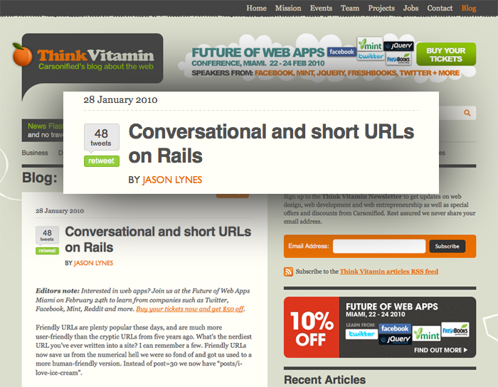
Props to our own Jason Lynes for his article over at Think Vitamin. Love the idea of conversational URLs and even though I don’t speak Rails I got a good idea of what he did.
Nice work Jason!
posted by
aaron
on Friday, Jan 29, 2010