ui archives
“Usability problems usually fall into two categories; either it’s not clear how to do something, or something is too cumbersome to do. The latter is fixed by a better understanding of what the key tasks are, and the former is usually resolved by adding clarity. Often the best way to do this is through the writing of the interface.”
Des Traynor: “Writing an Interface” a post about a presentation he gave at Content Strategy in London (Sep. 5, 2011). If you have 25 minutes I highly recommend watching the presentation. Enjoy™
posted by
shane
on Monday, Jan 30, 2012
I was sitting in a meeting recently with several clients and we were discussing how to create a solution for a business need. You know the scenario. I was trying to extract understanding from the clients so I could design a solution. Have you ever started squirming when one of them goes up to the whiteboard and starts drawing little boxes and circles to create a user interface? Do you get that feeling in your gut that this person is trying to do your job and prescribe what you should create? We designers tend to get testy about that sort of thing. We want to ensure we maintain control of the design so that we can enforce quality. It’s a good desire, but the push and pull of client interaction can be distressing at times.
But for me, this meeting was a breeze. There was a tense discussion between the clients, and the complexity of the business rules they were discussing would make the IRS cower. The paint-like smell of whiteboard markers filled the room and there were scribbles of UI layouts strewn across six whiteboards. Me? I wanted to put my feet on the conference table. Everything was going quite well.
The designer-client interaction was working for me because our project team had established a strong UI framework for our app. As the clients were drawing visual constructs of functionality, they were using our widgets, patterns, and themes. They were comfortable enough with the UI framework that they could rely on it to represent their ideas—it made designing the solution much simpler. It was easier for me to decipher what they were attempting to explain because they were designing with the designers’ paintbrushes.
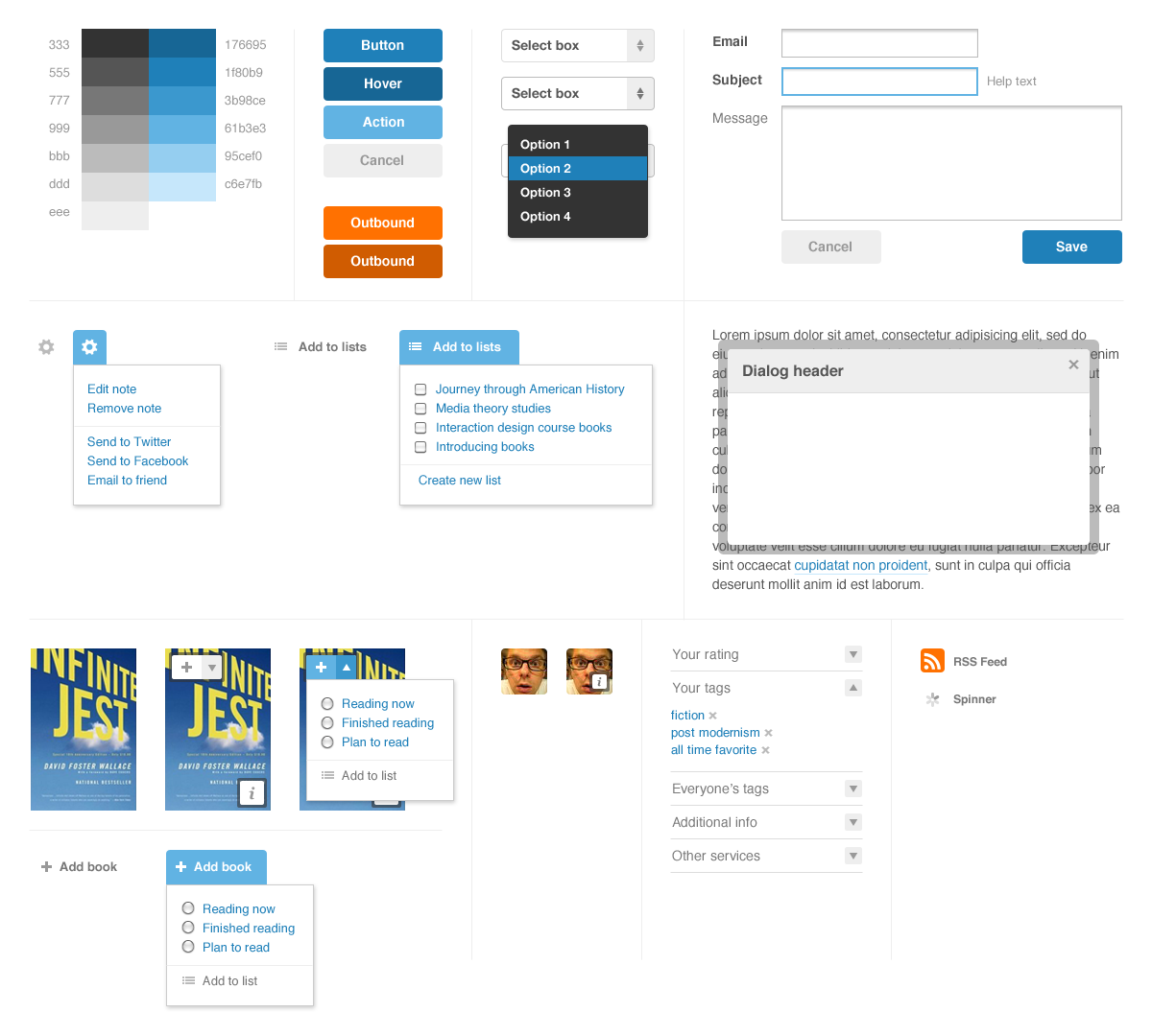
Trust me on this one. If your app is anything bigger than tiny, take the time to create a framework. Here are some pointers.
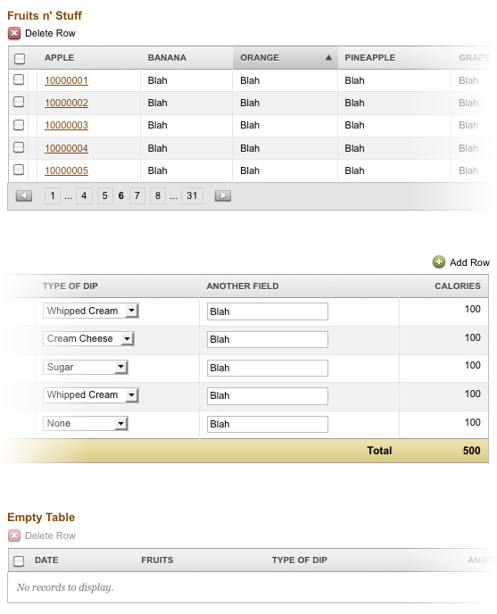
Create a separate page in your app that showcases constructs and patterns.
Here is part of ours that describes data table models (filled with dummy data, of course). Imagine that the title for each table was something like “Tables that Need X Functionality” and each would have example data to reinforce its intended use.
Hold your peeps to it.
If you’re collaborating with other designers, it’s critical for everyone to own and honor the frameworks. If you need to create an exception or an entirely new construct, run it by the team and do your best to reduce visual deviation. If you’re a small team, consider a weekly design review. If your team is larger, a daily design scrum may be necessary.
Share the framework with your client.
In time, the app you are building will help your clients recognize your design standards. But putting them all in one place gives them (and you) a library of possibilities. For us, our clients began to appreciate the consistency in the application, and became our allies in enforcing it. They began to crave uniformity in app-wide user interactions.
Just try it. Gosh.
This may just sound like more work and an extra chunk of code to manage, but rest assured that it will serve you well. The bigger your project gets, the more critical a framework is. This will reduce the subjectivity of your design discussions and give you something to hold to when a client wants to get crazy with a particular piece of functionality. This has served us well and I’ll continue to put my trust in UI frameworks.
posted by
clifton
on Thursday, Feb 04, 2010
case study
Interfaces are one of the principal sources from which a person learns about his or her work. That understanding gets turned into diagrams, charts, and maps that, whether accurate or not, come to define the work that person does each day.
posted by
davidlindes
on Monday, Feb 01, 2010
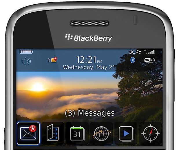
When I first started reading this review of the Blackberry Bold, the home screen UI looked promising. But the further you scroll down and the deeper you dive into the OS, it starts feeling too much like File System Land.
It’s almost as if the designers only had time to make a good-looking home screen so that the phone would sell well (and meet the obligatory marketing requirement of looking iPhone-ish). The rest of the phone’s OS ungracefully degrades the further you explore.
(via Jared).
posted by
clifton
on Friday, Aug 15, 2008

I love the new paper-clipped note that has been added to Backpack from 37signals. What a great way to bring the real world into the virtual world in a subtle yet appropriate way.
posted by
aaron
on Wednesday, Feb 13, 2008
Visit adobe.com today and receive a shocking surprise of a look that resembles more of a junk pile of web trends, then the website of an industry leader in digital design products. The purpose behind the redesign was to put more emphasis on the content rather than the UI, and work better on wider screens. Unfortunately, I believe the UI is so disgracefully designed it hinders the readability and usefulness of the content and becomes the primary focus.
Flash video headers engulf most of my 15” screen and I can’t see the content. On a 7 Mbps connection, the site slows down so much that the drop down menus are useless, until the center flash video has completely loaded and played. When I hover over the dropdown menus, I interact — unintentionally — with the flash content beneath the dropdown menu. I have such a hard time getting past the navigation, I can barely get to the content and I find myself closing the window rather than surfing any farther.
Coming back later, with the navigation cached, I get to the community pages for designers. My eyes are continually drawn to the empty gray space on the right and top. I have a hard time focusing on the article summaries squished to the left in a 783 pixel wide box, further confined into three columns, each 150 pixels wide. How in the world does this work better for wider screens? I can’t take the claustrophobia any longer and close the window again.
For a site that should be showcasing the best use of its own products, it fails miserably. Content can only emerge when the user interface is so well designed, it works silently without intruding rough edges or poorly aligned spaces into the experience.
posted by
emmy
on Friday, Dec 07, 2007
Do you know about Yahoo UI Grids yet? More on these later, but dude, sweetness.
posted by
jason
on Friday, Sep 08, 2006