case study
School Report Cards Have Unfortunately Become Like Executive Dashboards
Back in the day report cards were very simple to read. No more than eight boxes each with a letter grade. An ‘F’ meant you were grounded and an ‘A’ meant you could use it to your advantage in getting money or additional privileges from your parents. It was with great disappointment that I read the report card of my first grade son. Like most executive dashboards found today his assessment/report numbered over 80 key performance indicators (KPI’s) yet failed to provide clarity about how my son was doing. Read on to discover why my son passed but his report card failed.

Netvibes just released several upgrades to their personal dashboard product.
Several of the features I’ve enjoyed have been the customizable layout into various grid-based designs. They’ve also improved their thickbox modal experience by allowing the modal box to be draggable, and making the 70% opaque background become lighter if I need to view changes made in real time to the screen behind the modal (specifically when I’m choosing my template design). I also enjoy their RSS feed reader and inline podcast for both audio and video.
Thanks to Cameron for the tip on Netvibes earlier this year, it’s been a great resource.
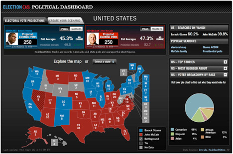
Yahoo!’s Political Dashboard provides users with a quick perspective of the current US presidential election polls.