color archives
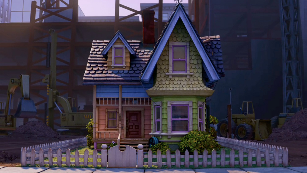
New trailer just out for Pixar’s new movie “Up.”
The color palette and texture in this new movie looks nothing short of gorgeous. I was so taken by the look of the trailer that I had to play it again just to find out what it was about. I also had to wipe a little drool from the corner of my mouth.
I’ve posted some screenshots of some of the more luxurious shots here. Just look at the texture on that kid’s uniform. Man, that’s nice
posted by
foster
on Thursday, Nov 20, 2008
·
2 comments
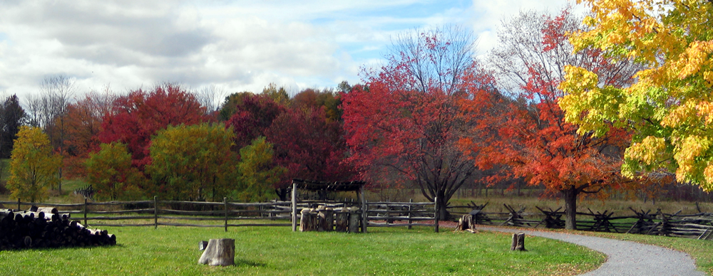
Path leading up to a grove of trees adjacent to the Smith Family Farm near Palmyra, New York, where Joseph Smith’s first vision occurred. Very quiet, very peaceful, very inspiring on multiple levels. A few days prior, at the UIE 13 Conference, Luke W encouraged us to use color combinations we found in nature. After leaving the grove, I told my wife that I had found a color palette I wanted to use someplace in my work here at the Church. Now I just need to find the opportunity…
posted by
ted
on Thursday, Nov 20, 2008
·
0 comments

Speaking of color, here’s a sweet Guide to Choosing Colors for Your Brand. The graph above was created by Dmitry at Usability Post using a new website called Cymbolism, which “attempts to quantify the association between colors and words.” Nice resources no matter what your color background.
posted by
jason
on Wednesday, Oct 01, 2008
·
0 comments
Looking for some inspiration today, and hoping you guys can help me out. I’m looking for websites that make extensive use of color. Non-white, full color websites that buck the NY Times or Apple (or Northtemple) clean but sterile style of black type on white background.
What are your favorite colorful sites?
posted by
jason
on Wednesday, Sep 24, 2008
·
9 comments
Test your color IQ by dragging and dropping some colors to arrange them by hue order.
I got a 16 (lower is better). I messed up a bit in the green to blue transition.
What’s your score?
posted by
aaron
on Tuesday, Sep 16, 2008
·
16 comments
“Nothing has no color”
Sam Grigg(s) during the color part of our design class today
posted by
aaron
on Friday, May 30, 2008
An interesting article discussing the relationship between language and the perception of color.
posted by
kaleb
on Wednesday, May 14, 2008
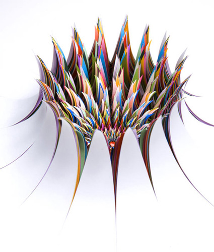
One of the many paper sculptures created by Jen Stark. Fridays need color.
posted by
kaleb
on Friday, Oct 19, 2007
For the color scheme challenged. Just pick your main color, then browse alternative palettes revolving around that color.
posted by
ted
on Monday, Jul 23, 2007

Gil pointed me to this cool write-up over at ColourLovers spotlighting the colors of the 2007 Grammy Award Winning Albums. Love the Chili Peppers, but those are all sweet schemes. Related: Adobe Kuler color scheume widget for OS X..
posted by
jason
on Wednesday, Apr 11, 2007
Meyer’s Color Blender is a nice little tool. Great for lightening or darkening a color, when blended with #fff or #000.
posted by
jason
on Friday, Sep 08, 2006
Color management in Photoshop CS2 on OSX. Good tips in the comments too. I’ve been struggling with this for a bit—just open up this site in Firefox and Safari and compare. Ah!
posted by
jason
on Thursday, Sep 07, 2006
“It is the spectrum, not the color, that makes color worth having, and it is the cycle, not the instant, that makes the day worth living.”
Unknown source, qtd by Richard Saul Wurman in Information Anxiety
posted by
ted
on Thursday, Aug 31, 2006