“Walmart didn’t pursue the question of what customers wanted. Instead, Walmart came up with the answer first, then asked customers to agree to it. [They] ignored customers while attempting to fool stakeholders into thinking that the strategy [was] customer-centered.”
FamilySearch.org is hiring Front-End Developers. We need highly skilled front-end developers who have a passion for creating delightful, useful and usable web experiences, a gift for writing clean, web standard front-end code, and a love for the work of the Lord. It that’s you, then ring our bell. Ring Bell
“The better search gets, the more dangerous it gets.”
Jakob Nielsen in an interesting article on how people’s lack of research skills hampers their ability to search effectively—despite or maybe even partially because of intelligent search engines. Highly relevant for me, as I’m working on a couple of search-related projects.
Jared Spool is giving a free presentation titled “Anatomy of a Design Decision” in three cities: Portland (April 13), Seattle (April 15), and Minneapolis (April 28). (Pre-registration is required, but free. Beware the maps, however—as a University of Washington alumnus, I noticed that the Seattle location is off by a few miles.)
Assuming this is a version of his presentation at UIE, this is worth your while if you’re in one of those areas. Here’s his summary: “The best designs come from not one, but hundreds of well-made decisions. The worst designs arise out of hundreds of poorly-made decisions. All that stands between you and a great design is the quality of your decisions. Where do they come from?”
FamilySearch.org is hiring! We’re looking for full-time Senior Designers and Freelance Web Designers. We’re the largest non-profit genealogy organization in the world. We want to help the world find their ancestors. Come help us do some good!
A little news. The design team working on FamilySearch.org is joining NorthTemple. We’re looking forward to contributing to the great NorthTemple content. Look for some new faces posting soon!
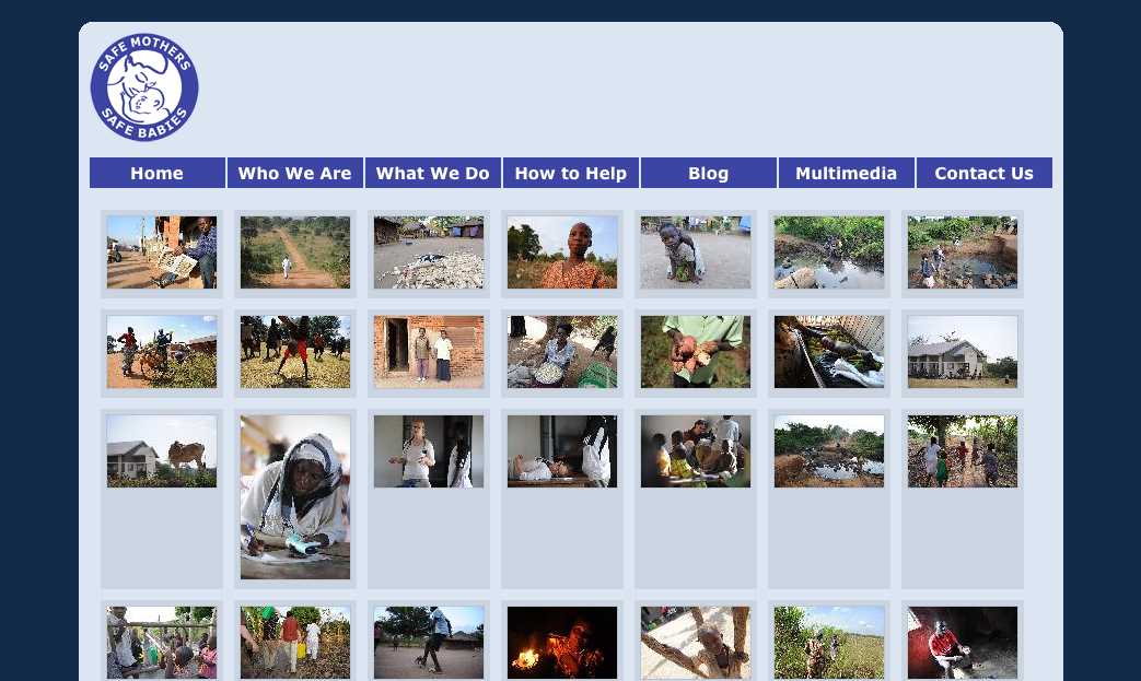
I was checking out a site referred to me by a friend at work: Safe Mothers, Safe Babies (SAFE). She said they needed some design help, so I thought I’d take a look. (You can contact them if you’re interested in helping out—looks like a great cause, helping mothers and babies in Uganda.)
As I browsed the site, there were clearly a lot of opportunities to spiff things up, but not that many that truly hindered understanding or use of the site. At least until I came to their multimedia gallery:
Interesting photos, but I am not sure what they are about. There are no labels on each photo to help me out, so I start looking for clues. At that point a new problem emerges. See it?
Seven nav links aligned pretty closely with seven columns of images. Without a closer examination, some folks might think that the nav links are related somehow to the content aligned beneath them—that they are column headings. Human beings are are meaning-makers, so we stretch and strain to figure out the relationship, to define a connection that isn’t really there. Confusion or at least a loss of time is the likely result. In worse cases, it might actually lead you to assume something that isn’t so—that the last column shows actual photos of the group’s headquarters or something, for example.
It struck me that this is a type of visual “tombstoning”—an unintentional (and often humorous) alignment of headings in newspaper or magazine layouts. Here’s an example from an About.com article on tombstoning:
Really? Dead Bugs Drink Wine? Were they dead before or after they drank it? Either way, that’s pretty interesting… but not what the authors or editors intended!
There’s obviously a lot more to say about The Principle of Proximity, but it’s good to keep in mind that:
It is not enough to group things that should be grouped.
You must also avoid grouping things that should not be grouped.
And if you’re interested in helping SAFE dig up and replace those visual tombstones, drop them a line—I’m sure they’d appreciate it!
I just finished an article by Jared Spool entitled Creating Great Design Principles: 6 Counter-intuitive Tests. It was a good read that took me back about sixteen months to the time we started a revision of the Church’s Online Store by defining 8 or 9 guiding principles to help us focus. The new store launched without fanfare last June, with a more public launch in September after some refinements were made. Those principles had a big impact on design decisions, how products were highlighted on the site, and how we measured success. So this article was of particular interest to me, and I wondered how our principles would stand up to Spool’s “counter-intuitive tests.”
“It’s much harder to understand complicated information when you’re reading through a peephole.”
From Jakob Nielsen’s latest Alertbox on research into comprehension on iPhone-sized displays. His conclusion: “[W]ebsites … must design a separate mobile version for optimal usability. Specifically, complicated content should be rewritten to be shorter, with secondary information deferred to subsidiary pages.” Worth the maintenance of separate content for desktop and mobile?
Check out this new online Encyclopedia of Interaction Design. The contributor list reads like a who’s who of design, information architecture, usability, and user experience gurus! Definitely going to be spending some time here…
“It’s harder to give money away than it is to spend money buying stuff.”
According to Jakob Nielsen, it’s harder for people to donate to charity online than it is to make a purchase. Sad! According to his study, the top priority for non-profits should be presenting information more clearly—not focusing on trendy (but secondary) things such as social media.
“Companies often spew about “customer relationship management” or “disruptive customer-led innovation” or any number of other impressive-sounding processes. But as often as not, what the customer wants is as simple as sitting down and listening for a minute.”
To balance my “don’t (just) listen” to customers post below, a great article by Mark Hurst on how to exceed low expectations by just listening for a change.
We’re hosting a get-together at SXSW on Sunday, March 13th from 6-8 PM. If you’ll be in Austin, we’d love to meet you. We’ll be offering a behind-the-scenes look at several applications supporting the LDS Church’s global operations and over 13 million members. The event is invite-only, so please contact us for more information or find one of us for an invitation.
I read Jakob Nielsen’s latest AlertBox today, and wondered—even with all his caveats—what planet he lives on, suggesting that content sites should quiz their users to improve retention. I can’t see that working for any but a fraction of educational and maybe training sites. Unless maybe it was a user-initiated link: “Want to remember this tomorrow? Take a quiz!” (Which most users would probably ignore or find annoying anyway.)
The Sartorialist is fashion blog run by blogger/photographer Scott Schumann out of New York. I like the “out of the box” thinking he has. The video touches on art, fashion and doing what you like. Awesome.