I have long wondered why those taking addresses require you to give your city and state. Whether it’s over the phone or through a web-form, why not just ask for the zip code, allow the computer to look up the city and state, and then simply confirm the result with the user?
I was pleased to experience such purchasing my new AppleTV a few minutes ago from apple.com.
“Edwin Land, inventor of the Polaroid camera, once said that his method of design was to start with a vision of what you want and then, one by one, remove the technical obstacles until you have it. I think that’s what Steve Jobs does. He starts with a vision rather than a list of features.”
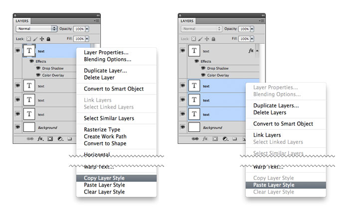
I have long appreciated the ability to copy layer styles by option + dragging them from one layer to another. For those like me that have also longed for the ability to copy layer styles to multiple layers, you are in luck—there is a way. Dragging the style is a shortcut for the copy/paste layer style option in the layer contextual menu and allows for the application of styles to multiple selected layers.
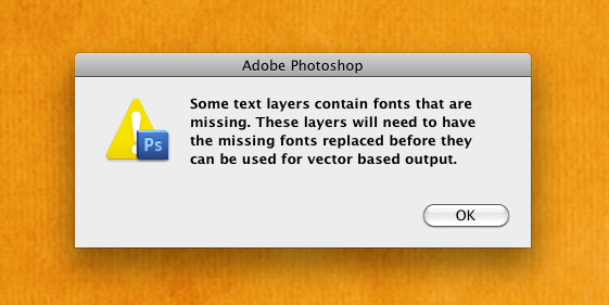
Working with a team of designers I’ve been getting this error a lot lately opening files in Photoshop. Digging through all the layers manually is a pain and on a few files I’ve not even been able to locate the offending text. Nic Johnson just made my day however pointing me towards the Replace All Missing Fonts feature under Type in the Layers menu.
“Design, stripped to its essence, can be defined as the human capacity to make our environment in ways without precedent in nature, to serve our needs, and give us meaning in our lives.”
The Interaction Framework (IxF) is the result of a collaboration between members of the Interaction Design Team in Church’s Information and Communication Systems Department. The goal of IxF is to make development and prototyping faster, to ensure best practices in UI design and ultimately to save sacred tithing funds and make the user experience better for the folks who use our apps. We are excited to formally announce this project and introduce you to some of the work we’ve been involved in.
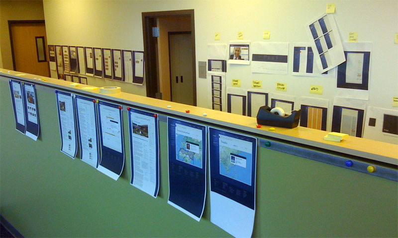
Here’s a glimpse of us at work. We meet each morning for a design review, printing out our work from the day before, and run it through the gauntlet. The team works together to ensure consistency and feeds off of each other’s ideas. The whole is indeed greater than the sum of any parts would could produce on our own. Once designs are flushed out and approved, they are moved out into the hallway for reference for us and for content and development teams after hand-off.
To the side of our meeting space, we have a row of desks with low dividers that allow of instantaneous and effective collaboration. Our developers and content teams are immediately down the hall and across the cubicle wall. Physical proximity, tactile, analog conversations and design explorations, and being surrounded by our product is crucial for a project of this scale.
Good article by Neven Morgan about designing icons and the various sizes required for iOS. I was especially interested in what he mentioned about resolution independence and how it’s not possible to have a single source file for an icon.
It continues to perplex me how so many basic interaction conventions did not make it onto the web. With each browser revision, we’re slowly improving experiences online, but so much of it is simply catch-up and not new innovation. Sure, it was born as a method for structuring and sharing documents, but once we started building things with it that involved interaction, why didn’t we at least start with what we knew thus far? Simple patterns designed decades earlier are slowly starting to show up on the internet but so many are still not even technologically possible.
It’s unfortunate because it limits the internet’s potential. By requiring experienced users to learn new behaviors, requiring users to deal with a sub-set of features, or lowering standards and expectations by providing new users with a sub-par experience, we are doing them a great disservice.
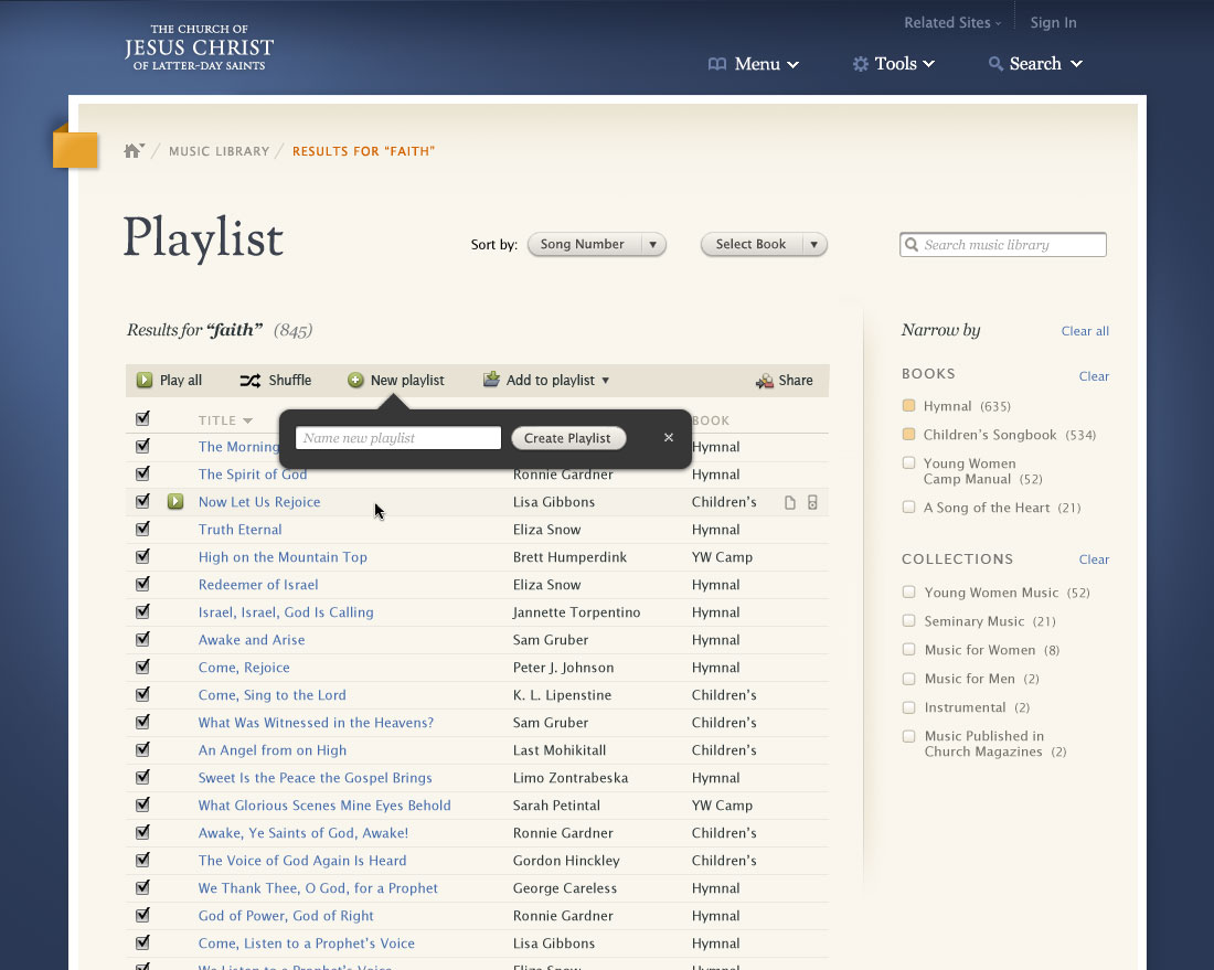
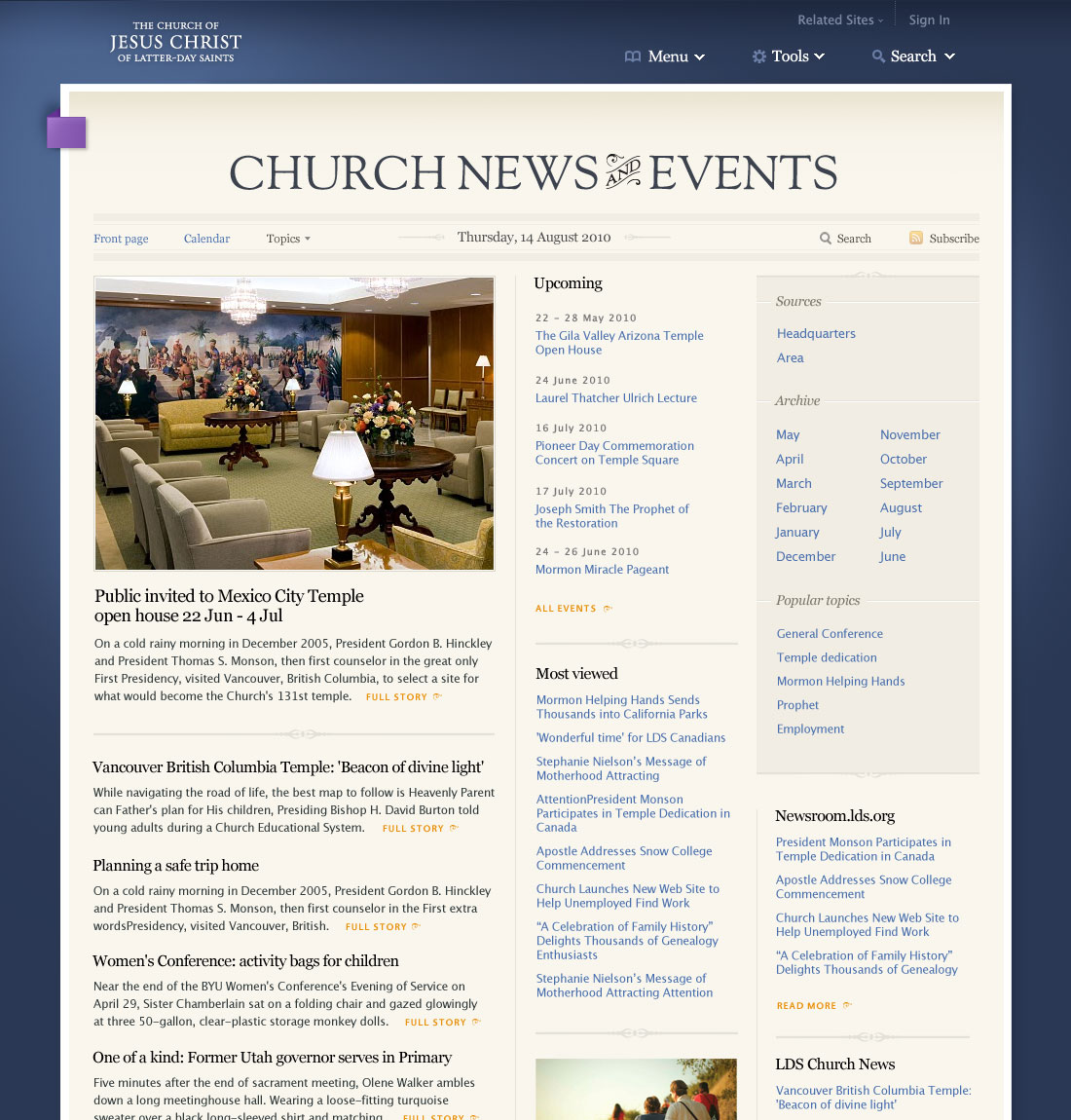
This is a preview of the front page of the news and events section coming in the new lds.org. It will be up on the beta site in the next few weeks. It will provide an aggregate of articles and new content being published on the site and by official Church news services.
“I used to think that, as a designer and a somewhat creative person, it was my calling to bring form to things I saw in my mind. In the creative act of making things, people would understand my thoughts and feelings through the work, in perfect translation. We would shape things with our hands based on notions of utility and delight, and provide them to others for repeated physical (and mental) consumption and use. If well-crafted, it would fulfill a clear human need.
“Now, I feel quite different. The act of form-giving is not a means to a clear end. Our senses continually map and remap in reaction to the elements that order our physical world, harmonizing those perceptions with the world we construct in our minds. Neither is more precise than the other, or ‘real’ in any standard sense of the word. Physical form and thought of form, messy, human interplay: yin and yang.”
In our quest to design simple, intuitive, and efficient things, we must be careful to not over-design. I have run into several examples recently where I believe the designer (or more often, the business employing them) is trying too hard—too hard to be everything, too hard to have too many options, too hard to up-sell, too hard to be original or innovative, too hard to be too simple—and has failed. A fine line is walked between questioning traditions and standards for irrelevance, age, or oversight, and respecting them for their tenure of existence. A delicate balance must be struck between production costs, competition, patents, marketing, aesthetics, work-flow, and usability. While we most often are not the one with the final say, I believe it’s a designer’s duty to satisfy a project’s many requirements simultaneously while diligently advocating usability—resisting and preventing the mistake of over-designing.
Adobe released an optional plug-in for Photoshop today that disables the multi-touch zoom and rotate features introduced with the new CS4 and unibody MacBook combination. While I find many of the new multi-touch gestures quite handy, I agree with John Nack that “on the latest systems (with the enormous trackpads), it can be too easy to zoom or rotate accidentally.” The most frustrating part though is there is no way to reorient the image back to zero degrees once you have rotated it. I am surprised that such an oversight made it to production. Honestly, if the rest of the Photoshop user-base rotate images as infrequently as I do, I feel safe in my assumption that the implementation of this feature was motivated more by marketing than research.
Refresh this page. Now do it again and this time note the moment that fifty-percent of the page is loaded. Got it? Do you know when it was? What about speed? Can you give me an idea how fast the page is loading? What if you were on a slow connection like the wifi I use on the bus to commute to work? Would you know if the page was loading fast or slow? Would you have an idea of how long you were going to have to wait? Should you switch to another tab and continue reading the news because it’s going to be a while?
If you were using Safari, you’d have an answer for me; other browsers leave you in the dark.
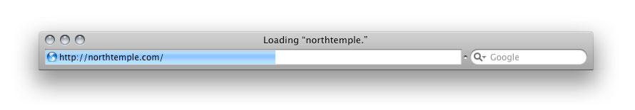
Well, at least that’s how it used to be (save Safari Mobile). Safari 4 Beta was released this morning and with it came a gaggle of exciting new features (including a Web Inspector and Console that can now hang with Firefox’s Firebug plugin). Unfortunately, Apple also removed one of Safari’s greatest features.
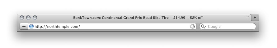
While the standard loading indicator for web browsers is a spinning icon, the great minds that designed Safari’s interface decided to innovate and instead take advantage of the functionless (after you have entered a URL and struck the return) address bar and animated a progress meter behind the text. Instead of a nearly useless icon that communicates little more than that the browser is running, Safari’s indicator simply and effectively let’s you know both how much has loaded and how fast it’s loading.
With Safari 3, the browser’s state is clear. With the requested site’s title prefixed by the word “Loading” at the top of the browser and the progress meter status indicator, the state of the browser and the action taking place is immediately obvious to the user. Even viewing this static screenshot, having not physically interacted with the browser and requested the page yourself, you are able to quickly and accurately discern this.
The state of Safari 4 Beta on the other hand is a mystery. I have requested northtemple.com but the browser still displays the title of the previous site. The only indicator that the new site is loading is the small animated “spinner” on the right side of the address bar. Both versions of Safari display the requested URL prefixed by the word “loading” in the Status Bar in the footer, but most users do not have this bar turned on.
Here’s to hoping that it’s absence is just an oversight in the beta.