Some cool insight from Campaign Monitor on their new office space. This part was particularly interesting:
“After software, the most important tool to a hacker is probably his office. Big companies think the function of office space is to express rank. But hackers use their offices for more than that: they use their office as a place to think in. And if you’re a technology company, their thoughts are your product. So making hackers work in a noisy, distracting environment is like having a paint factory where the air is full of soot.” —Paul Graham, Great Hackers
Every company I have ever worked for uses offices in conjunction with rank (which is fine) but I can definitely see how having a place to concentrate is important. But I’d trade an office for some open spaces with big whiteboards, lounges, games, and food. It’s no coincidence that nearly all my ideas that I would consider innovative have come when I wasn’t in the office (or even working).
“A by-product of sub-par design courses is that aspiring designers today see computers as the only truly necessary tool. On the contrary. By removing the computer from the creative process, you gain much more freedom when translating your thoughts.
You learned to draw before you learned how to use a computer. Why? Because it’s easier. It’s less restricting. And it’s more creative. You want a circle here? A stroke there? No problem. Just do it. Translating the same process to a computer requires unnecessary steps that hinder your creative flow.”
I was sitting in a meeting recently with several clients and we were discussing how to create a solution for a business need. You know the scenario. I was trying to extract understanding from the clients so I could design a solution. Have you ever started squirming when one of them goes up to the whiteboard and starts drawing little boxes and circles to create a user interface? Do you get that feeling in your gut that this person is trying to do your job and prescribe what you should create? We designers tend to get testy about that sort of thing. We want to ensure we maintain control of the design so that we can enforce quality. It’s a good desire, but the push and pull of client interaction can be distressing at times.
But for me, this meeting was a breeze. There was a tense discussion between the clients, and the complexity of the business rules they were discussing would make the IRS cower. The paint-like smell of whiteboard markers filled the room and there were scribbles of UI layouts strewn across six whiteboards. Me? I wanted to put my feet on the conference table. Everything was going quite well.
The designer-client interaction was working for me because our project team had established a strong UI framework for our app. As the clients were drawing visual constructs of functionality, they were using our widgets, patterns, and themes. They were comfortable enough with the UI framework that they could rely on it to represent their ideas—it made designing the solution much simpler. It was easier for me to decipher what they were attempting to explain because they were designing with the designers’ paintbrushes.
Trust me on this one. If your app is anything bigger than tiny, take the time to create a framework. Here are some pointers.
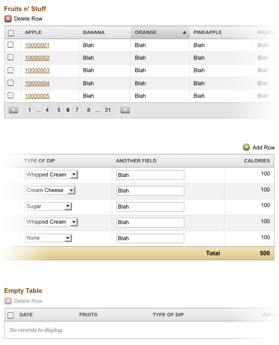
Create a separate page in your app that showcases constructs and patterns.
Here is part of ours that describes data table models (filled with dummy data, of course). Imagine that the title for each table was something like “Tables that Need X Functionality” and each would have example data to reinforce its intended use.
Hold your peeps to it.
If you’re collaborating with other designers, it’s critical for everyone to own and honor the frameworks. If you need to create an exception or an entirely new construct, run it by the team and do your best to reduce visual deviation. If you’re a small team, consider a weekly design review. If your team is larger, a daily design scrum may be necessary.
Share the framework with your client.
In time, the app you are building will help your clients recognize your design standards. But putting them all in one place gives them (and you) a library of possibilities. For us, our clients began to appreciate the consistency in the application, and became our allies in enforcing it. They began to crave uniformity in app-wide user interactions.
Just try it. Gosh.
This may just sound like more work and an extra chunk of code to manage, but rest assured that it will serve you well. The bigger your project gets, the more critical a framework is. This will reduce the subjectivity of your design discussions and give you something to hold to when a client wants to get crazy with a particular piece of functionality. This has served us well and I’ll continue to put my trust in UI frameworks.
Nic found this stellar logo today. I love it when logos have multiple visual interpretations that reinforce the brand. Good logos are really difficult to come up with (at least for me) so I respect what they’ve accomplished here.
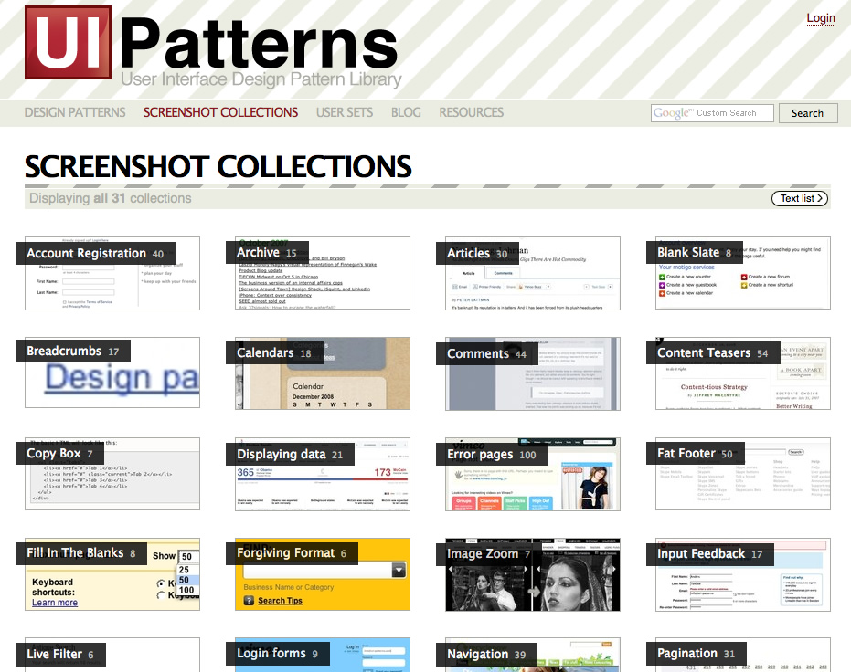
While attending UI14 this week, I learned about UI Patterns, a community effort ”...to use recurring solutions to solve common problems.” Great idea. Be sure to check out the screenshot library.
Many in the world of web application design desire to make their web-based software look and feel more like a desktop application. I’m a fan of making the web experience as rich as possible, and I recently learned how to add something more to my designs: click-action buttons.
Yes, it’s true. I love buttons. To me, the button is quite possibly the most important element in an interface. They should be designed and implemented with a lot of thought since they are the invokers of action and the committers of data.
Here I’ll demonstrate how to make buttons that press in when clicked, and it’s all going to happen without any JavaScript or magic.
It looks like you can use XHTML and CSS to wrap and flow text just like you would do in InDesign. I don’t know how useful something like this would be, and I haven’t looked at the cleanliness of the code, but it’s nice to know this is programmatically possible (and in IE6, no less). Check it out.
This is quite possibly the coolest search box I have ever seen. Way to go, Design Disease. So often search boxes are the last thing on a designer’s mind, yet it’s so easy to remove all the default styles and plop a wild background image behind the search input. I dig this kind of detail.
Update: Smashing Magazine put up a massive search article that talks about customization and design considerations. Great stuff.
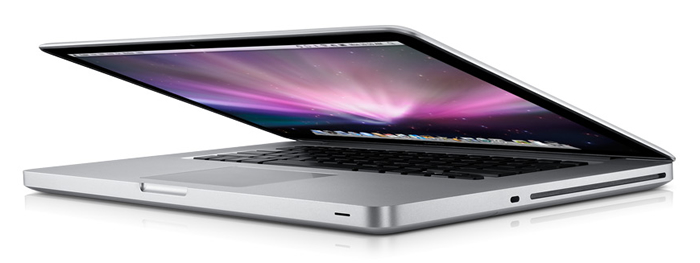
While Apple has a healthy amount of attention on profit, product features, and competition, they seemed to pause this week to make a clear statement about their company. Steve Jobs passed around a Macbook chassis in their media event and Jony Ive, SVP of Design, emphasized careful craftsmanship in their product showcase. Apple has communicated what drives their company. They, the CEO and his fellow business-minded executives, respect the balance of form and function and embrace beauty and innovation. They notice nuances and foster a culture of design excellence. Leaders that love design are the foundation of an experience-driven organization.
MacRabbit, the maker of CSSEdit, has introduced a new web development tool called Espresso. While I’m a Coda man, and many around the office here use TextMate, I’m glad to see another good option on the horizon. It certainly looks promising. (Via Pedro.)
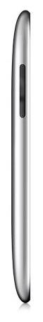
I know it may seem a bit cliché to post an Apple product on a blog these days, but I am very impressed with the elegant and gorgeously thin profile of the new iPod touch. This is beautiful product design. Very well done.
One of the rumors going around is that this visualizer will be available in iTunes 8.0 tomorrow (Sep 9th). It’s like a cross between fireworks and flying through space. I like it. I also dig the downtempo song: Suzuki by Tosca.
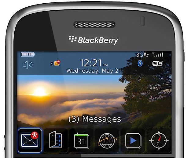
When I first started reading this review of the Blackberry Bold, the home screen UI looked promising. But the further you scroll down and the deeper you dive into the OS, it starts feeling too much like File System Land.
It’s almost as if the designers only had time to make a good-looking home screen so that the phone would sell well (and meet the obligatory marketing requirement of looking iPhone-ish). The rest of the phone’s OS ungracefully degrades the further you explore. (via Jared).
“IE 6 is a last-generation browser. This means that IE 6 can’t provide the same web experience that modern browsers can. Continued support of IE 6 means that we can’t optimize our interfaces or provide an enhanced customer experience in our apps. Supporting IE 6 means slower progress, less progress, and, in some places, no progress. We want to make sure the experience is the best it can be for the vast majority of our customers, and continuing to support IE 6 holds us back.”
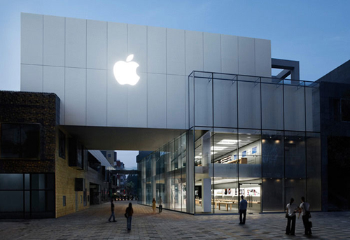
Apple opened its first retail store in China today. I’m sure Tim and Christine, our two Chinese team members, would approve. :)
(Photo courtesy of 变脸.)
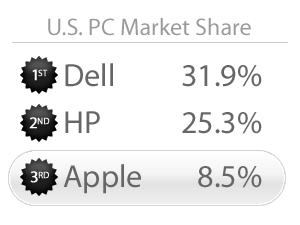
Apple just reached 3rd place in market share in the U.S. PC market (Gartner via AppleInsider). They are still dwarfed by HP and Dell, but their growth is getting attention. Note how this is PC market share, independent of their iPod and iPhone products.