case study
Click-Action Buttons
Many in the world of web application design desire to make their web-based software look and feel more like a desktop application. I’m a fan of making the web experience as rich as possible, and I recently learned how to add something more to my designs: click-action buttons.
Yes, it’s true. I love buttons. To me, the button is quite possibly the most important element in an interface. They should be designed and implemented with a lot of thought since they are the invokers of action and the committers of data.
Here I’ll demonstrate how to make buttons that press in when clicked, and it’s all going to happen without any JavaScript or magic.
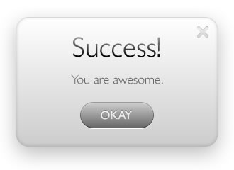
Let’s say we have a little modal dialog box that we want to popup, and it has an “OKAY” button.
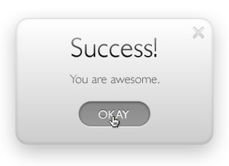
When clicked and held by the mouse, it should look like this:
The first thing to do is design the button in both its normal and pressed states, and place them side by side.
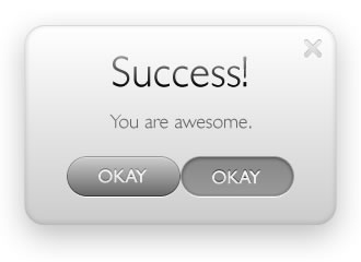
Export them as one image so that the total width is exactly double the size of an individual button.
Think of it as making a mirror image of the button, except with a different state. Name it button-okay.jpg. Your exported image should look something like this:

With that image ready to go, we then go to our code. The markup looks like this:
<a href=”#” class=”okay”><strong>Okay</strong></a>
It’s pretty straight forward. Just link up whatever you’d like, give it a class that matches the button name, and then enclose that same name in <strong> tags. Why do that?
Let’s look at the CSS:
a.okay{ background:url(button-okay.jpg) no-repeat left; width:104px; height:38px; display:block; }
a.okay:active{ background-position:right; }
.okay strong{ display:none; }
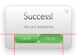
Essentially this says that for any <a> tag with a class of “okay” apply this CSS. We point the background image of the button to our exported image and give it the width of one of the buttons states (half of the total image). We then align it to show the left half of the background image.
The :active pseudo-class refers to when you click and hold a link or button. Apparently it has been supported since IE4 (which, I believe, came out during World War II). Using this pseudo-class says that when the user clicks and holds the button, show the same background image but show the right half of it. This is a pretty common technique because only one image has to be loaded by your browser, and therefore the pressed state loads instantly (there is no flicker while a second image loads up).
The <strong> tags are used and made invisible by the display:none; property so that if the user turns off styles or is seeing the page with a screen reader, they’ll see a regular hyperlink.
That’s all there is to it. Just good old fashioned CSS and a nice touch to your web application. You can try out a demo to get the full experience.