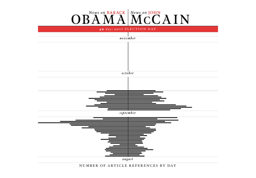
Another interesting interactive tool for tracking the US presidential election. This one allows quick access to the number of news news article references for each candidate. It’s very easily digested data. It’s interesting to see the contrast in coverage between Biden and Palin. Check it out.