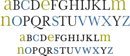
Beautiful font here plus a cool concept: “The plan for simplifying and improving our alphabet, entitled “Alphabet 26 was first presented in Westvaco Inspirations 180 in 1950. It recommended the use of only one symbol for each of the 26 letters.”
(via SVN)